Review: HTC One M9
Mar 22, 2015, 7:00 PM by Eric M. Zeman
updated Mar 24, 2015, 10:32 AM

HTC's 2015 flagship is an evolutionary update to last year's model. While the new hardware is refined with better manufacturing and high-quality materials, not all the changes are for the better. HTC's Sense user interface is complimentary to Android 5.0 Lollipop and is a compelling alternative to stock Android. The M9 has a serious flaw, however, that we hope will be fixed.
Is It Your Type?
The HTC One M9 is for flagship seekers. It's the pinnacle of design and technology from HTC, and competes directly with the likes of the Apple iPhone 6 and Samsung Galaxy S6. If you're an Android lover and want hardware that rivals the iPhone in terms of quality, the One M9 is the way to go.
Body
It's probably best to think of the One M9 as the iPhone 5s. The iPhone 5s carried over the iPhone 5's design almost exactly, but added new features. So does the M9 when compared to its predecessor, the M8. That means this year's phone from HTC is practically identical to last year's phone. I haven't decided if that's a good thing or a bad thing, yet.
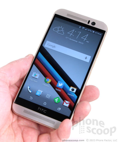
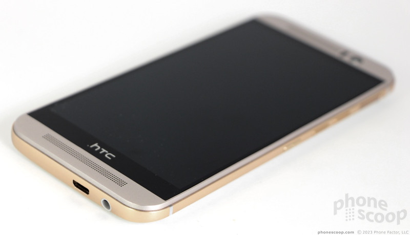
The M9 is skinned in aluminum and glass. The metal has a two-tone finish, which is one of the few things that sets the M9 apart from the M8 visually. I can't say I'm a fan. The model we tested has a light champagne hue on the back and front surfaces, but the side of the phone is wrapped in a gaudy-looking gold band. The all-black version looks better, as the band doesn't stand out so much. The phone has the now-familiar BoomSound speaker grilles above and below the screen, as well as thin plastic bands that run across the back surface. These bands are purely functional; they serve the antenna design, just like similar bands on the iPhone. However HTC was able to incorporate them into the design in a tasteful way. The M9 is an elegant piece of hardware, to be sure.
The quality of the materials is quite good. I like the brushed aluminum back cover, which has just a bit more texture than last year's phone. It meets the side edges in precise corners. Together, these make the M9 less slippery. The phone is fitted together perfectly. It's a bit on the heavy side, but that's to be expected in an all-metal phone. Since the M9 has a 5-inch screen, it isn't monstrously huge. I found it easy to hold and use. For example, my thumb was able to reach the entire screen without requiring me to adjust my grip. The gentle curve of the rear surface helps it sit comfortably in your palm, but the band that circles the side edges has an annoying lip. The M9 slips into pockets with no problem.
When viewed from the front, the M9 is nearly indistinguishable from the M8. The glass screen fills the bulk of the front surface and is installed in the metal frame snugly. Bezels along the side edges of the display are practically nonexistent, but there are sizable bezels above and below to house the speakers, sensors, and user-facing camera. There are no physical buttons on the front at all; the phone uses Android's on-screen button bar.
The side edges are where all the action is. The lone element on the left side of the phone is the SIM card tray. It is positioned near the top edge and requires a paperclip or SIM tool to eject. The memory card tray is on the right side of the phone. HTC split the volume toggle into two buttons, which are below the memory card tray. These buttons have excellent travel and feedback. Thankfully, HTC moved the screen lock button from the top of the phone to the side. All three buttons have a nice texture, but the screen lock button has its own, circular texture that helps set it apart from the others. It also has a more noticeable profile.
You'll find both the microUSB port and headphone jack on the bottom of the phone. The top edge has a large black plastic strip that houses an IR port for controlling your home theater equipment.
HTC made dramatic changes to the camera, which is the one other element that helps the M9 stand apart visually from the M8. Where the M8 has two camera modules on the back, the M9 has a single, larger module that protrudes ever-so-slightly from the surface. It is a squarish shape, and is joined by HTC's two-tone flash. Like the M8 and M7, the M9 is sealed up tight. You cannot open it up or access the battery at all. This is a common tradeoff with metal-clad phones. Unlike its predecessors, the M9 is slightly resistant to water. You can't dunk it in the sink by any means, but it can handle some rain if you get caught in a storm.
While I would have preferred to see more differentiation with the hardware, the M9 is a solid bit of work from HTC. The phone has a classy look and exudes craftsmanship and professionalism. It is put together better than last year's model and offers all that is expected from today's flagship devices.
Comments
Number One Reason for Quad-HD
The actual image captured is more dense and stands up to image expansion on larger monitors and of course Quad HD devices. Now you have a reason to desire the new standard. 😁
Very disappointing
(continues)


 HTC Updates Lock Screen and Sense Home Apps
 Hands On with the HTC One M9
 HTC Bringing the One M9+ to Europe
 HTC's One M9 Earns RAW Support Via Camera Update
 HTC to Sell One M9 March 27 for $649, Carriers April 10
 HTC One M9 (CDMA)
 HTC One M9 (GSM)


