Review: Microsoft Lumia 640 for Cricket Wireless
May 21, 2015, 4:15 PM by Eric M. Zeman

Microsoft packs a lot of power in the potent, pocketable Lumia 640. This Windows Phone handset offers more bang for the buck than most other handsets in Cricket's varied lineup.
Is It Your Type?
The Lumia 640 is a low-cost Windows Phone that represents an incredible value for prepaid customers. The phone covers the basics in spades and comes with juicy extras. If you're a fan of Windows Phone and prefer the prepaid route, look no further than the Lumia 640.
Body
The design language for Nokia's (nee´, Microsoft's) smartphones hasn't changed much since the Lumia 800 showed up way back in 2011. For the most part, you can expect bright, colorful shells made of polycarbonate that are somewhat chunkier than they should be. These attributes describe the Lumia 640 to a "T."
The Lumia 640 has a black glass front and shiny cyan on the side and back surfaces. Where most phones opt for boring blacks and dark grays, the cheery blue is a pleasant change of pace. There's nothing buttoned-down about it. Interestingly, the blue is not uniform. The cyan is more true-blue along the side edges and somewhat lightened up with a small amount of white and green on the back surface. You might not notice this unless you hold the phone close to your eyes in good lighting. Most of the accents on the phone are black. The color combo works well, though I'd prefer if the finish were matte rather than gloss.
The 640 is an average-sized phone by today's standards thanks to the 5-inch screen. It's not dainty in the least. As is often the case with Lumia handsets, the 640 is bit thick. The side edges are squared off; tapering them would have made the phone easier to hold and use. My large hands found the size manageable, but it is treading dangerously close to phablet dimensions. My thumb was able to reach the top of the screen without trouble. The slick surfaces don't do the phone any favors. It's almost as if the polycarbonate is coated in oil, so slippery is this phone. It will glide into most pockets, but the squarer shape of the side edges makes the phone less comfortable when you're walking around.
The materials are glass and plastic. The display is protected by Gorilla Glass 3. The polycarbonate shell is thick and strong. All of the 640's parts are assembled tightly. The overall quality outmatches similarly-priced phones from LG, Samsung, and others.
Many Lumia handsets have more bezel than I care to see, and the 640 indeed falls into that category. The display is surrounded by thick, black borders. Microsoft opted to put the navigation controls on screen rather than use hardware buttons. This takes away from screen real estate since the buttons don't appear / disappear as aggressively as they do within Android OS. You can just barely make out the Microsoft logo above the screen. There's a small slit cut into the glass for the earpiece speaker.
Microsoft hardly varies the button configuration on its handsets. That means the left edge of the phone is smooth, the volume and screen lock buttons are on the right, the headset jack is on top, and the USB port is on the bottom. The side buttons have excellent profiles, making them easy to find and tell apart. They also have excellent travel and feedback.
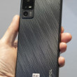
The phone's camera module and flash are perched near the top of the back surface. Microsoft and Cricket logos are emblazoned on the back in black paint. There's also a small circular hole in the bottom-right corner for the speakerphone. The hole is big enough that a small bug could crawl into it, which makes it a curious design choice.
It's a bit tricky to remove the rear shell since it also wraps around the side edges. You have to pull the back cover off and remove the battery to get at the SIM and memory card slots. Sticking the memory card slot under the battery kind of stinks, if you ask me.
In all, there's not much to complain about. It's a decent-enough piece of hardware that most owners should find the Lumia 640 a pleasure to use.
Comments
No messages


 Hands-On: Microsoft Lumia 640 and 640 XL
 Cricket Prices Lumia 640 at $129
 Lumia 640 Landing At T-Mobile In Near Future
 Microsoft Announces the Lumia 640
 Microsoft Lumia 640


