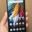
Review: Nokia Lumia 900 for AT&T
With the Lumia 900, Nokia has taken the design language seen on its iconic N9 and Lumia 800 smartphones and kicked it up a notch. It is bigger and (somewhat) better is almost every way.
The 900, which will ship in three colors (black, cyan, white), is made of polycarbonate. Polycarbonate is a fancy name for really strong plastic. After playing with the Lumia 900, Lumia 800, and HTC One X, I can understand why it appeals to hardware makers: it is lightweight, resistant to damage, and looks/feels good. We tested the black 900, which has a matte finish on the polycarbonate, but the cyan and white variants have a glossier look and feel to them.
The 900 is a big phone, there's no denying that. Any device with a 4.3-inch display is going to have a significant footprint. The industrial design of the 900 stretches that footprint with a large bezel and blocky appearance (when viewed from the front). The polycarbonate shell is solid, and wraps around the top, bottom, and side edges of the 900 to meet the outer rim of the display. The display has a raised edge that I don't particularly care for, as it interrupts the flow of what would otherwise be an entirely smooth device. The sides of the 900 are gently curved and the portions of the shell above and below the display taper down to meet the top/bottom edges. It's unique, and gives Nokia's Lumia 900 its own look in a crowded field of me-too smartphones.
It's a satisfying device to hold. The materials and the shape together are a comfortable combination. It's not too heavy, but I wish it were slightly thinner. It's 11mm thick compared to the HTC One X's 9mm. Phone makers really need to shoot for thicknesses less than 10mm in my book. It'll easily slip into a pocket, but the sharp-cornered top and bottom surfaces will make themselves known as you move throughout the day.
There's not much on the front face other than the display. You can just make out the user-facing camera within the bezel above the display, and the three typical Windows Phone buttons are below the display in capacitive form. The buttons work well, but don't light up often enough; it can be hard to find them in the dark.
There are no controls or ports on the left side and bottom edge of the phone. The right side is full of silvery buttons, including the dedicated camera key, screen lock key, and volume toggle. They are all easy to find, as their color and texture differs from that of the polycarbonate. The buttons each have good travel and feedback, but I am troubled by the position of the screen lock button. It falls right in the center of the right edge, and I found that the palm of my hand accidentally pressed it when I was gripping the phone. The result is that it wakes up the screen far more often than I want it to.
The 3.5mm headset jack, microUSB port, and SIM card slot are all on the top edge of the 900. The SIM card slot is a fussy little thing, but Nokia doesn't expect you'll be ejecting it all that often.
We can add the 900 to the (sadly) growing list of devices that has a built-in battery. It is not accessible at all by the owner. The 900 also does not have a user-accessible memory card slot. The 16GB baked into the phone is all you get for storing media.
The overall effect of the 900's design and materials gives it a slightly chunky look, but I still find it much more appealing than what other handset makers have done for Windows Phones. It stands out, and that's what Windows Phone needs right now to compete with Android and iOS devices.


 Hands-On: Nokia Lumia 900
 Liveblog: Nokia Lumia 900 for AT&T
 AT&T to Sell Pink Lumia 900 Starting July 15
 Nokia Makes the Lumia 900 for AT&T Official
 Nokia Lumia 900


