Review: LG Lucid for Verizon Wireless
The Lucid ships with Android 2.3.6 with the expected minor user interface tweaks from LG and Verizon.
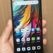
I'm pleased to report that the Lucid has some lockscreen shortcuts. When you first tap the lock button, you have two choices. You can slide the entire screen up to unlock the Lucid, or grab one of the four app shortcuts (phone, messages, voicemail, camera) on the screen and drag it down to jump straight to that application. Yay! If you have a passcode enabled, however, unlocking the code takes you straight to the home page; no shortcuts are available.
The Lucid offers five home screen panels for customization and content. There are a handful of widgets scattered across these screens out of the box, but of course they can all be canned in favor of your own layout.
The main app drawer is a single screen with all the apps displayed in a grid that's broken down by category. You can also view the main menu in an alphabetical list, or in a custom grid if you prefer. The customizable grid is perhaps the most flexible way to arrange apps, as you can shuffle around not only the location of the apps on each page, but where the pages land as well.
In terms of performance, the Lucid is just fine. I didn't notice any glaring speed issues in the user interface or within applications. It didn't stutter or slow down, and even some fast multitasking didn't seem to faze it.


 LG Optimus Zone and Exceed Hit Verizon Prepaid
 Verizon Wireless Announces the LG Lucid
 Samsung Refreshes Galaxy S Series with S Pen, New Cameras
 Samsung Refines its Foldable Phones
 Samsung Upgrades its Wearables
 LG Lucid / Optimus Exceed


