Review: HTC EVO 4G LTE for Sprint
Sprint wanted its variant of the One X to stand apart from other versions. I totally understand that. There's nothing wrong with wanting to offer a unique product. Unique isn't always good, though, and I think the design choices made by Sprint and HTC on this device border on chaotic.
From afar, the phone looks good. It's a black slab that's broken up by red and silver styling cues. Usually this palette mixes well. Hold it close and the stylings look forced. The international and AT&T variants of the One X are housed in a single piece of polycarbonate. The polycarbonate is smooth, with rounded edges, and is a pleasure to hold. The plastics, metals, and other materials of the EVO aren't pleasant to hold at all.
First, the aluminum. There's a metallic band that loops the side, top, and bottom edges of the EVO. Brushed metal almost always looks and feels good, but this band has some seriously sharp edges to it. The edges feel hard against the skin when the phone is gripped tightly. The benefit is that the EVO is strong as heck.
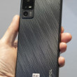
There are no less than four different materials used on the back of the phone. At the top, there's a cheap-looking, glossy piece of black plastic. This piece of plastic can be removed to access the microSD card slot. The cover fits snugly. Below it, there's a red metallic band (Verizon's colors, anyone?) that also serves as the kickstand. The kickstand is easy enough to remove with the help of your thumbnail, and the phone can be positioned on either the left or right side with the kickstand open. Then there's a soft-touch surface that takes up perhaps 50% of the back of the EVO. It's grippy feeling. Finally, the last 1.5 centimeters of the back surface (where the antennas are located) is covered with a slightly different soft-touch surface. The overall look — with multiple horizontal lines running across the surface — is way too busy for me, and completely loses the sex appeal of the polycarbonate One X.
The front of the EVO has a slight lip that rings the display. This lip is meant to help protect the display when it is placed on a flat surface. I totally understand the utility in such a design choice, but it gives the EVO a hard edge that simply doesn't feel good in the palm. It's more or less the complete opposite of the polycarbonate One X in overall feel.
It's still thin enough to easily slip in and out of pockets, and the weight is nothing to be concerned about.
What little portions of the EVO's front surface aren't consumed by the display house the speaker grill and user-facing camera up top, and three Android capacitive controls at the bottom. As with other variants of the One X, the capacitive buttons offer mild feedback. The microUSB port is on the left edge, and the volume toggle is on the right edge. The volume toggle has a decent feel to it, but was a bit sticky. It didn't spring back quickly enough.
The one major hardware advantage the EVO has over other One X variants is the dedicated camera button. The button is on the right edge, and has absolutely fantastic action to it. It's a two-stage button, and both stages are well defined. What's dumb is that pressing the button won't unlock the phone and take you to the camera. You have to use the lock-screen software shortcut to reach the camera or unock the screen first. Only *then* can you use the hardware button. Stupid. HTC knows better than that.
The 3.5mm headset jack and lock button are on top. The lock button is improved compared to other variants of the One X. It has better travel and feedback, and is easier to find.
From my perspective, the design changes take away from HTC's original device and serve no discernible purpose. You may love them. I don't.


 Hands-On: HTC EVO 4G LTE
 Sprint's Latest EVO from HTC Adds 4G LTE, Brings Back Kickstand
 HTC EVO 4G LTE


