Review: Samsung Galaxy S Relay 4G for T-Mobile
Sep 27, 2012, 9:02 AM by Eric M. Zeman

T-Mobile fills a spot in its lineup with the Galaxy S Relay 4G. This smartphone offers a QWERTY keyboard, Android 4.0, a 4-inch display, and speedy data. Phone Scoop puts the Relay through its paces so you don't have to. Here's what we think.

Is It Your Type?
The Galaxy S Relay 4G for T-Mobile is a compact smartphone the includes a respectable number of features in addition to a slide-out, physical keyboard. For the smartphone user who needs real keys and wants performance in a smaller footprint, the Relay has merit.
Body
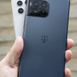
The Samsung Galaxy S Relay 4G (Relay) is no Galaxy S III nor Note II. It is significantly smaller than its flagship brothers, and doesn't have quite the design aesthetics, either. It tones everything down in favor of function over form. It is also nearly indistinguishable from a half dozen other smartphones fielded by Samsung this year. It's somewhat boring and conservative; it's a wallflower attending the smartphone party.
Its bar-of-soap shape — which is to say somewhat chunky with rounded corners — is necessary to add the QWERTY keyboard. Keyboards almost always add thickness to a device, and the Relay is no exception. Despite the chunky look, the Relay is comfortable to hold, as it fits snugly in your palm. It has a mix of glossy and matte finishes, with the battery cover wearing the matte. The battery cover also has a minimal texture that adds grip. I'm able to wrap my hand all the way around the Relay without trouble.
The Relay's four-inch display is surrounded by plenty of bezel, though it's not an egregious amount. The Relay has an actual, physical button for the Android home function. It has one capacitive button to either side for the menu and back functions. All three controls work well. The physical button, in particular, has pleasing travel and feedback.
The volume toggle is on the left. It's easy to find and use, but the travel and feedback are disappointing. The same goes for the lock button on the right side. It's too mushy for such a vital key. The headphone port and microUSB port are on the top and bottom of the Relay, respectively.
Thanks in part to the grippy back surface, the slider mechanism is easy to use. I found the Relay didn't want to jump from my hands when opening the slider; it remained firmly in my grasp and slid open easily. It has a bit of spring assistance to help both open and close it. The mechanism feels strong and well built
Speaking of which, the Relay in general feels pretty solid. The materials aren't necessarily the best available but the device is well put-together.
Moving on to the keyboard. It's a five-row job that gives the number keys a row to themselves. The middle three rows are reserved for letters, and the bottom row is mostly control buttons. There's a dedicated email button and a dedicated text message button. The period and comma each have their own button, as well. The keys are nearly flat, with only the smallest amount of shape to them. It can be hard to tell the keys apart if you're typing in a hurry. Thankfully the keys have excellent travel and feedback. The one significant issue I noticed has to do with the bottom row: they are too close to the lip/edge of the Relay. The result is, the bottom row of keys (and especially the space bar) is in a bit of depression, making them a bit harder to hit consistently.
The Relay's battery cover peels off just like those of every other Samsung smartphone released in the last two years. It is the only component of the hardware that feels somewhat flimsy. You can't access the SIM card or the microSD card without first pulling the battery.
Comments
Samsung's craptastic UI tweeks
I'm hoping to get this device as soon as I get my discount. I just hope Samsung supplies at least one update to it. The Sidekick got forgotten in F...
(continues)


 Samsung Confirms 'Galaxy S Relay 4G'
 T-Mobile Makes the Samsung Galaxy S Relay 4G Official
 Samsung Refines its Foldable Phones
 iPhone 14 Plus Offers a Big Screen For Less
 iPhone 15 Series Goes All-In on USB-C and Dynamic Island
 Samsung Galaxy S Relay 4G


