Hands On with the Sony Xperia Z and ZL
The Xperia ZL is the smaller little brother to the Z. It has all of the same features, though, including the huge 5" display, top-end Exmor R camera, and quad-core processor.
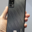
Besides being smaller, it has a toned-down design. From the front, it looks quite similar to the Z, but it looks more different as you turn it over. The sides are broken by an easily-accessible exposed headset jack and a dedicated camera button, unlike the Z. The back is completely different, with a tapered, textured or matte plastic back for improved feel and grip.
Putting the same display in a smaller phone means the ZL has an impressively thin bezel. The front is almost all screen, giving a wonderful screen-size-to-phone-size ratio. Helping it feel even smaller are the thin sides and tapered back. This is the five-inch phone for people who find other five-inch phones too large. I'm impressed.
The shape and texture of the back feels great, but it's broken up by a weird door near the bottom, hiding the memory and SIM card slots. On the models we tried on the show floor, it didn't fit well, ruining the otherwise clean lines and solid build quality of the ZL.
The buttons are better than the Z, starting with a slightly better-feeling volume rocker in a more sensible location near the top. It also adds a dedicated camera key.
The ZL also has a small sliver of an indicator light centered under the display, a welcome carry-over from last year's designs.


 Hands-On: Sony Xperia Z1
 Review: Sony Xperia Z for T-Mobile USA
 Review: Sony Xperia ZL
 T-Mobile USA to Sell the Sony Xperia Z
 FCC Documents Suggest T-Mobile Will Sell Sony Xperia Z
 Sony Xperia Z
 Sony Xperia ZL


