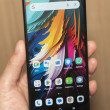
Hands on with the ZTE Grand S
Jan 8, 2013, 7:24 PM by Rich Brome @richbrome

ZTE is joining the club introducing a phone with a 5-inch 1080p full-HD display here at CES. It's big, thin, light, and the screen will impress the most jaded display critic. There's more to a phone, though. Read on for our impressions from spending some time with it.
If you're introducing a new flagship phone here at CES this year, it had better have a huge 5-inch "full HD" 1080p display. Not to be left out, ZTE just unveiled their Grand S LTE, their top-end model for 2013.
The Grand S has everything. Besides the huge (and gorgeous) display, there's also a 1.7 GHz quad-core Snapdragon S4 Pro processor, 13-megapixel camera, and 4G LTE data. Although the battery is sealed inside, there's a memory card slot on the side.
The phone is put together with a plastic unibody back and sides. This gives the phone a wonderfully smooth and solid feel. The phone is quite large - especially vertically - but the side bezels are quite thin, making it slightly easier to hold. It's also very thin and not too heavy. The back and sides have just enough curve to make it comfortable to hold.
The phone was being shown off in many colors and finishes, including unique colors like bright yellow and a very light blue. The glossy ones were fingerprint magnets, but others had a well-done matte texture that looked and felt nice. The one break in the matte back is the large camera bulge near the top, which is covered in black glass that shows fingerprints like mad.
The side keys - just a volume toggle and lock key - looked and felt like finely-machined metal. They work well and look good doing it. The phone has capacitive Android keys below the display. They're very near the bottom, making one-handed use tricky. They also don't seem to be backlit, and the markings are extremely faint; they're easy to miss. Like many manufacturers, ZTE has ignore Google's recommendations and included a proper "menu" key instead of a dedicated muti-tasking key. I approve.
The Grand S runs Android 4.1 with a heavy dose of customization from ZTE. Those tweaks are quite a mixed bag of good and bad choices.
There's a decent lock screen, with shortcuts to six apps. There's also a well-done notification shade with two tabs at the top: one for standard notifications, and a second for a whole screen of shortcuts, including quick settings switches and customizable app shortcuts.
The camera interface is especially well-done. It offers big buttons for common options, and an easy menu for additional options. It offers all of the major features you expect on a high-end phone now, such as face recognition and HDR. It also sticks very closely to Google's "Holo" design language for Android 4.x, which is even more curious because the rest of what ZTE has done with the interface is not Holo-like at all. Regardless, it's a very good camera app.
Revisiting the standard Android controls below the display, ZTE must have thought they didn't do a good job with them, because they added a second set in software that float above everything else at all times. There are four buttons arranged in a diamond, that collapse into just a back key when not used. You can drag this widget anywhere, but it's always there, which is annoying. I really can't wrap my head around this odd bit of software. Surely it will always be easier to just use the buttons below the display? Why duplicate them with something that gets in the way?
There are myriad other tiny places in the software where ZTE has made changes to Android that make things more confusing while adding little value. Perhaps these things make sense to Chinese consumers (where this phone is launching first) but they made little sense to me. I hope that if this phone makes it to U.S. shores, whatever carrier picks it up will insist that the software be tweaked to make more sense to western minds, or perhaps simply more like stock Android.
Small software issues are fixable. More important is the hardware, which does impress.
ZTE hasn't yet announced if it will bring this phone to the U.S.
Comments
Comparison Picture Grand S vs. iPhone


 Samsung Refines its Foldable Phones
 Hands On with the Motorola edge (2022)
 iPhone 14 Plus Offers a Big Screen For Less
 TCL's Newest Concept Phone has a Matte Screen
 Qualcomm vs. Bullitt: Satellite Connectivity Comparison and Hands On


