Review: HTC One VX for AT&T
Jan 14, 2013, 6:58 PM by Eric M. Zeman

AT&T's latest Android smartphone from HTC is the One VX, a mid-range device that slips into the lineup below HTC's capable One X. This mid-range model is no slouch, however, and carries its weight and then some.
Is It Your Type?
The HTC One VX is a smaller, more affordable sibling to the One X for AT&T's network. It dials down the quality a bit, but still manages to offer a lot compared to other phones in this segment.
Body
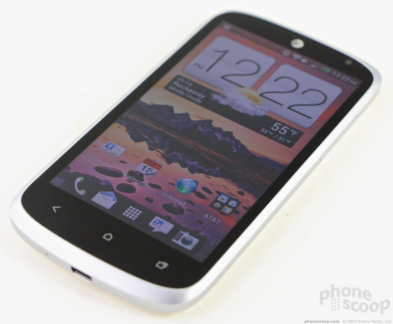
The HTC One VX is unmistakably from our friends in Taiwan. It fits right in with the current design language being used by HTC with its curves, lines, and overall appearance. It's also unmistakably a mid-market phone, and eschews some of the finer materials and elements seen in HTC's higher-end handsets.
In general, the VX is an attractive phone. It makes good use of white, black, and metallic accents to define the different surfaces. There are plenty of rounded corners and flowing curves that give it a fluid look. The materials and manufacture, however, are not nearly as good as I would like them to be.
The glass panel that makes up most of the front face and display feels fine. The metal-colored band that runs around the outer edges of the VX is really plastic made to look like metal. (HTC has used aluminum in past devices, which would have boosted the feel and quality.) I don't like the feel of this plastic outer band. The seam where it joins the display panel is not comfortable against the skin and the seam where it joins the battery cover is not even. Further, the materials that are used in the battery cover are cheaper than the polycarbonates that make up the HTC One X's shell, for example. It's not falling apart, but it could have been made with finer materials and put together a bit tighter.
Feel of the materials aside, the VX is light and slim. It has a comfortable size, and slips into pockets with no problem at all.
The display takes up perhaps 70% of the front surface. There's a bezel around it that is a wee bit bigger than I'd like to see. There's a generous space below the display for three capacitive buttons (back, home, multitask). These buttons have a hair trigger and provide light haptic feedback when pressed.
The physical buttons for the VX are among the worst I've seen on an HTC device. The screen lock button, which is on top, is flush with the surface. This makes it impossible to find. Worse, the travel and feedback are miserable. This is a vital button that HTC continually screws up. The volume toggle, which is on the right edge of the VX, is only marginally better. It is easier to find, but travel and feedback are minimal. There is no dedicated camera button. The headphone jack is on the top and the microUSB port is on the bottom.
The VX has a removable back cover, but not a removable battery. Instead, removing the back cover allows access to the SIM card and microSD card slots.
At the end of the day, the VX feels exactly as a $50 phone should.
Comments
No messages


 Hands On: HTC VX and One X+ for AT&T
 HTC One VX Lands on AT&T's Web Site for $49
 AT&T Announces HTC VX, Will Sell One X+ with LTE
 Samsung Refreshes Galaxy S Series with S Pen, New Cameras
 iPhone 14 Plus Offers a Big Screen For Less
 HTC One VX


