Review: Pantech Discover for AT&T
Jan 18, 2013, 10:28 AM by Eric M. Zeman

Pantech puts the big boys on notice with the Discover, its latest Android smartphone for AT&T. It offers all the performance you'd expect from a flagship device at one-quarter the cost of the competition. Here is Phone Scoop's full review.
Is It Your Type?
Pantech breaks into 2013 with the Discover, a new flagship smartphone for AT&T. This piece of Android goodness claims to have it all — 4G, HD display, killer camera — and it might actually deliver on that promise. At just $50, there's no excuse not to discover what Pantech's latent device has to offer.
Body
The Pantech Discover is perhaps the company's finest device. It's not perfect, but compared to the company's past efforts, the Discover is its piéce de résistance.
Pantech embarked on a new course for the design of the Discover. Gone is the blunt look from devices such as the Renue or Pocket; in its place you'll see smoother lines, sleek curves, and more attention to detail. The Discover is still a mostly rectangular slab, but the contours and accents give it a hint of a personality not often evident in Pantech's designs.
What probably stands out the most are the stereo speakers. The two black mesh speaker grills are fitted snugly into each side of the phone, and almost look like twin smiles grinning out. Speakers aren't often positioned so, but Pantech had good reason. (More on the speakers later.)
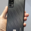
The aspect I like most about the Discover's design are the slopes along the back surface. The battery cover swells near the bottom and top, which makes it thicker and the ends than in the middle. It's subtle, though, and has real-world practicality in that it makes the device fit well in the palm of your hand. It's a comfortable phone to hold and use. The front surface is entirely smooth due to the glass, while the battery cover has a patterned texture with a matte finish. It's thin and light, and slips easily into a pocket. I'd call the materials of average quality. They're not anodized aluminum or polycarbonate, but they're a few steps above the cheap plastics I've seen on some competitors' devices.
The Discover uses on-screen buttons for Android's back and home keys, so there are no extra keys below the display. The volume toggle is on the left edge of the phone. It's easy to find, has a pleasant feel to it, and produces excellent travel and feedback. The same can be said of the screen lock button, which is on top of the phone. Considering how many crummy screen lock buttons I've encountered of late, the Discover's is a relief. The headphone jack is on top, too, and the microUSB port is on the bottom. There is no physical camera key.
The battery cover can be removed with the aid of a thumbnail. It is pried off easily. Once removed, you can access the microSD card with no problem, but you need to pull the battery to access the SIM card. This is a pretty typical set-up.
Comments
"...easily outperforms devices that cost more than twice as much."
Can you elaborate on this? Are you saying that the phone is "better" than say an S3 or One X? I know the Burst was spec'ed very highly for it's time, but severely lacked in build quality and potential for longevity...
Have they improved on quality itself, rather than just specifications?
I know that you get what you pay for, so why is this product so cheap??
Also, I couldn't find the memory or RAM... 8 GB, 1 Gig RAM? im guessing...
(continues)
No special manufacture processes, no fancy machined metal chassis (which often requires several mechanical processes to achieve) , curved glass surfaces, anodized aluminum or or high grade polycarbonate housing(which also requires sev...
(continues)
They skimped out on the most important feature of a phone.
(It has 16 GB of internal storage + 1 GB of RAM.)
Thanks for your great reviews
;)


 Hands-On: Pantech Discover for AT&T
 Pantech Discover for AT&T Boasts HD Display, 12MP Camera
 iPhone 14 Plus Offers a Big Screen For Less
 Qualcomm Expands Snapdragon 8 Series to Cover More Price Points
 Samsung Puts its Best Camera Yet in the Galaxy S23 Ultra
 Pantech Discover


