Hands-On: ZTE Grand Memo
Feb 25, 2013, 9:34 AM by Eric M. Zeman

The ZTE Grand Memo pushes the boundaries of the phablet market with its 5.7-inch display. This massive phone crams tons of features into a slim package.
source: ZTE
The ZTE Grand Memo is a stunner. If not for the screen, then at least for the sheer size of it. It is the largest of the phablets with sub-six-inch displays. The display measures 5.7 inches, and there is (unfortunately) plenty of bezel around the screen pushing the length and width into the dinner plate dimensions. ZTE is clearly taking aim at the LG Vu, Samsung Galaxy Note, and other devices that have defined the phablet category. By showing up with the biggest screen, ZTE is looking to outmatch the competition.
The design of the Grand Memo is similar to that of the Grand S, which was announced during CES earlier this year. It is relatively slim, but made from somewhat cheap plastics to keep the weight down. ZTE was only showing off black and white versions of the phone, and didn't indicate if other colors would become available. Both colors are glossy, with smooth and reflective surfaces. It was difficult taking a shot of the phone without reflections from all the lights.
I was surprised by how light the Memo is. It barely weighs anything, which is surprising given the size of it. I wish the materials were nicer. The plastics are simply not up to snuff, and do not do the Memo any favors in terms of fit and finish.
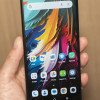
Of course, the Memo is all about the screen. The 5.7-inch display offers full 1080p HD resolution. It is impressive, but not as impressive as the 5-inch display I saw on the LG Optimus G Pro earlier. It is sharp and colorful, but I though the brightness was lacking a bit. ZTE's custom user interface elements pop off the screen though, thanks to the colorful palette. The viewing angles of the Memo's display were good, too. There are three capacitive buttons below the display in order to interact with the Android operating system.
The left edge of the Memo is all about hatches. There are two, one for the SIM card and another for the microSD card. These hatches felt chintzy to me. The volume toggle is the only button on the right edge of the device. It has a really nice feel to it and satisfying travel and feedback. The stereo headphone jack is on top, as is the screen lock button. This button worked just as it should. The microUSB port is stowed on the bottom edge.
A 13-megapixel camera module is positioned on the back of the Grand Memo. It features a flash, and of course can record 1080p HD video.
On the software side of the equation, the Memo runs the exact same user interface customizations seen on the Grand S. What's most noteworthy to me is that the Grand Memo does not include a stylus. It's very name implies that it should be used to write stuff down. The omission of a stylus is a curious choice on ZTE's part at the very least.
The ZTE Grand Memo is certainly an impressive device. The likelihood of it reaching the U.S. is slim, however.
Comments
Huge


 TCL's New Foldable Concept Swings Both Ways
 iPhone 14 Plus Offers a Big Screen For Less
 Hands On with Xplora Kids Smartwatches
 iPhone 15 Series Goes All-In on USB-C and Dynamic Island
 Hands On with the TCL 50 XE NXTPAPER 5G


