Review: Pantech Perception for Verizon Wireless
Menus
The Perception runs Android 4.0 Ice Cream Sandwich (really, not even Android 4.1?) with a user interface skin from Pantech. It also has the Pantech Easy Mode and Standard Mode tools, which alter the entire experience of the phone.
Pantech has done some unique things with its Android lock screens in recent years and the Perception is no exception. There are four shortcuts on the lock screen that will take you to the camera, phone, messaging app or music player. These shortcuts can be customized by the user to open pretty much any app on the phone. You can also mute incoming calls from the lock screen.
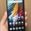
There are five home screen panels populated with various apps, shortcuts and widgets. The home screens on the Perception are as flexible as any other Android device.
The main app menu can be arranged in different ways, including alphabetical grid, custom grid, and list. Individual apps within the app menu can be hidden from view, some can be deleted, or they can be added to folders. You can also change the appearance of the icons, which is fairly novel. There are two options: stylish and classic. The differences are minor, but still manage to give the phone a new look. Cool.
The notification shade is too busy for my tastes. It has the status bar, a separate little bar for the full menu, the quick toggles for various radios, another strip for settings shortcuts, then a strip for controlling the Wi-Fi radio, and then, finally, your notifications. Ugh. Who thought of this design?
As for the easy mode, it really tones down the clutter of Android in general. It makes all of the icons larger and easier to read, reduces the number of home screens down to one, and uses alphabetical lists for the settings and app menus. One bummer is that it drops the handy lock screen shortcuts, and disables the use of widgets entirely. It also hides the bulk of the apps installed on the device, leaving only the main communications tools available. It will probably be easier for first-time smartphone users to begin with the easy mode enabled, but it really cuts down on some of Android's best features (widgets, and so on.) There's no difference in the way either performs.
The settings menu is fairly standard and easy to figure out. Rather than use the simple, stock Android look, Pantech has added lots of splashy color and icons, but these don't impact usability.
In terms of performance, the Perception held its own. The dual-core 1.5GHz processor is more than adequate for powering the Perception. I didn't see any stuttering apps, crashes, or problems with screen transitions.
Calls/Contacts
Aside from the lock screen shortcut that takes you directly to the call log, the Perception's phone app behaves as it does on most Android phones. You can answer calls from the lock screen, or by pressing the up volume key (this feature can be turned on/off.) You can also select from three different dialpad styles, which is not a common feature, though we saw it on the Pantech Discover earlier this year.
The contacts application behaves much like stock Android, too. The one thing setting it apart is a really useful home screen widget. The widget lets you create a miniature contact list that is accessible from the home page. It holds at least ten people, and includes their thumbnail photo and shortcut buttons for messaging them or calling them.
Messaging
The Perception covers all of the messaging basics. It runs the stock messaging (SMS), email, Gmail, Google+, Google+ Messenger, Latitude, and Google Talk apps. All of them work well, though they don't present any new features. There are no Verizon-branded messaging apps on board, and both Facebook and Twitter are pre-installed.


 Pantech Perception for Verizon Arrives April 25
 FCC Outs Pantech Perception for Verizon Wireless
 Samsung Refreshes Galaxy S Series with S Pen, New Cameras
 Samsung Refines its Foldable Phones
 iPhone 14 Plus Offers a Big Screen For Less
 Pantech Perception


