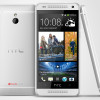
Hands On with the HTC One mini
Jul 18, 2013, 4:00 AM by Rich Brome @richbrome

The HTC One mini is just what it sounds like: a shrunken version of HTC’s well-regarded flagship One. The mini is smaller in both stature and cost. As with Samsung’s Galaxy S 4 Mini, a smaller, cheaper phone requires compromises in some areas. But HTC took a slightly different tack, keeping some of the best features of the One intact in the mini version. We spent some time with the mini, comparing it with the competition. Read on for our first impressions.
Article
The big news is that the One mini includes pretty much the same great UltraPixel camera and BoomSound speakers as the full-size One. The body also uses real aluminum and has a premium feel not far off from the flagship One. Having these premium features in a smaller, more affordable phone is a huge selling point.
To make the mini smaller, HTC had to trim the screen size from 4.7 inches down to 4.3. That much is a given for this class of phone. Fortunately, HTC chose a 4.3-inch Super LCD display with 720p resolution, which is as good as it gets at 4.3 inches. That means sharpness equal to Apple's Retina display. It's the same display panel as you'll find in the HTC First (which is also excellent) and it's just as lovely to look at as the display on the full-size One. In other words, the screen is not an area where HTC compromised.
The other major size compromise is a smaller battery: 1800 mAh versus 2300 on the One. A smaller battery could be fine given the smaller display and lesser processor. However, 1800 is also smaller than the 2000 mAh battery on the HTC First, which has a similar display and processor. The First battery life doesn't impress me, so I'm tentatively worried about battery life on the mini. But of course only full testing will reveal how well HTC has tuned everything in terms of real-world battery life. The inclusion of HTC's Sense optimizations should improve battery life compared to stock Android on the First, according to HTC.
That they kept the UltraPixel camera sensor is wonderful, although unfortunately, there wasn't room for the optical image stabilization (OIS) mechanism to steady the lens. So while this should still be an uncommonly good camera for this class of phone, you might end up with a few more blurry photos in low light than you would with the full-size One.
As with the One, there's no memory card slot (it has 16 GB of storage built in) and the battery is sealed inside. But those are trade-offs engineers must make to achieve the smallest size and sleekest design.
HTC also compromised in a few areas for the sake of price. One is the lesser processor. It's a Qualcomm Snapdragon 400-series instead of 600-series. Since plenty of new phones are still being announced with older S4 chips, a 400 processor is still nothing to sneeze at. (If you must have the very best, newest processor, you probably already bought a One or Galaxy S4 anyway.) HTC also included less RAM (1 GB instead of 2.)
On the more unfortunate side, there's no infrared port for controlling your TVs, etc. There's also no NFC. There is LTE 4G, although by now, a smartphone without LTE is almost unthinkable.
The body of the mini resembles the One, save the sides, which are all plastic. That one change saves a large amount of manufacturing cost, according to HTC. Frankly, for me, it's an even trade-off. The engineering of the full-size One is amazing (and fun) to gaze at, fondle, and show off. But the plastic edges of the mini are more comfortable to hold, and should be a little more durable in terms of surviving small drops with less damage.
I was very impressed with the feel of the mini. To me, it feels more premium than it looked in the leaked photos. The metal back lends it most of the premium feel of its big brother. The bands of plastic across the back have the same seamless feel as on the original One. The size and shape, though, really set it apart. The One mini is hands-down the best-feeling phone I have ever held in one hand. It fits my hand like a natural extension of my body. Thanks to the thin bezels on the left and right of the display, it's narrower than most other phones with a 4.3-inch display. The slightly angled sides make it easy to keep a firm grip on it even with a small hand. The curve of the back, though, is what makes it really just melt into your hand and feel exceptionally thin. Thanks to that, it easily beats the iPhone 5 form factor, my previous favorite hardware to use one-handed.
The rest of the hardware is very close to the original One. The lock button up top is now metallic, and it's actually better. The volume buttons on the side are now two separate metallic buttons. They feel nice. The action of the volume buttons was shallow and mushy on the unit I tried, but it was a pre-production unit; I hope that improves by launch. The back has the UltraPixel camera, which fortunately has a recessed lens to protect it from scratches. The front design is similar to the larger One, including two capacitive buttons below the display.
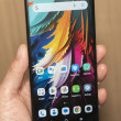
The software on the One mini is extremely close to that on the larger One. It's HTC's Sense 5, BlinkFeed, Zoe... all of it. The mini, simply for being newer, will come with Android 4.2. It also has some small tweaks, like being able to swipe up from the home button to launch Google Now. Otherwise, it's identical.
In short, the One mini is promising. We look forward to reviewing it, and testing things like battery life, especially. Assuming it performs well, it could be a dream phone for those looking for a smaller phone ideal for one-handed use. Look for it in Europe in August and in the U.S. before the end of the year.
Comments
curious to know the benchmark scores....


 Hands-On: HTC Desire 601 and Accessories
 Review: HTC One mini
 HTC One mini Hits AT&T Stores August 23 for $99
 HTC One Mini Made with the Small-Handed in Mind
 HTC One mini


