Review: Nokia Lumia 925 for T-Mobile
Jul 27, 2013, 5:59 AM by Eric M. Zeman

Nokia's Lumia 925 represents the current pinnacle of hardware design for Windows Phone, but it still doesn't get every feature right. See where the 925 shines and where it doesn't in Phone Scoop's full review.
Is It Your Type
The Lumia 925 is the top-of-the-line Windows Phone available from T-Mobile. It takes Nokia's design language to a new level, and is stuffed with custom Nokia-made software. If you're looking for a solid Windows Phone, the Lumia 925 has plenty to offer.
Body
The Lumia 925 is the first Lumia smartphone from Nokia to ditch the all-plastic design and use some metal. It also trims some significant girth and weight when compared to models such as the 928 and 1020. The result is a Windows Phone from Nokia that has a new, updated look and its own identity.
There's no doubt that Nokia's polycarbonate smartphones help the entire brand stand out on store shelves. The bright yellows, reds, and other hues give Nokia's Windows Phones some eye-catching luster compared to the black and gray smartphone masses. But not everyone likes color, not everyone likes plastic, and not everyone likes heavy, bulky smartphones. All of which have been characteristics of Nokia's leading devices. Enter the Lumia 925.
Rather than use a polycarbonate shell, Nokia gave the Lumia 925 an aluminum frame and a polycarbonate back panel. On earlier designs, Nokia needed to use thick plastic to give its Lumia phones strength. Aluminum is stronger than plastic, so Nokia can use less of it to reach the same strength needed to protect the device's innards. Bottom line: the 925 is dramatically thinner and lighter. This improves the day-to-day experience of using the 925 by quite a lot.
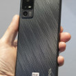
As far as looks go, the aluminum frame wraps around the 925's sides and has a nice sheen to it. There are four black bands that appear in the frame (one near each corner) that are part of the antenna structure (similar to the iPhone.) The back plate that protects the back surface comes in either white or dark gray. It has a matte finish and is unremovable. The front, of course, is solid black glass.
I really like the way the 925 feels to hold and use. I'm a fan of metal when it comes to phone designs, and the the juxtaposition between the metal, glass, and polycarbonate feels good. The 925 is still a sizable phone, but it will fit into pockets easily.
The front panel has three capacitive buttons at the bottom and the rest is all screen. The three buttons worked well. The rest of the hardware controls are concentrated on the top and right edges. The top is where you'll find the SIM card slot, microUSB port, and stereo headphone jack. The SIM tray requires a paperclip to open. It's a bit fussy, if you ask me, since the tray needs to be extracted slowly with the paperclip. It doesn't just pop out like on most other devices. The volume toggle, screen lock button, and camera button are all on the right edge, in that order. All three are easy to find and have excellent travel and feedback. The camera button, in particular, has well-defined stages for focusing and shooting images.
As noted, the back panel is made of polycarbonate. Since it's not removable, there's no access to the battery, nor a memory card slot of any kind. There's a small hump where the camera module is, and the dual-LED flash is situated next to the lens. There are three metallic contacts on the back for use with a dock, and the speakerphone's grill is also visible.
Suffice to say, the Lumia 925 is one of the best smartphones Nokia has designed in years.
Comments
Nice


 Hands On with the Nokia Lumia 925 for T-Mobile
 Nokia Intros the Metal-Clad Lumia 925 with PureView
 Nokia Lumia 925


