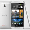
Review: HTC One mini
Aug 9, 2013, 3:15 PM by Eric M. Zeman

HTC's smaller Android smartphone is an excellent choice for the phablet-averse. It takes everything that was great about the One and stuffs it into an equally-attractive, yet more-usable, piece of hardware.
Is It Your Type?
The HTC One, released earlier this year, is a dazzling smartphone in many respects. For some, however, it is perhaps a bit too big. That's why HTC created the HTC One mini, a smaller version of its flagship phone with the smaller-handed public in mind. If you like premium phones, but need something more human-size than today's phablets, the One mini is well worth a look.
Body
The HTC One mini is small, but only when compared to the One, the Galaxy S4, the LG G2, and other modern flagship smartphones that blur the line between tablet and phone. It's not as compact as an iPhone 5, for example, but it is smaller than its bigger brother. It carries over the same high-quality design and feel from the One and makes only a few compromises to gain the desired reduction in size.
The most obvious change to the design between the One and mini is where the metal and plastic materials meet. The One sandwiches plastic between two metallic platters; the mini's front and back surfaces are instead placed into a polycarbonate frame that wraps all the way around the outer edge of the smaller phone. The effect is that the mini has more obvious plastic pieces as part of the design (see comparison images below). I wish the plastic on the mini was matte instead of glossy. The glossy finish cheapens the look just a wee bit, in my opinion.
Other than this minor difference, the mini really looks exactly like a miniature One should. It has the same aluminum (or aluminum-looking) bands above and below the display's glass, the stereo BoomSound speakers, and the even the same sensor and camera placements on the front. The same is true of the back surface, as well. The mini's back is made of three pieces of aluminum separated by two polycarbonate frets smoothly embedded.
The smaller footprint of the mini is indeed easier to get a handle on. I found it very comfortable to hold and use over the course of a week. I really enjoyed its reduced width and weight the most. These make it easier to carry about on a daily basis. To whit, with the One, my thumb can only reach about 80% of the screen unless I adjust how I hold the phone. In order to tap anything in the top corner on the One, I have to change my grip. With the mini, however, my thumb can easily reach 100% of the display while maintaining a tight hold on the device. This is a usage improvement that should be welcome news to anyone with small(er) hands.
Since the materials are largely the same, the mini echos the premium and high-quality feel of the One. As I said, though, the plastics used on the side downgrade the overall quality rating a smidgen in my book. Even so, the mini provides a much better experience than pretty much anything offered by Samsung or LG. It will easily find its way deep into whatever pockets you might have.
The mini's front face is mostly black glass, but there are those two metal-like bands that provide an attractive contrast and give the mini the same distinctive front appearance as the One. The BoomSound speaker grilles are drilled holes, each arranged in a rectangular pattern. In standard HTC form, the top speaker grill also houses the well-hidden notification light. There are two, not three, capacitive buttons below the display: Back and Home. HTC doesn't think people need a Menu button any longer. I complained about this button arrangement on the original One, but can now say (after using the One for a while) that I don't even notice the two-button configuration, let alone have any trouble with it. The capacitive buttons work well, and will provide haptic feedback if you want them to.
The micro-SIM card is tucked into a slot on the left edge of the mini. There is no memory card slot on the mini. The lock button is on the top, and it's a major improvement over the One's. Whereas the One's is flush with the top and hard to find, the mini's has a great profile and it is a cinch to find and use. Better yet, the travel and feedback is quite good. The stereo headphone jack is on top, as well. The volume buttons are two separate keys — rather than a toggle — and are also easy to find and use. The buttons are all welcome improvements. The microUSB port is positioned on the bottom of the mini. There is no dedicated camera button, and the battery is sealed inside.
A few minor complaints aside, the mini is a great, little handset that offers plenty of high-quality appeal.
Comments
No messages


 Hands-On: HTC Desire 601 and Accessories
 Hands On with the HTC One mini
 HTC One mini Hits AT&T Stores August 23 for $99
 HTC One Mini Made with the Small-Handed in Mind
 HTC One mini


