Review: Motorola Droid Ultra for Verizon Wireless
Aug 22, 2013, 5:01 PM by Eric M. Zeman

Motorola's newest Droid for Verizon Wireless is thin, light, and sleek. It's a solid effort from Motorola, but doesn't earn top marks across the board.
Is It Your Type?
Motorola has updated its entire Droid lineup for Verizon Wireless, and the Ultra is the thinnest of the lot. It's even thinner than last year's model and still manages to make improvements in several areas. If you're the type who wants the slimmest possible device without compromises, the Ultra is a good place to start.
Body
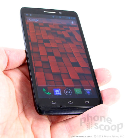
The Motorola Droid Ultra is as thin and light as they come, but it still packs a huge screen and a 2130 mAh battery. It replaces last year's RAZR HD, which was an incredible feat of engineering. The Droid Ultra loses a bit of personality along the way, but manages to outdo its predecessor in most every other way.
Motorola employed what we like to call the "smoosh effect" to create last year's RAZR HD. In order to flatten the phone, the length and width were increased, as if the entire phone has been smooshed by a press. The result was a slightly awkward-looking phone, especially considering the small screen and large bezel. Motorola resolved that issue with the Droid Ultra, which has a larger display filling up more of the front of the phone. It gives the device a more balanced look. Let's not kid ourselves, though. It's a large, black slab that resembles many other devices in the market. It just happens to be a thin, large, black slab. (It's also available in red.)
The front of the Ultra is pitch black, with only the three white buttons on the front breaking up the inky darkness. The bulk of the phone is covered in a glossy finish that I dislike. Where last year's model had a nice, matte Kevlar lining on the back, the Ultra is super smooth and reflective. It attracts more gross grime than any other phone I've tested in recent memory. The back surface, in particular, is nothing but a fingerprint-covered mess. It has a Kevlar look to it, but the Kevlar weaving is buried under the gloss, giving it a slight three-dimensional look. I don't like the feel of the plastics, which come off cheap. The entire phone is pieced together tightly, though. Everything about it seems to be solid and strong.
If ever there were a pocketable device, it is the Droid Ultra. The phone measures only 7.2mm thick on average, though there's a moderate hump closer to the top where the camera module is. Even so, it will slip into even the tightest pocket.
The display hides well in the thinner bezel of the Ultra. There's a thin slit carved into the glass above the screen where the earpiece is. The three capacitive buttons below the screen are easy to see, but not feel. They offer haptic feedback when pressed if that's what you want. The main camera is positioned near the top on the back. The module also houses the flash and the speakerphone.
The stereo headphone jack is on top and the microUSB port is on the bottom. The screen lock button and volume toggle are both on the right edge of the Ultra; there's nothing on the left edge. Motorola did a good job giving the Ultra's buttons an excellent profile and amazing travel and feedback. Both the screen lock button and volume toggle have raised edges and a ribbed texture that make them easy to find. The travel and feedback is very satisfying.
Everything else is sealed inside. The battery is inaccessible. There's also no microSD card support. This means no swapping batteries, and no extra storage. You're limited to the 16GB with which the Ultra ships. The SIM card is well hidden in the volume toggle, believe it or not. There's the smallest little ledge on the bottom of the volume toggle that you can yank with your thumbnail. Do that, and the SIM tray will pop out.
I like that the Droid Ultra has a more refined look, but I prefered the matte finish of the RAZR HD to the glossy finish of the Ultra. Further, the heterogenous materials may give the Ultra a more uniform look, but it waters down the appearance enough to leave it somewhat bland.
Comments
At least the Droid Maxx has a matte back?


 Hands On with the Motorola Droid Ultra, Mini, and Maxx
 Liveblog of Verizon's 2013 Droid Event
 Motorola Makes Moto Voice Available to 2013 Droids
 Verizon Intros 2013 Motorola Droid Lineup
 Motorola Droid Ultra


