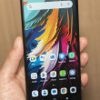
Hands-On: ZTE Warp 4G and Source
Nov 21, 2013, 7:16 PM by Eric M. Zeman

Phone Scoop was able to spend a few moments with the recently announced ZTE Warp 4G for Boost Mobile and the ZTE Source for Cricket Wireless. Here are our initial impressions.
ZTE recently announced several new handsets for prepaid carriers in the U.S. Among them are the Warp 4G for Boost Mobile and the Source for Cricket Wireless. Both devices are Android smartphones with attractive price points.
Warp 4G
The Warp 4G is the higher-end of the two devices. According to ZTE officials on hand, it is the "best-spec'd phone under $200." Whether or not that is true is for you to decide.
The Warp 4G runs Android 4.1 Jelly Bean and includes a 4.5-inch HD display with durable glass; an 8-megapixel main camera and 1-megapixel user-facing camera; dual-core 1.2GHz processor with 1GB of RAM and 8GB of storage; and Wi-Fi, GPS, and Stereo Bluetooth 4.0. The Warp has a 2,070mAh battery and is preloaded with a number of Boost Mobile apps and services, such as Boost Zone and Mobile ID.
It is a mid-sized device that compares well to the Moto X. It is a little bit bigger than an iPhone. The Warp 4G is made of plastics, except for the display, and doesn't feel cheap despite its low price point. The back and sides are formed by a rather stiff plastic that has a slight pattern to it. It's a little bit on the slippery side. The side edges are nicely rounded and give the Warp 4G a pleasant footprint in the palm. It is easy to hold and use.
The display is nice, but it's not the greatest. The 720p resolution is decent (especially at this price point), but colors looked a bit flat to me, and the viewing angles were rather shallow. The screen has a rather sharp rim that encircles it. This serves to protect the device when placed face down on flat surfaces, but it doesn't feel that great against your skin.
The Warp 4G has two volume buttons — one up, one down — and they are positioned on the left side of the device. Finding and using them was quite easy, and travel and feedback was very good. The microUSB port is also on the left edge, close to the bottom. There's a dedicated camera button on the right edge of the device. It is a bit difficult to find, as it is recessed slightly. The screen lock button is on top and is easily found and used.
There's no quad-core processor under the hood, the the Android user interface felt snappy enough. Screen transitions were smooth and apps opened quickly. The device runs a near-to-stock version of Android, with very little customization from ZTE or Boost Mobile.
In all, it's a decent little phone, especially considering that there's an 8-megapixel camera on board.
Source
The Source is very similar to the Warp 4G in terms of size and shape, but it's further down the totem pole in terms of specs and features. For example it trades the 720p HD display for an FWVGA screen and the 8-megapixel camera for a 5-megapixel camera. In the Source's favor, however, it has support for Cricket's LTE 4G network. That's a major bonus.
With the basic design of the Source so close to that of the Warp 4G, it is hard to tell them apart just by looking at them. The biggest differentiator are the materials ZTE chose for the Source. Rather than use a solid, slippery plastic shell, the Source has a soft-touch, matte finish that actually feels much better in the hand. It is an easier phone to hold onto, in my opinion. It also loses the sharp rim around the display that makes the Source more comfortable to grip.
The display may not have as many pixels, but I thought it was brighter and a bit more accurate in the color department. When held side-by-side with the Warp 4G, the difference between the two screens was noticeable. There are three capacitive buttons for controlling the user interface below the display. Interestingly, ZTE substituted a "Menu" button for the "multitasking" button that has become the standard on Android devices.
The Source has a standard volume toggle placed along the left edge of the phone. it is a cinch to find and use, and the travel and feedback are quite good. There is no dedicated camera button, and the screen lock button is located on the right edge rather than the top. It's easy to find and use, I liked the feel of it. The microUSB port is on the left edge and the headphone jack is on the top.
The user interface is also very close to stock Android, though there are plenty of Cricket applications on board, such as Muve Music. The basic behavior of the user interface was good. The dual-core processor provided enough oomph to keep the Source running smoothly.
It's also a decent little phone for prepaid customers. For $99 with no contract, it's almost a steal.
Comments
No messages


 Cricket Announces the ZTE Source
 ZTE Updates Warp for Boost Mobile with LTE
 Boost Launches Sub-$100 5G Phone
 Motorola Gives its Stylus Phone a Spec Bump
 Motorola Brings More Affordable 5G Phones to its 2024 Lineup
 ZTE Warp 4G
 ZTE Source


