Review: Nokia Lumia Icon for Verizon Wireless
Feb 13, 2014, 4:59 PM by Eric M. Zeman
updated Feb 13, 2014, 4:59 PM

Verizon finally gets the Windows Phone it deserves in the Lumia Icon from Nokia. The Icon has a full HD screen, 20-megapixel camera, and many other enticements. Phone Scoop put them to the test in this full report.
Is It Your Type?
Windows Phone fans who happen to be Verizon Wireless customers finally have a device to get excited about. The Nokia Lumia Icon is a “hero” phone that packs all the features they might want into a solid piece of hardware. For Verizon customers, Windows Phone doesn't get much better than the Lumia Icon.
Body
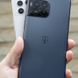
The Nokia Lumia Icon (nee, Lumia 929) merges the design of the Lumia 928 with the features of the Lumia 1520. Like the 928, the Icon is blocky and blunt. It skips the smooth and rounded edges found on Nokia's other Lumia devices and opts for hard edges, sharp corners, and a rather boring design. There's a metal band that that forms the outer edge. It is perfectly flat; flat enough that the Icon will stand on edge if placed on a table. On the back, the band is chamfered a bit where it meets a polycarbonate panel that forms the back surface. This seam is mostly clean, but I noticed a small area where it is uneven. On the front, the glass panel that forms the entire face is tapered a bit where it meets the metallic band, but the edge is still fairly square.
Nokia can't seem to make thin-and-light Lumia smartphones, and the Icon is another example thereof. It is thick and heavy, and feels ponderous in the hand. The rear panel is curved gently to better fit your palm, but the hard edges negate the benefit. That said, the materials all feel top-notch. The Icon may be weighty, but that lends some credit to its perceived quality.
As expected, the front surface is nearly all display, and what a gorgeous display it is. The Icon's 5-inch OLED display looks great. There are three capacitive buttons below the screen for interacting with the Windows Phone interface, and they work well. There's a thin slit in the glass near the top for the earpiece speaker, and the Verizon and Nokia logos are wedged up there, too.
The Icon follows the same design as most Lumia devices when it comes to physical buttons. All buttons are all packed onto the right edge. The volume toggle is closest to the top, the screen lock key is in the middle, and the dedicated camera key is near the bottom. All three have very good profiles, which make them easy to find. The travel and feedback is quite good, too.
The stereo headphone jack is found on the top of the phone, as is the hatch for the SIM card. The hatch is sort of tricky to release, and requires some fingernail action to coax open. The micro-USB port is on the bottom.
Sadly, the Icon's rear panel cannot be removed; like nearly all other Lumia devices, the battery is sealed in. Further, the Icon does not support memory cards. That means you're stuck with the 32GB of included storage, of which only about 23GB is available to end users.
In all, the hardware is well made, though it would be nice if Nokia could slim things down, even if by 10% or 15%. We're testing a black version of the Icon, but it also comes in white.
Comments
It's all fine and good, however
I would love to buy a Nokia phone for a full retail price no questions asked but there are about 6 apps that I need that are not available for WP8 and that's what stops me.


 Hands-On: Nokia Lumia Icon for Verizon Wireless
 Nokia Camera App Updated with New Features
 Nokia Announces the Lumia 930
 Lumia Icon Boasts Lossless 1080p Video Zooming
 Nokia Lumia Icon


