Hands-On: Sony Xperia Z2 and M2
Feb 24, 2014, 4:22 AM by Eric M. Zeman

Here is a first look at Sony's new flagship and mid-range Android smartphones. Both are thin and light and loaded with all things Sony.
Sony unwrapped the Xperia Z2 in Barcelona today, a successor to last year's Z1/Z1S. It is nearly indistinguishable from its predecessors, but the improvements are real indeed.
The Z2 has a round profile , which makes it comfortable to hold and use. The rounded edges aside, it is still a big phone. It is impressively thin, but it is wide and tall to accommodate the 5.2-inch display. It is also very light. The Z1/Z1S was light, too, and Sony did a good job packing the device with features while also keeping the weight down. In fact, it almost feels too light for such an expensive piece of hardware.
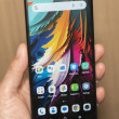
The screen looks really nice. It uses Sony's mobile Bravia engine, in addition to what Sony calls TriLuminos and X-Reality technologies. It Basically, it is bright and sharp and incredibly colorful. The phone uses LEDs to illuminate the display, and Sony says it has the widest color range of any smartphone. It looks fantastic. The bezel surrounding the screen is slightly smaller than on the Z1/Z1S. Sony managed to keep the overall footprint of the device the same while stretching the screen out another 0.2 inches.
The phone has a bevy of buttons and hatches placed along the edges. The hatches are to protect the Z2 from water ingress. The device is "more waterproof" than last year's phones, and has an ingress protection rating of IP58 for water. Sony says it can sit in up to 4.9 feet of water for up to 30 minutes. I find the hatches make day-to-day use annoying, though most people may not notice them other than when plugging their device in to be charged. They cover the memory card and microSD card slots, in addition to the USB port. The headphone jack is waterproof, though, and it does not require a hatch.
The screen lock button has Sony's signature look, which it calls Omnibalance Design. The button is large, round, and chrome colored. It stands out nicely along the side of the phone and has good travel and feedback. There's also a volume toggle and dedicated camera button - all along the right edge of the phone. The volume toggle is quite miserable, as it is far too small.
There are holes for the speakerphone drilled into the bottom edge.
The Z2's user interface runs Android 4.4 KitKat and has Sony's custom look and feel. There are a handful of new features for the camera that make it more fun to use. The Xperia Z2 is Sony's "hero" smartphone device for the world, and it will ship in April. Sony didn't announce any specific plans to sell it in the U.S., but it is likely that either AT&T or T-Mobile will offer it before summer.
Comments
No messages


 Sony Says Xperia Z2 to Be Sold Unlocked This Summer
 Sony Debuts the Waterproof Xperia Z2 with LED Screen
 Sony's Xperia M2 Targets the Middle of the Pack
 Sony Xperia Z2


