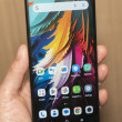
Hands-On: YotaPhone
Feb 24, 2014, 7:46 AM by Eric M. Zeman

Yota announced a second-generation Android smartphone that has an e-ink display on one side and a regular screen on the other. Here are a few thoughts about Yota's unique handset.
Yota is back at Mobile World Congress with a much-improved version of its two-screened device. We first saw Yota several years ago. It has a simple proposition: people should be able to get information from their smartphones all day long without worrying about battery life. In order to do that, it stuck an e-ink display - which draws almost no power - on the back of regular smartphone. The original device was middling in quality and features, but the new phone announced in Barcelona is significantly better.
Yota had mostly non-working prototypes on hand in its booth, but said the mock-ups were true to what the final build will be like. Where the original YotaPhone was thick, blocky, and unbecoming, the new device is modern and quite attractive. It has pleasant curves and an appealing design. The main screen has been upgraded to a 5-inch HD panel. There are buttons on the right side for controlling the volume and turning the screen on or off. The charge port is on the bottom and the headphone jack is on top. The phone has both user-facing and rear-facing cameras. The difference between the old and new pieces of hardware couldn't be more stark.
The e-ink display is much larger (4.7 inches) and brighter, and will be fully touch-enabled, something the original device couldn't claim. Yota says the e-ink display also has a light so that it can be used in the dark. The e-ink side of the device is capable of displaying tons of content, such as calendar details, stocks, weather, your email or messaging inbox, and of course e-books. The wallpapers, as Yota calls them, are live and active, and change when data or content needs updating.
The original Yota phone was rather clunky in its behavior. It used swiping gestures rather than buttons for controlling the user interface. The new phone does away with those gestures and instead relies on the on-again/off-again software buttons that are part of Android 4.3 Jelly Bean. This was a wise move, as it improves usability a lot. Adding touch control to the e-ink display will allow users to interact with the content there rather than flipping the phone back-and-forth all the time.
The original Yota phone never made it to the U.S., but Yota claims this version will - in 2015.
Comments
I Love This


 Review: YotaPhone 2
 YotaPhone Upgraded With Full Touch, Better Specs
 Yota Debuts White YotaPhone, Pushes Lollipop
 YotaPhone's Improved Dual-Screen Smartphone Goes On Sale
 Yota YotaPhone 2


