Review: HTC One
Mar 25, 2014, 10:45 AM by Eric M. Zeman

HTC's new flagship Android smartphone ramps up the drool factor with its all-aluminum design and updated software. Here is Phone Scoop's full review of HTC's mobile marvel.
Is It Your Type?
HTC is back with the All New One. This year's flagship smartphone bears the same name - and more than a striking resemblance - to last year's device. Don't be fooled; it's an entirely new piece of hardware that HTC says is in no way an "incremental" update. The One has been re-envisioned to be even more powerful, easier to use, and better looking than its predecessor. Is it for you? Answer these questions: Do you like pretty, well-made things? Do you prefer metal over plastic? Do you want the best of the best in your mobile phone? If you answered "Yes" to any of these, then the HTC One might be for you.
(NOTE: HTC is using "One" as the name for the phone it released last year as well as the new phone it is releasing this year. You'll see HTC sometimes refer to the new, 2014 One by its model designation, which is M8. The 2013 One's model designation is M7.)
Body
Every so often something comes along that resets the rules. We saw that last year when HTC introduced the One, a stunning aluminum-and-polycarbonate smartphone that was both gorgeous and well made. Nearly everything about the One was exceptional, and it was among the most well-reviewed devices of the year. It may be hard to believe, but HTC actually improved the hardware when compared to last year's phone. The 2014 One is almost a piece of art.
This year's One has more aluminum, and the metal now wraps fully around the phone and forms the side edges as well. Aside from the glass front and some narrow bands of plastic, the One is mostly metal. There is absolutely nothing cheap or chintzy feeling about this device. It's a hardcore piece of metallic awesome.
When viewed side-by-side, the new One has softer corners and edges than the old One, and is slightly taller. The bloodlines are clear between the two, and it is obvious they come from the same genetic stock. The new One is being offered in three shades: dark gray, silver, and gold. All three shades feature a brushed aluminum exterior that feels exquisite. HTC said it made an effort to soften the look and feel of the phone. This means the edges have more aggressive tapering and are less sharp. The black plastic bands (white on the silver model) cross the back in two places, just as with last year's phone. HTC also placed a plastic band on the front to provide it with a nice frame.
The aluminum is smooth almost to the point of being slippery. The back panel is gently curved to allow the One to sit deeper in your hand. There are no hard corners or seams. Last year's One had a sharper edge where the glass on the front met the side edges. This year's model does away with that edge and the chamfered side surfaces are angled perfectly to meet the glass. As good as it feels, there's no denying that the One is a big phone. It's not overly heavy, but it isn't light, either. It may be too big for some. Even so, the slim profile means it will easily slip into pockets.
The materials and build quality are second to none. Only Apple makes hardware in the same class as this. The design and manufacturing are top notch. The One puts most other smartphone designs to shame.
The One's front face has the now-familiar BoomSound dual-speaker setup. There are machine-drilled holes in the plastic panels above and below the screen to house the speakers. In the top set of holes, one tiny opening is reserved for the notification light. There are also some sensors and the user-facing camera above the screen. HTC has done away with physical buttons on the One and now uses the on-screen control buttons that are part of the Android operating system. This is a welcome change. The screen, which measures 5 inches, has plenty of bezel above and below, but minimal bezel along the sides. This gives the One a bit of an oblong look, but I'm not put off by it.
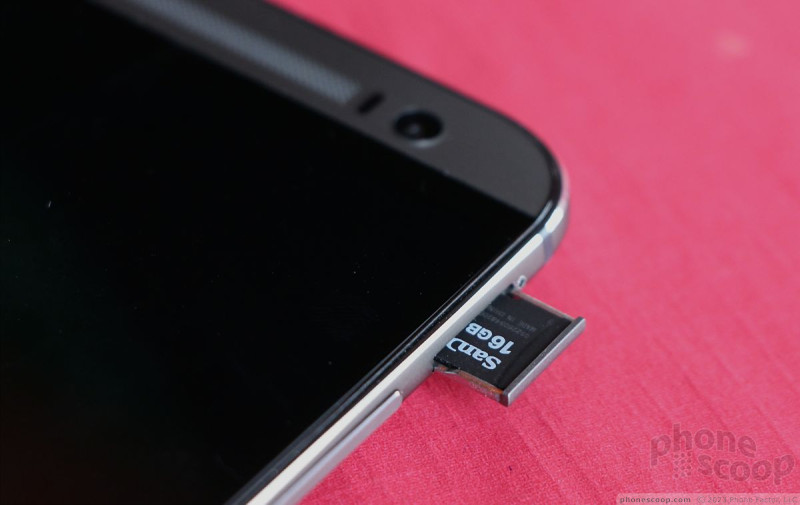
The SIM card tray is located along the left edge of the One, just like last year's model. It requires a SIM tray tool or paperclip to eject it. Of note, HTC has switched to a nano SIM card, which is the same size SIM card used in the iPhone 5 and just a handful of other phones at the moment. Both the micro-USB port and 3.5 mm headphone jack are positioned on the bottom edge of the One. The volume toggle is on the right edge; it's a thin strip that has a reasonably good profile. Travel and feedback are decent. One bit of news that should make people happy: the new One supports microSD memory cards up to 128GB. The memory card tray is positioned on the right edge and also requires a SIM card tool or paperclip to eject.
The screen lock button is on top. It is placed in a strip of black plastic. This strip also houses the infrared port. The lock button itself has a low profile. I wish it were easier to find with my finger, though travel and feedback was all right.
As with last year's phone, the battery of the One is sealed inside. The back panel houses two cameras, a dual-LED flash, the NFC antenna, and microphones for recording audio. All of these elements are arranged in a pleasing way.
Simply put, the One's hardware is impressive. It should appeal to most anyone seeking a high-quality smartphone.
Comments
Why is it so hard for Samsung to produce something this nice?
1) Is Real Metal
2) Doesn't look like a Band-Aid
Still needs removable battery
I have friends who bring extra batteries to the field with them for the Samsung smartphones because we do not have any plug ins. Just so they can have a phone that lasts a 3 days
I don't think it's realistic to have a removable battery in a phone like this. The high-quality, solid feeling of the unibody metal construction is ...
(continues)
My impressions
HTC One M8 battery drain in low signal areas?
In your review did you notice faster battery drain in low signal areas?
arouth said:
I had an htc one and loved it BUT it had one problem. In low signal areas the battery drained really fast.
That's going to be an issue with any phone, by the nature of physics. If it drained noticeably fa...
(continues)


 Review: HTC One for Sprint (Harman Kardon Edition)
 Review: HTC One for Verizon Wireless
 Hands-On: HTC One
 HTC One Owners Can Now Share Duo Cam Shots Via Gallery App
 HTC to Offer BlinkFeed and Zoe Apps to Other Phones
 HTC One (M8) (CDMA)
 HTC One (M8) (GSM)


