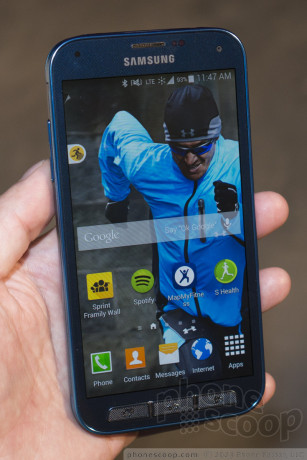
Hands On with Samsung's Galaxy S5 Sport for Sprint
Jun 23, 2014, 12:58 PM by Rich Brome @richbrome
updated Jun 23, 2014, 3:20 PM

Sprint today revealed the Samsung Galaxy S5 Sport. Sitting somewhere between the standard S5 and the Active model, the Sport gives you physical keys and a distinctive design. We take it for a quick spin.
Article
While the Galaxy S5 Active brings military-rated toughness for case-free drop-ability, the Sport is more designed for the fitness-minded person who wants a phone that's, well, a little "sportier". The differences between the standard and the Sport are frankly quite minimal.
It has physical keys instead of capacitive ones below the display. That's supposed to be easier to find and use when you're running or doing something else active. I'm not sure this change is really necessary, since to do anything useful at all, you need to touch the screen anyway, which isn't any different from touching capacitive buttons. But the change is welcome nonetheless. They are, in fact, great keys. They have a very rough texture that makes them extremely easy to feel and use, and they work well. I wish keys like this were on the standard S5, honestly. Even though the keys click well, the phone adds a completely redundant vibrating feedback; you can turn it off. As with the Active, the different keys mean you lose the fingerprint scanner. It never worked well; we're not shedding any tears over that.
The body is tweaked a bit compared to the standard S5. The Sport is mostly matte plastic instead of faux chrome and faux leather. If you dislike silver plastic as much as I do, you'll find this a welcome change. The matte plastic feels nice. They did keep the controversial "band-aid" texture on most of the back. Whether the design works for you is a matter of personal taste. Personally, I think it looks far less refined, perhaps even toy-like, especially with the red and blue colors that are your only two options. But again, the matte texture feels nice and should wear well.
The other keys also have a rough texture, although not nearly as rough as the front keys. The side volume rocker is still quite thin and has too little travel; it's not great. The lock key, however, works great. I can't explain why they're so different.
Sprint has added some software in an attempt to make the phone more "fitness-oriented". There are a couple of very unusual widgets that attempt to make fitness info more integrated and easier to access. I'm not sure they're a success.
The first is "Sprint Fit Live". It's a little tab on the left that you tap, which then slides out into a floating window of shortcuts to fitness apps. How this is supposed to be easier or better than just using a home screen shortcut or folder with your fitness apps, I cannot fathom. It's useless interface clutter, as far as I'm concerned.
The other is a little page-curl at the top-left of the home screen that you drag down to "peel back" the home screen and show a full-screen app with a half-screen widget for MapMyFitness, and the other half is Samsung's S Health. Then another tab gives you generic health and fitness tips. This probably sounded great in some Sprint meeting, but I have a hard time seeing anyone using this more than once. You're probably going to prefer loading the MapMyFitness app directly (or maybe S Health, or some other app) rather than this split-screen view with no interactive functionality.
There's also an active wallpaper component that can put motivational images and quotes on your home screen.
The one truly useful software bit Sprint threw in is a free year of the MapMyFitness "MVP" service, which is a little like a digital personal trainer. It lets you set up interval training, heart rate analysis, and even has an audio guide to "coach" you through different workouts.
The Sport is available July 25th and is exclusive to Sprint
Comments
Another one?


 Review: Samsung Galaxy S5 Sport for Sprint
 Review: Samsung Galaxy S5 for Verizon Wireless
 Hands-On: Samsung Galaxy S5
 Verizon Begins Updating Samsung Galaxy S5 to Lollipop
 Best Buy Scores Electric Blue Galaxy S5
 Samsung Galaxy S5 (CDMA) / Galaxy S5 Sport


