Review: Huawei Ascend Mate 2
Menus
The Mate 2 runs Android 4.3 Jelly Bean with Huawei's user interface skin dropped on top. Aside from the different shapes and colors found throughout the UI, there are only a couple of significant features worth mentioning.
The lock screen is animated and offers only three shortcuts (phone, camera, messages.) These shortcuts can be changed if you want. The lock screen can be turned off completely, or protected with several different options (face, pattern, PIN, password.)

The notification shade functions as expected, though it has a unique look thanks to Huawei's UI skin. Users can edit which toggles appear along the top of the screen, but the shade leaves plenty of room for notifications.
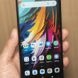
The home screen panels behave more or less as you'd expect for an Android device. There are several active out of the box with a number of Huawei-made widgets running. Users can rearrange and edit the home screen panels however they wish, but there's one major limitation: Huawei has done away completely with the app drawer. There's no secondary screen containing all the apps on the Mate 2. Instead, they are splayed out on the home screen panels, as well as jammed into several pre-existing folders. The upside to this means there is one less set of screens to worry about. The downside is it means you have to work a little harder to control clutter on the home screens. Personally, I like to minimize what's on the home screens, which means I had to create lots of folders to get unwanted apps out of my sight.
The settings menu has been adjusted just a little bit. First, Huawei decided to hide some of the less-used settings options. For example, the wireless controls are bunched near the top. Rather than see all the options, you only see the first few (airplane mode, Wi-Fi, Bluetooth, Mobile Networks). Under the last, there's an option called More. Select that to see all the connections tools. Repeat this same setup down the entire length of the settings menu, and Huawei has cleared away a lot of the clutter. Huawei took it a step further. It provides an alternate settings screen that has just the most important basics (radios, wallpapers, volume/ringtones, etc.). The phone has several different themes, which change the colors, wallpapers, and fonts.
The Mate 2 offers an Easy Mode. This dumps the traditional Android home screen setup for a much simpler and blockier one. Easy Mode is for first-time smartphone owners who might be overwhelmed by the otherwise busy home screen panels. It reduces clutter and makes selecting important apps much easier.
As far as performance goes, I didn't see any problems. The Mate 2 is powered by a quad-core 1.6GHz Snapdragon 400 processor from Qualcomm. This is Qualcomm's budget processor and I've found it to provide ample power to every phone it's in. Apps on the Mate 2 opened quickly, screen transitions were smooth, and the Mate 2 didn't stutter once.
Calls and Contacts
The phone app is pretty simple. The basic screen shows the dialpad and the most recent couple of calls stacked above it. There are no tabs running across the top. Instead, there are three buttons below the screen to access your contacts and the phone's settings. The basic tools let you add a line, send to Bluetooth/speaker, or mute. The Mate 2 doesn't include fancy stuff like noise cancellation options.
The contact application is a re-rendering of the stock contact app. It looks slightly different thanks to Huawei's treatment, but the underlying functionality is unchanged. Contacts can be sorted into groups and favorites. A quick press of any contact brings up their info card. A long press brings up a dialog box that allows you to call, message, or email them. The contact cards hold tons of data, including multiple phone numbers, email addresses, street addresses, and other details.
Messaging
The Mate 2 offers only the basics when it comes to messaging tools. It includes an SMS app, email, Gmail, Hangouts, Facebook, and Twitter. The SMS app and email app have been reskinned a little bit, but function just as they do on other Android phones. The rest of the apps are unaltered. The SMS app is set as the messaging app by default, but you can choose to use Hangouts for both SMS and IM if you want. The Google-made apps all work well.
Huawei did try to make it easier to use the Mate 2 one-handed and most of those efforts can be found in the communications tools. To start, one-handed mode reduces the size of the dial pad and keyboard, and places them in the lower-right or lower-left corner depending on your preference. The smaller size means your thumb can actually reach to dial phone numbers or type messages. The one bummer is that one-handed mode can be either on or off, and it isn't smart enough to know when you're using one hand versus two. The feature can only be turned on/off in the settings menu.


 Hands On with the Huawei Ascend Mate2
 Consumer Cellular Adds Huawei Mate 2 and Vision 2
 Huawei Now Taking Preorders for Ascend Mate2
 Huawei Planning Direct U.S. Sales of Ascend Mate 2
 Huawei Announces Ascend Mate2 for U.S.
 Huawei Ascend Mate2


