Nokia Summer 2007
The 5610 XpressMusic is similar is many respects to the 5300 XpressMusic. It is a slider that is about the same size and weight of the 5300, with similar media functionality and button placement. It does, however, feature completely revised styling in a very positive way.
Where the 5300 was rather cheap and plastic-y, the 5610 is made from much better materials. The front features an average-sized screen with navigation cluster under it. The buttons on the nav cluster were all smooth as well, but easy to find and click. The buttons each had good travel and a nice action to them. Where the 5300 featured white and black coloring, the 5610 is maroon (or blue) and dark gray. These colors look good together, and the phone looks far more sophisticated.
Another major difference is the media buttons. The rubber media buttons that are featured along the left side of the 5300 are gone and replaced with a jog dial just above the nav cluster. The function of this jog dial is two-fold. It is tied directly to the music applications. Slide it to the left, and the media player launches, slide it again and the main music menu pops up, slide it again and the FM radio comes up. You can also slide it to the right, and these same menus appear, just in reverse. The jog dial also acts as a ledge for your thumb to use when opening and closing the sliding mechanism.
Contrary to the N81s and N95s, the 5610 sliding mechanism felt fantastic. It was spring assisted and these created for a nice solid "thunk" each time you open and close the phone. It was smooth and satisfying.
They keypad was also better than the N81 and N95's. The keys are simpler and well separated from one another. Though their spacing is still fairly tight, the larger key size and the texture made for easier keying.
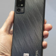
The back of the phone has a golf ball-like dimpled texture to it. This is only slightly noticeable when you hold the phone in your hand. Stunningly, the 5610 has only a 2.5mm headset jack, and not a standard 3.5mm headset jack. It does have stereo Bluetooth, though.
The XpressMusic's music functionality has also been revised a bit. When you open the media player, the player interface has a different set of themes that can be applied to it, and the new ones are much hipper than the appearance of the 5300's media player. The media player now also includes a video playback application. Otherwise, the functionality of the Series 40 interface is mostly unchanged.
And this is a disappointment when it comes to the camera. The camera is a solid 3.2 Megapixels and has dual LED flashes. The pictures we took in the darkened room were very good, but the camera user interface is completely unchanged. There are no additional actions or features to take let you more fully take advantage of the much better picture quality. Like the 5300, the 5610 is held sideways for picture taking, and there is a dedicated camera key on the right side of the phone that launches the camera and serves as your shutter release key.
Overall, the 5610 is a major step up from the 5300. The styling is better, the media playback functions are improved, and the overall appeal of the phone is higher.
We also have a short video preview of the 5610. You can watch it here:
Or go to YouTube for more viewing and sharing options.


 Nokia Announces Handful of Handsets
 iPhone 16 Brings More Features to All Price Points, Including New Camera Control
 Nothing Teases its First Phone
 Google Maps Putting Search Results in AR Live View
 Nokia N95 8GB
 Nokia N81
 Nokia 5610

