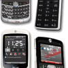
Review: Motorola Q9M
There's no question that the Q9M is a more attractive phone than its predecessor. Rather than the slate gray appearance, the Q9M is branded in Verizon's color scheme, which is to say black and a deep red. These colors pair together well, but I guess anything goes with black. The dimensions of the Qs are almost identical and the overall layout is similar. Most of the buttons are placed in the same spots on the Q9M, but they are all improved.
The Q9M has a very solid weight to it. The build feels beefier and has more authority than the original as you hold it in your hand. Where the original had several ridges along the sides that dug into your hand, the Q9M is smooth and comfortable. It weighs more than the original, but this isn't much of an issue.
The quality of the buttons is vastly better. Using the flat keys in the navigation cluster is much more satisfying. Each has good travel and action and you definitely know that you've pressed each one. The clicking sound is pleasant and doesn't feel cheap, as it did on the original. The send/end keys are twice as large on the Q9M and much easier to use. The home and back keys are about the same size, and positioned to the left and right of the D-pad, respectively. Speaking of which, the D-pad is far better. Rather than the high, narrow plastic ridge around the outside of the original, it is flatter and larger. While it isn't super easy to know exactly where your thumb is, it is more comfortable to use than the original, and also provides good action and feedback. The center select button is similarly bigger and easier to use.
The most notable improvement with the Q9M's hardware is the QWERTY keyboard. Where the original had tiny nub-like keys that were difficult to use, the Q9M features a textured keyboard. The material feels ever-so-slightly scratchy as your run your thumb over it. The keys may not be as distinctly separated as they are on the original, but this new keyboard is still easier to use. They keys are all larger and feedback is solid. The textured surface prevents your thumbs from slipping off the keys and hitting the wrong one, improving accuracy and speed.
A few of the buttons of the keyboard were swapped, and this is also for the better. On the original version, there was a dedicated camera button to the right of the space bar with the speakerphone button on the outside. These two buttons have effectively been swapped, with the speakerphone button now directly to the right of the spacebar and the media key on the outside. The media button activates Verizon's media menu. The mail button and "0" buttons have been swapped on the left side of the space bar, as well. This change up doesn't really affect performance.
Our one quip is that Motorola did not change the location of the delete key. As on the original, the only back/delete key is the one in the navigation cluster. Many other QWERTY-equipped phones place the delete button in its normal place on the keyboard. Not the Q9M. This led to an insane number of typing errors, as we hit the return key when we thought we were hitting the delete key. In the time we had the phone, we were unable to get used to this odd button placement. It really slows down usability for those used to regular QWERTY layouts.
The trackwheel along the right side of the phone has been recessed deeper into the phone. It is a little bit hard to find and dial with your thumb, but this is still an improvement, because the original Q's trackwheel stuck out too far from the side of the phone. The movement of the trackwheel is acceptable, but pressing it to make a selection is a little tough because your thumb often hits the frame of the phone surrounding the trackwheel rather than the wheel itself. The button underneath it doubles as a second "back" button. Hitting it will take you back to the previous screen. It has good travel and feedback.
Opening the 2.5mm headphone jack port along the top of the phone is tricky unless you have long fingernails. The miniSD slot on the side is much easier, and even though my fingernails are chewed down to the nub, I was able to dig enough in there to get the hatch open easily. Removing the battery hatch on the back is also a snap. Simply press in the button and slide the hatch off.
Shortcomings aside, the hardware of the Q9M is a solid improvement upon the Q.


 Verizon Parades Spring Lineup
 Hands on with the moto g 5G
 Hands On with the 2023 moto g 5G & moto g stylus
 Motorola Refreshes its 4G moto g stylus
 Motorola Q9m / Q9c


