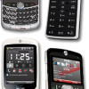
Review: Motorola Q9M
The Q9M uses Windows Mobile 6 Standard along with some Verizon Wireless-specific menu overlays. When you first fire up the Q9M (which, by the way, takes a full minute and 10 seconds), you are greeted with Verizon's new media menu.
This media menu is a large silver ring with 10 red boxes around it, each representing a different media action. You can use either the scroll wheel or the D-pad to navigate around the ring to the selection you want. From this menu, you have access to the camera, media player, photo gallery, the V CAST Music Store, as well as some basic controls to play/pause or otherwise interact with your media. In the center of the ring is where you will see video content displayed, or more advanced selections for whichever media app you choose to open. The one bone we have to pick with this otherwise intuitive menu is that the icons are not really explained with a label. While some of them are obvious, a handful are downright confusing, and you wouldn't be able to guess what they actually do before opening them up.
Other than a couple of Verizon-specific themes, the Windows Mobile 6 menu system works as normal. From the Today screen, the left softkey is the start key, and the right softkey takes you to your contacts. Across the top of the screen are shortcuts to your favorite applications or actions, and it also displays any messages or upcoming appointments you might have.
Hitting the Start key takes you to a grid of menu options. This is where you access the majority of the Q9M's applications and functions. There are 28 applications or folders found in here. Each one is labeled in a way so that you know exactly what it does or where it is going to take you. It is far more intuitive to use than many proprietary menu systems that are built into phones, if only because we are all somewhat familiar with the way Microsoft builds its menu systems.
Once you select a menu icon, it generally opens up to a plain list with black letters on a white background. No fancy dancing icons here. Just utilitarian lists. All of the menu selections listed in this type of view have a keyboard shortcut (A, B, C, D,...etc.) before it, so if you are fast with your fingers on the keyboard you can jump directly to that action without scrolling to it. This seems a bit redundant, though, because the trackwheel almost always gets you there faster. These B&W menus are particularly difficult to read in the sun.
The one important thing to note is that the Q9M often has trouble moving from one application to the next. Though it has a decent processor, there is often a noticeable lag from the time you select an action and when that action is completed. This lag is present in almost all menus and applications.


 Verizon Parades Spring Lineup
 Hands on with the moto g 5G
 Hands On with the 2023 moto g 5G & moto g stylus
 Motorola Adds 5G to its 2022 Mid-Range Lineup
 Motorola Q9m / Q9c


