Review: ZTE Grand X Max+ for Cricket Wireless
Jan 16, 2015, 6:10 PM by Eric M. Zeman

ZTE's latetest Android smartphone for Cricket is the high-class Grand X Max+. This phone is a bargain for phablet lovers.
Is It Your Type?
The ZTE Grand X Max+ is for customers who want a big, stylish, and sensible smartphone with a prepaid plan. It's classy and probably Cricket's best value.
Body
The Grand X Max+ boasts appealing design aesthetics, impressive specs, and easy affordability. It takes what was good about last year's X Max and makes improvements (almost) all the way around. The X Max+ carries over the appearance of the X Max, but makes significant changes under the hood.
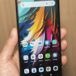
The X Max+ is a phablet, and a big one at that. It's about equal in size to devices such as the Nexus 6 or Lumia 1320. It measures 6.38 by 3.27 by 0.31 inches, which makes it tall and wide, but rather thin when viewed from the sides. The front and back surfaces are formed from glass and are held together by a polycarbonate frame. Some might say it resembles Sony's line of Xperia Z handsets. It's a good-looking phone. The design may be somewhat simple, but it is effective and attractive to my eyes. The materials may not be class-leading, but they are good.
I'd call the X Max+ a two-handed device. I was able to perform some tasks with just one hand, but my thumb could only reach about half the screen when I held the device normally. It doesn't have a one-handed operational mode, like Samsung's Galaxy Note 4 or LG's G3, so you'll find your other hand becomes necessary much of the time. The X Max+ doesn't fit that well into average pockets.
The front surface is all glass. Only a fraction of the frame extends to the front, at the top and bottom. The glass panel is set into the frame a bit, which has rather sharp edges along the left and right sides. The ZTE and Cricket logos - both painted on in chrome - are the only things that break up the otherwise solid black surface. There's a small grill at the top for the earpiece, and the user-facing camera is visible when viewed from the right angle. There are no physical buttons to control the operating system; instead, the X Max+ uses on-screen buttons that come and go as needed.
You won't have any trouble finding the volume toggle along the left edge of the device; it has an excellent profile. The volume control works well, but makes a rather cheap-sounding "click" when pressed. Like most big phones, the screen lock button is placed about midway up on the right side. It also has a good profile and solid travel and feedback. You'll see two trays above screen lock button. One is for the SIM card and the other is for a memory card. You'll need a pin tool to eject them. There's no dedicated camera button. The headphone jack is on the top and the USB port is on the bottom. They are both easy to use.
Like the front, the back surface is all glass. It's set into the frame and cannot be removed. That means you don't have access to the battery. I rather like the faux carbon fiber pattern in the glass. It helps give the phone just a bit more personality. The camera is positioned practically against the top edge of the phone. I found I sometimes covered it with my finger when reorienting the phone to take pictures.
In sum, the X Max+ is a fine piece of hardware.
Comments
No messages


 Hands-On: ZTE Grand X Max+ and SPRO 2
 Cricket Scores 6-Inch Grand X Max+ from ZTE
 iPhone 14 Plus Offers a Big Screen For Less
 iPhone 16 Brings More Features to All Price Points, Including New Camera Control
 AT&T's Newest 5G Phone Offers Wireless Charging for $220
 ZTE Grand X Max+


