Preview: Palm Centro
Sep 28, 2007, 11:18 AM by Eric M. Zeman
Palm released the Centro smartphone for Sprint. Rather than business users, it is intended to be a mass market phone. But is it appealing enough for the average Joe? Video tour included.
Palm Centro
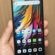
Palm and Sprint announced the Centro smartphone at the Digital Life show in NYC. It resembles the recently-announced Treo 500v, but substitutes the Palm Garnet OS for Windows Mobile, and keeps a touch screen. It is Palm's first attempt at a more consumer-focused device. After the press conference, we were able to spend a few minutes with the new phone.
The first thing you notice about the Centro is how tiny it appears. This is a relative illusion, though. Compared to a Treo 600 or 700 series it is shorter in length and width by a little bit. But compared to most other thin phones on the market, it is still rather beefy. It may be thinner than previous Treos, but it is chunky by today's standards.
One major improvement it makes over Treos is that it is noticeably lighter. In fact, it hardly feels like it has any weight to it at all. With its rounded back and light weight, it fits easily in your hand and is comfortable to hold one handed. Holding it with two hands in typing position is another matter.
Because the keyboard is so diminutive, typing is very uncomfortable. The keyboard is squashed down at the bottom of the phone and you really have to adjust your hands down to be able to reach the keys. Where Treos have a slightly curved keyboard made from plastic nubs, the Centro's keyboard is straight and the keys are smaller. As small as they are, the keys themselves feel better than the Treo keys. The Centro's QWERTY buttons are all made from a rubber-like material that has just the slightest bit of grip to it. Your thumbs will not slide off of the keys are you press them. Pressing the correct key is a chore, though. If you are fat fingered at all, hitting multiple keys at once is easy. In a quick typing test, we made a gazillion mistakes. As for typing in phone numbers, it will be far easier to set yourself up with some speed dials.
Using the navigation cluster was far easier. The buttons are all large enough and offer nice feedback. The four dedicated shortcut keys are made from a silver-colored material that is very slippery as you pass your thumb over it. The send/end keys were also easy to locate and use. The D-pad is a change from that found on Treos. It is bigger and has a ridge around it that sets it apart from the other buttons. Its action was good and made interacting with the screen easy.
The volume controls and application key on the left side of the Centro were easy enough to find with your finger as you pass over them, and they also had good action and feedback. The silence/vibrate switch at the top of the phone was a little bit harder to find and use. It didn't have enough of a ledge for your finger to catch in order to switch it back and forth.
The one thing about the Centro is that the whole thing comes off a little bit cheap looking. Palm had to shave off something in order to get it to the $99 price point, and this is obvious when you feel the plastics. They are just a little bit on the Fisher-Price side of things.
Also, aside from some pre-loaded applications from Sprint, it uses the same old Garnet OS that's been around for years. This can be a major drawback for those looking for something new. It is compatible with a number of Sprint's services, such as Sprint TV, Sprint's download store and PowerVision services.
Here are some pictures of the Centro so you can see for yourself.
Video
Here is a video preview of the new Palm Centro. You can watch it here:
Or visit YouTube for more viewing and sharing options.
Comments
Complete waste of time! Now i'm X treo user 600,650,700 - HTC
(continues)
And so it goes.
(continues)


 Qualcomm Taps Iridium for Satellite Connectivity
 Android 13 Will Bring Improved Privacy, Personalization
 Nothing Teases its First Phone
 OnePlus' First Foldable Aims High
 Palm Centro 690 (CDMA)

