Samsung's Style Phones 2007
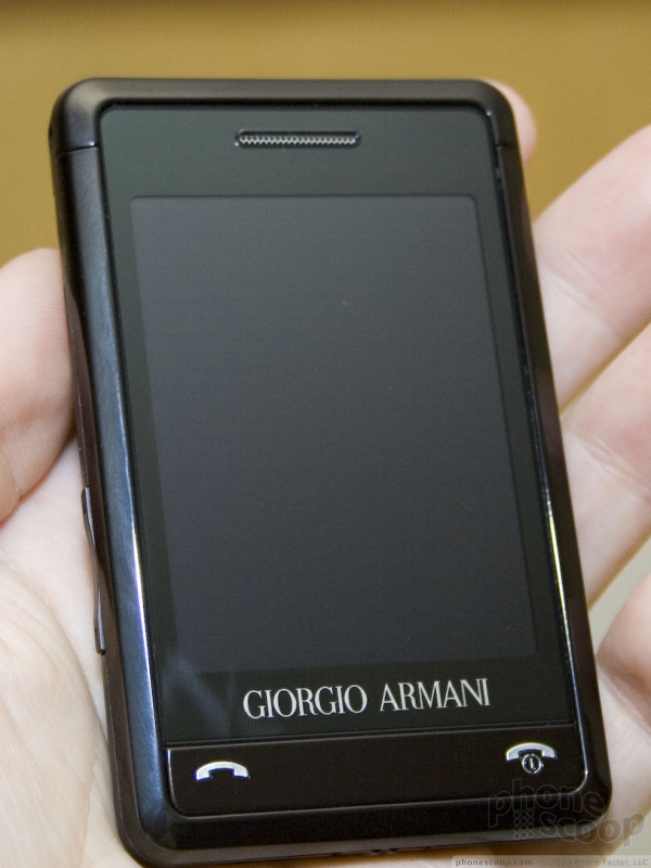
Samsung recently announed a global partnership with Armani for luxury fashion phones. Much like LG's famous Prada phone, Samsung is trying to define a new class of "high end" phone that is not just expensive and stylish for the sake of it, but is also a high-end phone on the technology side as well. This sets apart the Armani and Prada phones from previous luxury phones such as Nokia's Vertu line.
Merely looking at photos, some might dismiss the Armani phone as little more than a response to LG's Prada phone. Indeed, the basic shape, design, and even user interface are remarkably similar.
However, there is one really huge difference: the size. While the Prada phone seems small, thin and sleek on its own, it's quite large compared to the positively tiny Armani phone. The phone could easily slip into the inside pocket of an Armani suit without ruining the clean lines. One might say Samsung has beat Apple to the punch with an iPhone nano.
The user interface on the Armani phone is the same "Croix" UI as the Ultra Smart F700 that Samsung debuted at 3GSM year. It's a perfectly decent finger-touch UI, much like that on the Prada phone. In fact much of the UI is eerily similar to the Prada UI, such as the simple menu / OK / back buttons across the bottom, and the simple black-with-white-icons look. Parts of the Samsung UI do make a little more sense to western minds; it always bothered me that the Prada UI had main menu tabs running down the right edge instead of the top or left, for example. However, both UIs lack the thoughtful usability enginering and flair that make the iPhone UI such a delight.
The Armani phone features basic haptic feedback (subtle vibration) when touching on-screen buttons. Text input is via a virtual numeric keypad and T9 predictive text.


 iPhone 14 Plus Offers a Big Screen For Less
 Hands On with Xplora Kids Smartwatches
 iPhone 15 Series Goes All-In on USB-C and Dynamic Island
 Samsung S24 Series Adds More AI, Updates the Hardware
 JBL Puts a Touchscreen on its Earbuds Case
 Samsung Gleam SCH-U700 / Muse


