Samsung's Style Phones 2007
Oct 16, 2007, 9:00 AM by Rich Brome @richbrome
updated Oct 22, 2007, 4:00 AM
Hands-on with Samsung's Gleam, Armani, Serenata, i550, plus a video tour of the 5-megapixel G800.
Intro
At a recent Samsung event, I had the opportunity to get some hands-on time with a few of Samsung's new flagship phones for Europe. The interesting ones are all tri-band GSM models we wouldn't really recommend for use in the US (though the adventurous could use them with T-Mobile). However, each is a very interesting flagship phone that may make its way to US shores in a different incarnation at some point. At the very least, they show the direction Samsung is heading with some of its designs and technology.
* G800 page added Monday, Oct. 22nd.
Armani
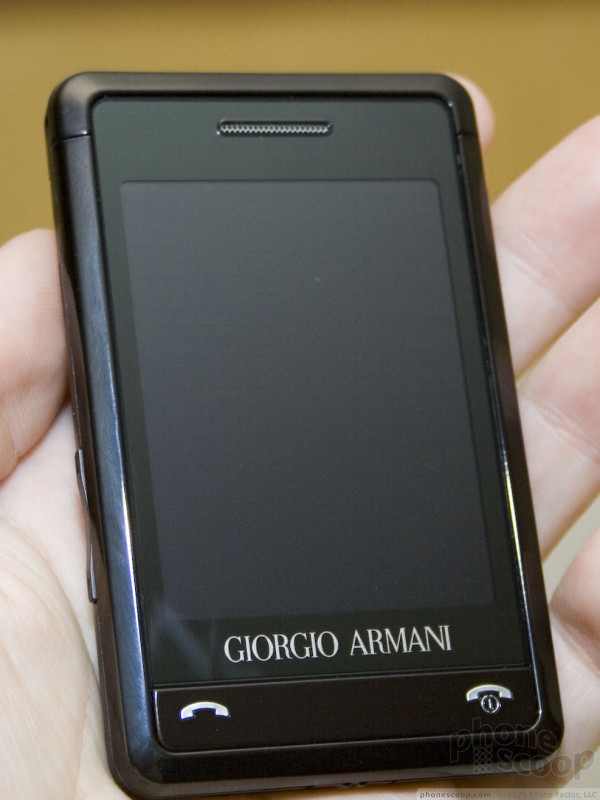
Samsung recently announed a global partnership with Armani for luxury fashion phones. Much like LG's famous Prada phone, Samsung is trying to define a new class of "high end" phone that is not just expensive and stylish for the sake of it, but is also a high-end phone on the technology side as well. This sets apart the Armani and Prada phones from previous luxury phones such as Nokia's Vertu line.
Merely looking at photos, some might dismiss the Armani phone as little more than a response to LG's Prada phone. Indeed, the basic shape, design, and even user interface are remarkably similar.
However, there is one really huge difference: the size. While the Prada phone seems small, thin and sleek on its own, it's quite large compared to the positively tiny Armani phone. The phone could easily slip into the inside pocket of an Armani suit without ruining the clean lines. One might say Samsung has beat Apple to the punch with an iPhone nano.
The user interface on the Armani phone is the same "Croix" UI as the Ultra Smart F700 that Samsung debuted at 3GSM year. It's a perfectly decent finger-touch UI, much like that on the Prada phone. In fact much of the UI is eerily similar to the Prada UI, such as the simple menu / OK / back buttons across the bottom, and the simple black-with-white-icons look. Parts of the Samsung UI do make a little more sense to western minds; it always bothered me that the Prada UI had main menu tabs running down the right edge instead of the top or left, for example. However, both UIs lack the thoughtful usability enginering and flair that make the iPhone UI such a delight.
The Armani phone features basic haptic feedback (subtle vibration) when touching on-screen buttons. Text input is via a virtual numeric keypad and T9 predictive text.
Serenata
Serenata is the newest fruit of Samsung's partnership with Bang & Olufsen. Much like the Armani partnership, Samsung is hoping that some of Bang & Olufsen's cachet as a high-end luxury brand rubs off on the Samsung brand.
The first B&O phone - Serene - was generally seen as an experiment in industrial design; a beautiful phone concept, but difficult to take seriously as a real product. The Serenata is different. It's far from perfect, but I expect there is a real market for this product among B&O afficianados.
To simply call the Serenata a "music phone" wouldn't do it justice. The phone actually includes a large, loud, very high-quality speaker for listening to music out loud. It includes a small flip-out stand. Sliding up the speaker and setting it on a table, you actually have a small standalone stereo system that not only fills a room with great-sounding music, but fits in your pocket. The high-quality speaker has also been optimized as a speakerphone for conference calls. And of course it's a great-sounding phone.
Putting all of that together, the Serenata will definitely be worth a look for some business executives looking for a luxury phone. If you have an assistant to handle your email, but you want a great portable speakerphone for meetings, plus great music in your hotel room, the Serenata might be for you.
The two major drawbacks are size and usability. The Serenata is not a small phone. Once you learn the quirks of the scroll wheel and partial touch screen, the UI is decent, (for a phone without a real keypad,) it just has a steep learning curve. Text input is a major chore using the scroll wheel. You can choose from groups of letters and use T9 to speed things up, but it's not the kind of elegant solution Nokia came up with for their scroll-wheel text input on their fashion phones. The UI is quite pretty, though, as you would expect from B&O design.
The Serenata also sports 3G (HSDPA) but no camera, so it's not designed to be an everything-phone, just a really, really good music phone.
i550
The i550 is a bit of a surprise from Samsung. While Samsung has been doing S60 smartphones for a while, they've never really had much traction to date. Samsung insists they've finally gotten good at making S60 phones now, and they're now making a major effort with that platform, rolling out a whole lineup of different S60 phones all at once this season. Unlike past efforts that were all fairly standard designs, their new S60 lineup spans a variety of form factors.
The i550 is essentially a Nokia N95 in a BlackBerry Pearl body. It has the same massive display, high-resolution auto-focus camera, and full GPS as the N95, combined with size and shape of a Pearl, not to mention the nifty four-way trackball for navigation.
There's 3G on this model as well, and the camera is 3 megapixel, with auto-focus for better quality. A 3.5mm headphone jack on the top is a nice touch for music lovers.
Gleam
The "Gleam" was just released for Verizon. It could be interpreted answer to LG's VX-8700, known in its European incarnations as a "Shine" phone. Indeed, the Gleam matches the Shine clamshell in nearly every spec and feature.
The Gleam shouldn't be dismissed, though. It is a well-spec'd phone in a very thin body. The keypad looks odd, but in practice it's perfectly pleasant to use. The Gleam is one of the first phones in the US with what Samsung calls a "living" home screen. It's essentially a type of active standby with various clever visual cues for the status of the battery, message inbox, etc. A cloudy sky means your battery is low, etc. On the Gleam, it's implemented in a car dashboard design.
G800 *
Samsung is really on a roll with new high-end phones for Europe. The latest is the G800, a high-end camera phone slider for Europe. By high-end, I mean the camera is 5 megapixel with a 3x optical zoom and xenon flash. The optical zoom is what really sets this apart from competition like the Nokia's N95 and Sony Ericsson's K850.
The G800 has metallic silver design combining a mirrored front and brushed stainless-steel body that might remind some of LG's Shine series. Resemblance to the competition aside, the design is quite stylish and feels very high-quality. It's no coincidence that the back resembles a standalone digital camera. Many high-end camera phones have intentionally adopted this sideways design, but the G800 may be the best yet at fooling people into thinking you're using a standalone camera and not a camera phone.
The G800 is a bit on the large and thick side, but not dramatically more than its competition with 5 megapixel cameras. In fact it's relatively compact for a device with an internal optical zoom.
The "internal" optical zoom simply means that the lens doesn't extend outside the phone body to perform its zoom function. Sony has been using similar lens technology for years on its popular T-series ultra-thin cameras.
As for the flash, xenon means it's a "real" strobe flash, instead of the LED type typical of most current camera phones. Sony Ericsson's K850 also sports a xenon flash. Since it doesn't have an LED flash to assist with focusing, it has a separate orange LED and lens that serves as an auto-focus assist lamp. Therefore when focusing in low light, you'll see a small orange beam projected on your subject during focusing.
Continuing along the list of high-end camera features, the G800 also sports face detection technology to help ensure people are exposed and focused correctly. This ensures the camera doesn't accidentally focus and meter on the background, leaving your friends dark and/or blurry.
A panorama mode adds to the extensive camera feature list. In the pre-production version we tried, panorama mode didn't offer any visual guide for lining up adjacent shots in the viewfinder, but it still seemed to do a decent job of stitching the photos together right in the camera as soon as the last shot was taken.
Finally, the G800 camera interface also sports a new four-way shortcut system using the d-pad, and a sliding cover on the back to protect the lens.
The rest of the G800 interface is standard for a high-end Samsung. It does sport some new features, though, such as a photo editor, video editor, and RSS reader. When viewing photos, the soft keys become zoom in/out keys, a novel and handy way to inspect your photos up close. Google integration is also present on the generic unit I tried, although that's typically a carrier-dependent feature.
The phone did feel a bit sluggish during my brief session with it, although it was a prototype, so that could easily be a pre-production issue. However the most important application - the camera - was very responsive.
Unfortunately, like most of the other GSM phones in this article, the G800 is not quad-band, so it's not a great choice for use in the US, but we can hope Samsung will bring something similar Stateside before too long.
Below is a quick video tour of the interface. I apologize for being half-asleep while narrating - Samsung had us on a quite the rigorous schedule last week. Much thanks for Vincent Nguyen of SlashGear for taping and uploading the video for us, since my video camera was stolen from my checked luggage (damn that Atlanta airport!)
Comments
Serenata
Most luxury hotels these days (at least all the ones I've stayed in) include an ipod music dock (iHome) in their rooms...
I guess this phone is for low level executives who want to walk around with a phone that looks like a ladies shaver.
Gleam
(continues)
B&O - 🤣
Gleam - 🙄
The Gleam still looks like a Samsung phone. I understand the need for a distinct form and style for a phone, but I am not a fan of the Samsung style. Beyond that the Armani looks the sexiest an...
(continues)
i550


 Samsung Refreshes Galaxy S Series with S Pen, New Cameras
 Hands On with the Motorola edge+ (2022)
 iPhone 14 Plus Offers a Big Screen For Less
 Hands On with Xplora Kids Smartwatches
 iPhone 15 Series Goes All-In on USB-C and Dynamic Island
 Samsung Gleam SCH-U700 / Muse

