Review: Apple iOS 9
Sep 17, 2015, 6:00 PM by Eric M. Zeman
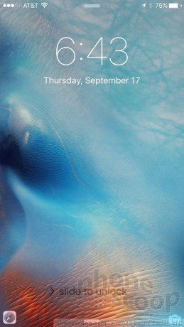
Apple's latest rendition of iOS delivers big in a few important performance metrics, while also giving iPhone owners a handful of delightful new features. Siri is more talkative and helpful than ever, while transit maps aid in navigating through select cities. Hundreds of other little features fill in gaps across the platform. iOS 9 isn't a huge leap forward, but it represents enough progress to make the operating system upgrade a compelling one. Here is Phone Scoop's in-depth look at iOS 9.
Intro
iOS 9, available for the iPhone 4s, 5, 5s, 5c, 6, and 6 Plus, picks up where iOS 8 left off last year. It's not a complete overhaul of Apple's mobile operating system (that was iOS 7). Instead, iOS 9 streamlines the platform significantly while also adding a fair number of new, powerful features. It should appeal to people with iPhones old and new alike for many reasons. Here are our thoughts on the latest operating system from Apple.
Design
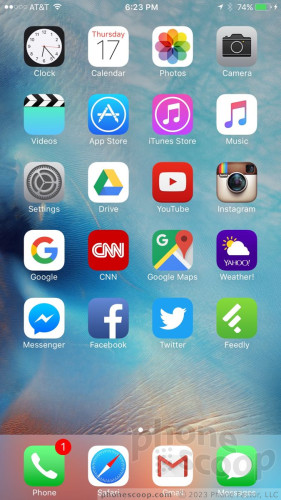
There's hardly anything new to report here. iOS has had the same look and feel since 2013's release of iOS 7. Apple has left the design more or less alone in iOS 9.
The one notable change is that of the font. Apple has changed the default font in iOS to the "San Francisco" font first seen on the Apple Watch. It's most obvious in the system settings, but even then I bet the majority of people won't notice. It's a not a dramatic shift.
iOS 9 is attractive and modern. The design doesn't get in the way of usability; in fact, it enhances the operating system's ease-of-use. Not everyone may like the look of iOS 9, but it is a simpler platform to use than Android or Windows Phone, without sacrificing power.
New
Siri and Search
"Hey, Siri, can you help me write my review of iOS 9?"
"Sorry, Eric, I'm afraid I cannot do that."
Well, it was worth a shot, right? Siri may not be able to help me write this review, but Apple's oft-maligned, voice-powered assistant is much more useful thanks to the updates wrought in iOS 9.
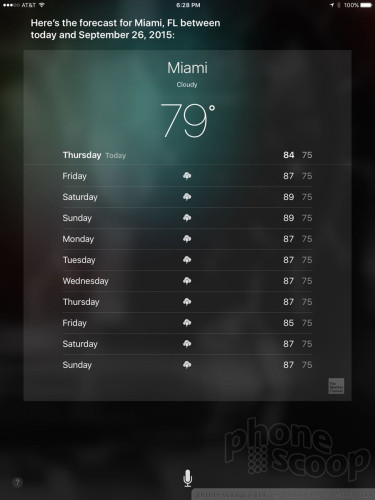
To start, Siri can now respond to more natural language requests. This means you don't have to sound so much like a robot yourself when asking Siri to do things. For example, you can ask Siri to show you Tweets from a specific person "Show me Tweets from Rich Brome", or to simply open the app, say, "Hey Siri, open Twitter."
Siri is much better at understanding queries and can easily handle requests that require more than one step. I love being able to ask Siri to set alarms and reminders, open the music app and play the new Sword album, and of course look up random things on the web.
Siri is supposed to be more proactive at taking care of such tasks as creating calendar appointments when it sees flight reservations in your inbox. The problem? It only works when you use all of Apple's apps. Siri doesn't look through third-party email apps, such as Gmail. That means Siri didn't see my CES flight reservation in my inbox and thus didn't automatically add it to my calendar. When I turned on Apple's email app, Siri was able to see the reservation and suggest the calendar appointment.
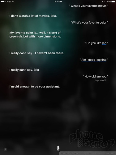
Siri's best feature is still probably her snarky attitude. (Q: What's your favorite color. A: I don't know how to say it in your language. It's sort of greenish, but with more dimensions.)
I think Google Now is a bit better than Siri at handling such actions — especially the proactive stuff — but Siri is no longer so far behind. Siri has easily caught up to Microsoft's Cortana, too, in terms of raw functionality.
Siri also powers iOS 9's improved search functionality, but it doesn't quite go as far as Apple claims.
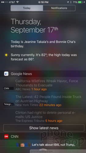
There's a new search screen in iOS 9, which is accessed by swiping the home screen to the right. It shows a search bar, suggested contacts, suggested apps, and news headlines if you want. The idea is to give you a "head start" on searching through the iPhone. As far as I am concerned, the suggested contacts and apps aren't that smart because they're often those most recently contacted or used. Apple says these suggestions will change throughout the day based on your usage, but I didn't see much variation.
I do like that Apple added easy tools for seeking out nearby restaurants, coffee shops, gas stations, and other points of interest. Selecting the gas search automatically opens Apple Maps and shows me my own location with the locations of several nearby gas stations pinned on the map. Want directions? Tap and away you go.
Searching through the iPhone itself is better than ever. Siri now automatically generates search suggestions as you type into the search field. This is helpful, though the suggestions are often limited to local items on the iPhone itself. Perhaps the best improvement? Apple added a search tool to the System Settings screen. This lets you search for the exact setting you want rather than forcing you to peck your way through the sprawling maze of menus to find it.
News
iOS 9 installs the Apple News app whether you want it or not. It's a connected reader for finding and managing your reading list for news, articles, and other online content.
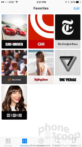
The app takes some time to set up and properly cultivate. It asks you about your general interests and then suggests some news outlets to get you going. It offers more suggestions over time based on your reading habits. You can easily subscribe to channels or topics, as well as specific web sites and content providers. News lets you preview articles within the app, but you can also leave the app and go the actual web site if you want. I like that the previews include the article's native fonts, images, and other media.
To be frank, I don't really care for the design of the app. The way it lists articles on the main screen is boring and uninspired. I also found it to be slow, which is frustrating given that its key selling point is supposed to be speed. It doesn't necessarily arrange articles in chronological order, which is always how I prefer to browse. Apple News has nothing on Flipboard, which is far more attractive and fun to use. Worse, it doesn't incorporate your social networks, such as Facebook or Twitter. This seems like a no-brainer to me. For what it's worth, the iPad version of News is vastly superior to the iPhone version, at least as far as the design is concerned.
Certainly people who have never used Flipboard will appreciate having a way to more easily read news on their iPhone, but there are better options in the App Store.
The news reader apps available from Google and Microsoft offer about the same level of functionality found in Apple News.
Maps
Apple Maps finally has transit directions! But only in a handful of cities. And they're not very good. Transit is supported in San Francisco, Philadelphia, New York, Chicago, Baltimore, and Washington, D.C. Using transit options, city dwellers should be able to route themselves between points with ease, but it doesn't work flawlessly.
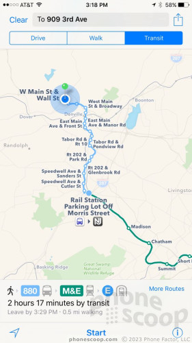
For example, Apple Maps was able to tell me how to take mass transit from my house to the Empire State Building using a mix of buses, trains, and subways. What's silly, however, is that Apple Maps doesn't include all the NJ Transit lines that operate in NJ, and, had I followed the suggested route, I'd have gone preposterously out of my way. Specifically, a NJ Transit line stops near my house and goes directly to the bus station in NYC. It's very convenient. Apple Maps wanted me to take a county bus route to a far-away train station and then catch a train to Penn Station. Silly.
Apple Maps was much better at getting me around Manhattan via subway. For example, Apple Maps shows station outlines and stairway locations for the majority of subway stations in NYC. That's particularly helpful when stations span several blocks and have multiple entrances. Apple also updated Maps instantly with the brand new 7 line that trundles across Manhattan, which was nice to see. And, in a nod toward consistency, Apple Maps' transit directions use the same colors, fonts, and shapes to denote the individual transit lines and there stations. This really helps bring together routes, especially those that contain multiple trains or busses.
By way of comparison, Google Maps provided excellent public transit support for Rich and I when we were in Berlin earlier this month. It expertly got us from A to B using buses, trains, and the subway.
More importantly, Google knew enough to include the NJ Transit bus line in NJ when asked to get me from my house to New York.
Conveniently, Maps carries over the simple search tools seen on the Siri search page. That means it lets you easily search for food, shopping, and other categories. The results it delivered through these simple searches were quite good.
Apple still has some work to do with Apple Maps and particularly mass transit directions. Further, the limited support for just six cities at launch leaves most of the country out of luck.
Notes
Apple hopes several improvements to its Note app will convince Evernote and OneNote die-hards to make the switch to Apple's product instead.
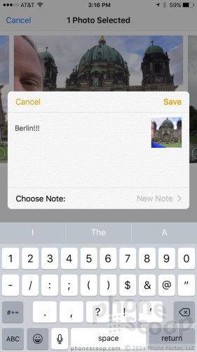
Notes now supports photos, maps, and web links, as well as checklists, and sketching. Apple added Notes to the "sharing" feature in other apps across iOS 9, which makes it easy to save attachments, documents, or whatever else you're looking at directly into Notes. Notes has a new browser for sorting through documents, including one for finding attachments.
Perhaps the best feature of Notes is iCloud. People who choose to sync through iCloud will see their Notes replicated across their iOS and Mac OS devices. It all works well enough that I'm almost tempted to use it.
Google and Microsoft each offer notes tools in Android and Windows, respectively. OneNote, Microsoft's app, is especially powerful and is available to Android, iOS, and Windows users. If you're already using OneNote, (or Evernote, for that matter,) there's no real reason to switch to Apple Notes unless you specifically want to use Apple's app.
Apple Wallet
Apple Wallet replaces the old Passbook app. It hooks into third-party apps for managing everything from movie and concert tickets to train passes and airline boarding passes. It also lets you manage your Apple Pay account by adding credit/debit cards and, now, store-issued credit cards (Macy's, Home Depot, etc.) and loyalty cards/accounts.
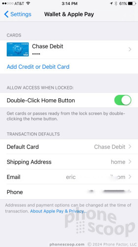
It makes sense to manage all of these retail-oriented tools from a single space called Wallet.
Apple Pay first launched last year and it remains the best experience for making tap-and-go mobile payments. At participating stores, iPhone owners need only tap their phone to the card reader while holding the Touch ID button to automatically open the app and verify the transaction.
Importantly, Apple Wallet does not store your normal credit card details locally, and every transaction is tokenized for security. This means retailers never actually see your standard credit card number; they just get your money. Moreover, Apple lets you disable Apple Pay remotely via Find My iPhone if you lose your iPhone. Lastly, it's easy to use Apple Pay to make payments in select third-party apps.
I like Apple Pay, but I wish it was more widely available. Apple claims iPhone owners can make payments at more than one million locations around the country, but they are few and far between. Honestly, I forget to use it when I walk into my local Walgreens, one of the few places I go that takes it.
Google is set to launch Android Pay very soon, but it will face the same limited footprint that Apple Pay faces. Samsung is launching its own mobile payment app shortly, and it should be more widely available thanks to support for NFC and MST (magnetic stripe) technology. It remains to be seen just how successful Samsung Pay may be.
To be fair, it is worth pointing out that NFC readers should become more common in the months ahead. Retails need to install more secure credit card terminals by October, and most new terminals include NFC. Hopefully that increased availability of NFC terminals in retail stores leads to an uptick in the availability of Apple Pay and its competitors.
iCloud Drive
Apple has long offered its own servers to people looking to store documents and other files online. iOS 9 makes it possible to access iCloud directly via the new iCloud Drive app. Oddly, Apple doesn't turn iCloud Drive on automatically. It's hidden in the system settings. Once activated, it puts a simple file browser on your home screen.
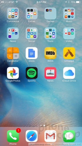
It's surprisingly effective for searching through any files you may be storing online. A search bar at the top helps quite a bit, especially if you know what you're looking for. The one thing I found annoying is that it doesn't let you view files through an internet connection. In other words, if you want to open a text document stored in the cloud, it first downloads the whole file to your iPhone. On the plus side, any changes you make to that document are then synced back up to iCloud and reflected across your devices.
Google Drive and Microsoft OneDrive are far, far superior, but it's nice of Apple to offer even this simple tool for managing your online documents.
Tweaked
"Back to…" and Multitasking
Apple made some changes to how people navigate through iOS and it's a case of one step forward and one step back.
Apple introduced a new "Back to…" tool that appears in the upper left corner of the screen in certain instances. Let's say you're using Facebook and you click a link that opens Safari. While you're in Safari, you'll see text at the top of the screen that reads "Back to Facebook." Press it, and that's exactly what will happen: you'll leave Safari and go back to where you were in Facebook. This is a great tool and I've come to use it often. It doesn't show up everywhere, but it really helps when you leave one app only for a little while and want to go back to what you were doing before.
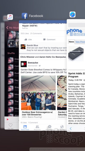
Apple also changed how iOS 9 handles multitasking. Double-pressing the home button opens the multitasking screen, which lets you sift through recently-used apps. In iOS 8, the apps floated on individual cards that were easy to see as you sorted through them. In iOS 9, the apps are stacked on top of one another, which requires a lot more (and trickier) swiping back and forth to find the app you want. I think it looks better, but the new look comes at the cost of usability.
The “Back to” tool mimics the back button on Android devices, which has been there since Day One back in 2008. Windows Phone, too, has had a back button since launch. Again, this is Apple sort of playing catch-up. As for multitasking, all three platforms are about in the same boat. The fast-app-switching tools all function in a similar manner and are equally effective.
Battery
Apple took steps to improve battery life through changes in iOS 9. Apple claims iOS 9 will give most iPhones an additional hour of battery life each day. How does it do this?
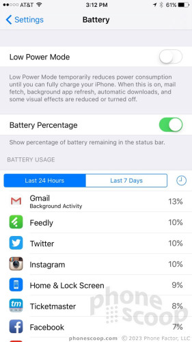
iOS 9 is much smarter about handling incoming notifications. For example, it knows when the iPhone is in a pocket or face down on a table and will leave the screen off when the phone receives a notification. Multiply this times dozens of notifications per day, and you're suddenly saving real power. (The display is the biggest battery drainer of any device.) iOS 9 also streamlined a lot of its internal operations and apps. Does it work? Sort of. I found my iPhone 6 Plus was giving me about 45 minutes more on a single charge. For many people, an extra 30 to 60 minutes is all they need.
Apple also added a Low Power mode to iOS 9. If you find yourself in trouble, turning on Low Power mode limits certain background processes and can extend battery life by up to three hours. Specifically, Low Power mode limits email fetch, background app refresh, automatic downloads, and some visual effects when transitioning between apps and screens. My iPhone 6 Plus definitely lasted a bit longer when in Low Power mode, but it's hard to say exactly how much.
Competing handsets have offered Low Power mode or other battery saving tools for years. Apple is late to the game with this feature.
Performance
I tested iOS 9 on an iPhone 5, iPad 3, iPad Air 2, and iPhone 6 Plus. It ran smoothly on the newer hardware, and, surprisingly, delivered a small boost to older hardware.
On the iPhone 5, iOS 9 performed well. In fact, the iPhone 5 with iOS 9 showed a slight improvement compared to how iOS 8 behaved on the same handset. That pretty much says everything you need to know.
To put it plainly, iOS 9 improves not only battery life, but performance on older iPhones without introducing any real drawbacks. These are more than enough to recommend iOS 9 to people using handsets like the iPhone 5, 5s, and 5c.
Apple Music
Apple debuted the new Apple Music app and service with the arrival of iOS 8.4 back in June. Honestly, it makes a mess of the old media player, which is now a confusing series of screens, options, stations, and content. The older music app was simpler to use.
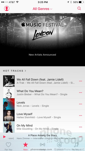
First, Apple Music is Apple's music streaming service. It costs $10 per month ($15 for families) and permits unlimited streaming of the entire iTunes library. It doesn't play well with people who've used iTunes Match to store their music libraries on Apple's servers. The service has a very hard time differentiating between content you uploaded versus what's already there. Some people have complained that Apple Music more or less deleted their entire music library from iTunes Match. I can say that I've not (yet) suffered such a disastrous fate.
That aside, the service does offer an insane selection of music. Apple offers recommendations based on your playing history, in a "For You" section. Because my library is so large and varied (i.e., I buy stuff for my kids), Apple Music often recommends pop-y junk I'd never listen to. The preconfigured radio stations aren't bad. Exploring the "Metal" genre, for example, yields at least 11 prepared streams, including artist spotlights, editor's picks, curated playlists, top songs, recent releases, and so on. It offers up videos, and sub-genre playlists, as well. I was honestly able to discover some new music using these playlists.
The Beats1 Radio station is a pile of garbage as far as I am concerned. It's a global radio station, so you have to listen to it with an open mind. Even so, after hours of listening over the summer I hardly heard a single song that I really wanted to hear. Moreover, the DJ's personalities generally aren't my "type."
The Connect feature, supposedly a space reserved for artists to drop non-music content, is pretty, but generally uninformative. You have to subscribe to the feeds of select artists. Apple will suggest some based on your library if you don't choose any. Then you can scroll through the feed of content. I never found anything in the feed that excited me, despite the fact that I follow more than 100 artists. Why? It feels like a marketing gimmick and not something with which the artists are actually involved. Want to know what Taylor Swift is up to? Follow her on Twitter and Instagram.
Last, the My Music section. This is where you'll find your library and playlists. My biggest complaint is how difficult it is to determine which music is stored on the phone and which music is stored in the cloud. You can only find out for sure by diving into the settings menu and turning off your cloud-backed library. That's a serious pain and gets old really quickly. Worse, songs that I was sure I "made available offline" seem to lose their offline status and have to be re-downloaded from time to time.
Seriously, this app is a mess.
That said, almost none of the major platforms gets music right. Google's Play Music library is more limited than Apple's, and the service has serious issues with respect to the number of devices on which it can function. Microsoft's recently re-branded Groove Music has strong ties to Windows PCs and the XBox, and seems to have a cleaner interface and better song selection than Google's offering.
Odds and Ends
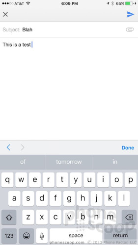
The keyboard. The letters displayed on the keyboard now switch from uppercase to lowercase as the shift button is pressed, offering people a much clearer visual cue about what they're going to type. This is a long-overdue "feature" that's been available on Android and Windows Phone for years.
WiFi Assist is a godsend. When activated, the iPhone will know to drop sketchy WiFi networks in favor of LTE. It works well and makes me very happy.
Music Shortcut: Now, when you plug headphones into your iPhone, a shortcut to the music app appears on the lock screen. This is a small but convenient change.
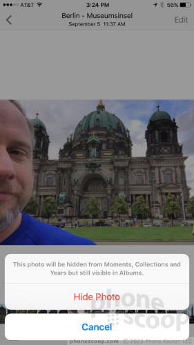
Select and Hide Images: iOS 9 makes it easier to select more than one image at a time. When in the Photos app, select one image and then drag your finger across other images to select them as well. This is a small time saver. iOS 9 also lets you hide sensitive images from the shared photo library, though the pictures will still show up in the camera roll.
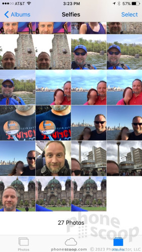
Selfies: The photo library now has an album dedicated to images snapped through the user-facing camera. This makes it a snap to find your selfies.
Email Attachments: The native email app adds two useful features. You can now write on files attached to emails using a tool called Markup. It lets you make selections and draw simple notes. Moreover, email now supports any type of file attachment. Though the list of supported file types has grown over the years, iOS 9 opens it up to all files (at long last).
iPad Multitasking: The iOS experience on iPhones and iPads continues to pull apart. This is particularly true with iOS 9, which brings true split-screen multitasking to the iPad. It takes some getting used to, but I found it works great. One feature lets you take a peek at select apps on the right side of the screen. If you want to run two apps at the same time, you can do that, too. The software lets the screen split into three different window shapes, including a one-third split and one-half split. I found it was easy to move content between open windows. The picture-in-picture function lets you watch YouTube and other videos in minimized windows on pretty much any other screen. It's pretty cool. These are all features that Apple should have adopted years ago. Now, Apple needs to bring them to the iPhone 6s Plus.
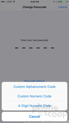
Security: iOS 9 adds support for 6-digit PIN codes to secure the iPhone. In fact, 6-digit PINs will be the default moving forward. People who've already set up 4-digit PINs on existing phones can keep their shorter code, but Apple recommends everyone update to the longer code. Why? Four-digit PINs only allow for 10,000 combinations. That may sound like a lot; from a computer security standpoint, it's nothing. Six-digit PINs up that to 1,000,000, making it harder to break into an iPhone using a brute force attack.
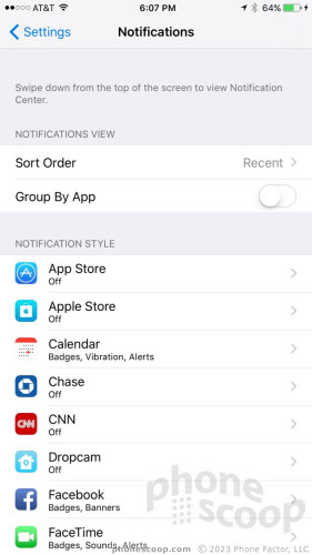
Notifications: You now have a little bit more control over notifications. For example, you can choose whether or not to group them via app (i.e., all emails in one notification pane), or sort them via recent (truly in the order they were received) or manually in the order you prefer. iOS 9 gives users extensive control over what apps can offer notifications, what form those notifications take, and where those notifications may or may not appear. You still can't dismiss all notifications at once — something Android and Windows Phone have long been able to do.
Unchanged
Apple left significant aspects of iOS more or less unchanged when you compare iOS 8 to iOS 9. That's fine, and something most OS makers need to do.
Apps that are carried over from iOS 8 include messaging, the phone, the camera, contacts, Game Center, Health, compass, stocks, voice memos, iTunes/App Stores, videos, clock, and the weather app. I don't think Apple is trailing its competition much with these apps, and the versions we've been using the last year are decent enough.
There are a couple of exceptions. One is the phone app. The phone app hasn't been updated in forever and it feels like a relic. I'd like to see much more obvious and seamless controls for features such as HD Voice, WiFi Calling, and even FaceTime, which I've long believed needs to be part of the phone app.
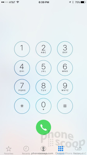
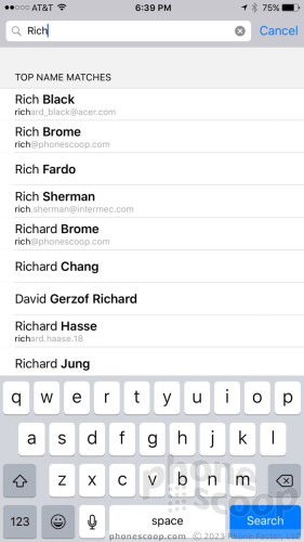
The contact app goes hand-in-hand with the phone app. It's still not as socially aware as the contact apps in Android and Windows Phone, which means you can't see the recent social networking updates from your family and friends. The phone and contact apps need work, and need to work better together.
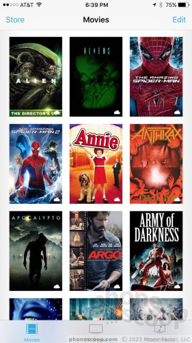
The video player app is incredibly limited in its feature set. You can essentially play iTunes purchases and that's it. I'd like to be able to more easily share videos and maybe even discover details about them via links to IMDb. The video player app offers none of these. Google Play Movies & TV can interact more with associated online content.
Wrap-Up
iOS 9 builds on the foundation created by iOS 7 and iOS 8. It is an evolutionary step forward that manages to deliver tangible improvements — such as better battery life — while at the same time bringing a few exciting new behaviors to the fold.
If you ask Apple, it will likely point to the more powerful Siri as the hallmark feature of iOS 9. Siri is, in fact, much better than on any previous generation of iOS. The tool responds much better to voice input and can handle a wider range of requests. It's also smarter about managing things in the background and offering suggestions as you perform searches. It doesn't quite match Google Now, but it's almost there.
The Apple News app and transit directions are other big additions to the platform, but each falls a bit flat. The News app is functional, but others do the same thing better. The same goes for transit directions, which are limited and sometimes inaccurate in iOS 9.
Multitasking on the iPad is another major step forward for iOS, and adds incredible new powers to Apple's tablet. We only wish Apple would make them available to the iPhone, too. Apple made solid improvements to Apple Pay, its note-taking app, and myriad other bits and pieces of the platform.
Taken as a whole, iOS 9 may not be the most exciting mobile operating system release ever, but it puts iOS in close parity with Android in may ways. As always, the updated system gives developers even more power to offer creative and compelling apps. That means devices with iOS 9 on board will only get better with time.
If you're weighing whether or not to update your older iPhone to iOS 9, the answer is an emphatic "Yes!" for the battery life and performance improvements alone. If you're trying to decide if iOS or Android is the right platform for you, iOS 9 is well worth strong consideration.
Comments
No messages


 iPhone 14 Plus Offers a Big Screen For Less
 iOS 16 Revamps the Lock Screen
 Apple Watch Series 9 Detects Finger Gestures, Brings Siri On-Device
 Google Bringing Transit Ride History to Google Wallet
 Google Making Maps Location History Private, Even from Police


