Review: Microsoft Windows 10 Mobile
Universal Apps
Microsoft has pitched universal apps — where one instance of an app can run in both phone and desktop mode — before. Cross-device apps were behind the major code-rewrite between Windows Phone 7.5 and 8.0. With Windows 10, that dream is finally realized. Developers can write a single app that runs on smartphones, tablets, and PCs. This is great news for Windows smartphone owners.
Windows Phone has long trailed its Android and iOS counterparts when it comes to the number of apps. The full version of Windows enjoys more developer support (than Windows Mobile) thanks to its greater numbers. By giving Windows 10 Mobile the ability to run Windows desktop apps, it bolsters the selection of apps available to handsets in a big way.
Microsoft is able to do this thanks to the core kernel, which is the same for all three form factors. Apps are now able to scale depending on the screen being used. Microsoft says universal apps do take a bit more work for developers, but believes developers and end users will both benefit over time.
What does that mean for Windows 10 Mobile right now?
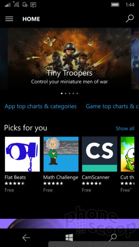
The Windows Store is entirely new. Gone is the left-to-right sliding app design in favor of an app that scrolls vertically. I found the new app to be more immersive and user-friendly for browsing and searching.
Though it is still early days, I was able to find most of the core apps I want/need. For example, Twitter, Facebook, and Instagram are all available, as are Amazon, eBay, United, Fandango, Spotify, Pandora, and many others. There's no Snapchat, Periscope, or Vine, however.
Worse, many banks — including my own, JPMorgan Chase — have abandoned Windows altogether. Chase used to offer a Windows app but pulled it earlier this year. That means no mobile banking for me, and that's a bummer. Banks are just one example. Microsoft is betting on desktop apps being ported to phones, but the world has moved on. The apps people care about aren't on desktops at all. Can you even imagine installing a Starbucks app on your laptop? Big, consumer-facing companies need mobile apps, but desktop apps aren't even a consideration. Many of these companies aren't on Windows for mobile, and Windows 10 won't change that.
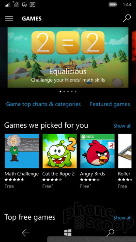
Universal apps look and behave the same across form factors, for the most part, with obvious and needed tweaks for mobile handsets, tablets, and PCs to aid usability. For example, PC apps default to landscape orientation, while smartphone apps default to portrait. Further, PC apps add a UI layer for interacting with the broader operating system, such as access to the Start menu and action bar at the bottom of the screen. I am generally pleased with the quality of the apps on Windows 10 Mobile, but they do lag behind Android and iOS. For example, the Instagram app, which is still in beta, doesn't let you upload videos.
Put simply, there aren't as many apps available for Windows 10 as there are for competing platforms. Universal apps are meant to help change that, but don't expect the change to be dramatic or happen overnight. Microsoft has done what they can to address the issue of improving the number of apps, but it still has to improve the quality.
It has made available a tool to help developers port their iOS apps to Windows. This has great potential, but Microsoft canned a similar tool planned for Android. If Microsoft can convince iOS developers, of which there are a great many, to port their apps to Windows it could be a boon to the platform.
Continuum
Beyond universal apps, Continuum is the biggest new feature in Windows 10 Mobile. Through Continuum, you can use any HDTV or monitor to turn your phone into a full PC. It's not magic; it requires a bunch of cables and a special accessory from Microsoft. The end result, however, is a portable PC platform that runs full Windows 10 from a smartphone.
Continuum
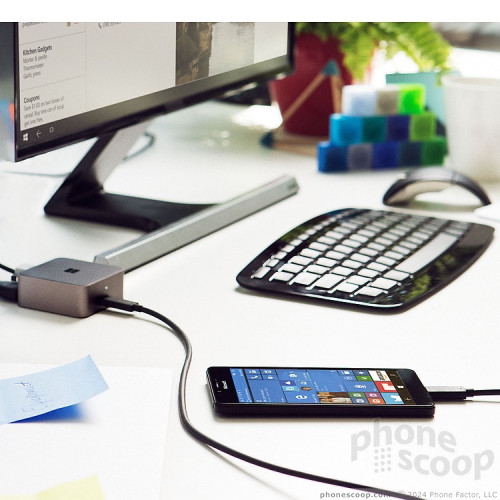
The setup includes a little hub. The hub needs to be plugged into a power socket and an HDMI cable needs to stretch from the hub to your TV/monitor. The phone needs to be plugged into the hub, too, and thankfully will charge while plugged in. Continuum supports a mouse and keyboard. The mouse and keyboard can be plugged directly into the Continuum hub via USB, or connected via Bluetooth. Got all that?
Does it work? You bet. I was able to convert my TV set into a Windows 10 computer in less than five minutes. I found the experience works best with a physical mouse/keyboard setup. With Bluetooth components, I was able to sit on my couch and control my TV from about 8 feet away, with the peripherals on my coffee table.
The UI is definitely Windows 10, but the Start menu will show you all the apps on your phone arranged as they are on the phone itself. This is helpful if you're looking for something particular, like an app or file. Speaking of which, all the apps work. Outlook, the Edge browser, Office, Groove Music, XBox, and so on. Every microsoft app on the phone runs on the TV/monitor without issue. It's really quite nifty. Third-party apps can be a bit odd. I'll pick on Instagram again, which was somewhat slow and didn't want to accept the landscape orientation without putting up a fight. The third-party app experience varies through Continuum.
Continuum is one area where you might see some performance issues. I noticed some sluggishness here and there.
My favorite feature lets you do one thing on the phone while you do something else on the PC. For example, you can send text messages from your phone while editing a PowerPoint file on the monitor. That's what I call multitasking.
Who might use this? I can only guess that Microsoft is targeting road warriors — who somehow don't have company-issued laptops or tablets, but need to be productive when traveling. Using Continuum, it would be easy to turn a hotel room TV set into a computer. You'd be able to access work files, respond to email, and so on. Of course, you have to bring the hub (which is blessedly small), all the bloody cables, mouse, and keyboard. You're not saving any space in your briefcase, that's for sure.
Personally, I thought it was a great way to push videos from my phone to the TV.
Neither Apple nor Google offers an equivalent function to Continuum. The Apple TV and Google Chromecast allow you to mirror your Android/iOS screen or push video/audio content to your TV, but they don't transform the bigger screen into a fully-functional computer. Continuum does.
It's important to note that Continuum only works with the Lumia 950 and 950 XL right now; it's not available to older Windows handsets.
Office
Microsoft's productivity suite has never been more accessible or more powerful. The core Word, Excel, PowerPoint, and OneNote apps are all brand new and much better when used on smartphones.
When creating fresh Word documents, the app offers a number of prebuilt forms for generating notes, lists, journals, brochures, newsletters, flyers, catalogs, resumes, letters, and much more. These offer excellent starting points for putting together documents on the fly. I prefer typing on a full keyboard, but I was able to pen a cover letter without problem using the on-screen keyboard and editing tools. PowerPoint is fun to use, but I was less enamored with Excel, which can be a bit tedious. Even so, Excel includes plenty of sample formulas to help ease the process of putting together those TPS reports for accounting.
Thanks to OneDrive (Microsoft's cloud service), every document, spreadsheet, or slideshow you generate on your phone is automatically synced to your tablet and PC complete with changes and formatting intact. The convenience factor here cannot be understated. You don't have to do anything, it just happens in the background. I had no trouble starting a document while riding the bus and then picking up where I left off on my PC when I got home.
Mobile professionals, students, or anyone who has to generate documents can benefit from the new Office and OneDrive productivity suite.
Apple and Google each offer their own productivity apps and cloud-syncing services. All three platforms are relatively even when it comes to the base set of tools and features. Microsoft has a bit of a leg up here, however, because it is the default productivity suite used by businesses around the world. Microsoft stepped up to the challenge and created a dynamic set of apps and services that work well in today's world.
Outlook
Outlook is Microsoft's business-class email app and it is amazing.
I'd call the design somewhat spartan, but Microsoft's mobile email app has always been heavy on the white space. Outlook is a universal app and functions much the same across phones, tablets, and PCs. It really shines in Windows 10 Mobile.
To start, it supports most every email service there is, including Exchange, Gmail, POP, and IMAP. I easily added several accounts to the app, which it synced in real-time without issue. You can choose to keep your email inboxes separate, or link them into a master inbox that collects and displays all your emails in a single spot. When you respond to any email from the linked inbox, it will address it from the appropriate account.
The app includes an incredible number of features for customizing messages. For example, you can insert images, files, tables, or documents, and the tool for doing so is quite simple to use. Outlook supports high- and low-importance messages, spell check, proofreading, and more. Tools make it simple to highlight text, use bold/italics, create bulleted or numbered lists, and even draw on emails with your finger.
My biggest and only real complaint pertains to HTML emails, which render too small in my opinion. The formatting and images all come across fine, but for some reason Outlook won't fill the entire screen with the contents of the message. Instead, it leaves too much white space framing the HTML designs.
Outlook plays well with the new calendar app. The apps work hand-in-hand to manage your daily appointments. The calendar app supports multiple accounts, (like my Outlook calendar and Google calendar,) and can be customized through the use of labels, colors, and so on. I like that Outlook and the calendar share a consistent interface. This is especially helpful if you switch from the phone to a PC.
For my money, Outlook crushes the native iOS email app. Apple's app isn't even close. Gmail on the Android platform offers about the same feature set and performance that Outlook does on Windows Phone, but I'd say Outlook is the best core email app available from today's leading mobile operating systems. (It's so good, I use the iOS version on my iPhone.)
Edge Browser
Internet Explorer is no more. Edge has taken its place. The Edge browser has a new name in part to escape IE's marred legacy. Beyond the name, however, Edge is a dramatically improved tool for surfing the web.
First, and most importantly, Edge is faster to load pages and better at rendering them. I was pleased with the appearance of Phonescoop.com and every other web site I tested using Edge. It handles HTML just fine, and can display mobile-optimized and full desktop sites as well as any other mobile browser in the market. That said, I experienced a few crashes here and there.
Edge has an expanded set of tools. It supports multiple open tabs, as well as private tabs. Individual sites can easily be shared, saved, viewed in Reading List form, pinned to the home screen, or added to favorites. The favorites tool works well and syncs across Windows 10 devices. There's also a great search tool for finding text on any given web site. Last, Edge includes a way to manage downloads so they are easier to find after the fact.
Edge is highly usable because the address bar and controls are all positioned at the bottom of the screen. Microsoft carried this over from IE on Windows Phone. Placing the address bar and other tools by your thumb makes one-handed browsing a snap.
Studies say that most of the time people spend on their smartphones is within apps, rather than straight-up browsing the web. That may be true, but Edge makes a great case for surfing the web the old-fashioned way.
Microsoft did a great job closing the gap between Edge and Safari/Chrome on iOS/Android.


 Samsung Refines its Foldable Phones
 iPhone 14 Plus Offers a Big Screen For Less
 iPhone 15 Series Goes All-In on USB-C and Dynamic Island
 iPhone 16 Brings More Features to All Price Points, Including New Camera Control
 Apple Watch Goes Ultra


