Review: HTC SMT-5800
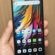
Unlike the HTC Touch or Shadow, the 5800 does not employ any user interface overlays to make accessing the phone's systems easier or more manageable. It uses the basic Windows Mobile 6 platform. The home screen offers the standard Today layout, with application shortcuts running horizontally across the top, and customized calendar appointments, notes, email and other user content displayable below.
The left and right soft keys let you access the Start menu and Contacts application, respectively. Hitting the Start key takes you to a grid of menu options. This is where you access the majority of the 5800's applications and softs. There are 22 applications or folders found in here. Each one is labeled in a way so that you know exactly what it does or where it is going to take you. It is only slightly more intuitive to use than many proprietary menu systems that are built into phones, if only because we are all somewhat familiar with the way Microsoft builds its menu systems.
Once you select a menu application or folder, it generally opens up to another grid of applications or a plain list with black letters on a white background. No fancy dancing icons here. Just utilitarian grids and lists. All of the menu selections listed in this type of view have a keyboard shortcut (1, 2, 3, 4,...etc.) before it, so if you are fast with your fingers on the keypad you can jump directly to that action.


 CTIA Fall 2007
 CTIA 2007
 Samsung Refreshes Galaxy S Series with S Pen, New Cameras
 Samsung Upgrades its Wearables
 iPhone 14 Plus Offers a Big Screen For Less
 HTC 5800 / Fusion / S720


