Review: Apple iOS 10
Sep 16, 2016, 3:30 PM by Eric M. Zeman

Apple's iOS 10 gives iPhones and iPads a healthy serving of new features. Some are easy to discover, while others are not. We really like the new iMessage tools and the snappiness of Apple News. It's hard not to appreciate the more powerful version of Siri to lend a helping hand when requested. Apple Maps and Apple Photos are now much better at search, but Apple Music still struggles a bit. Here is Phonescoop's full review of iOS 10 for Apple iPhones and iPads.
Intro
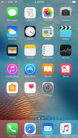
Apple released iOS 10 recently for iPhones and iPads. While the platform looks largely the same as it has since the release of iOS 7, this year's update makes big strides in several key apps and functions. Siri now interacts with more apps across the platform, and iMessage is more fun than ever. Apple News, Maps, Music, and Photos all see significant feature upgrades, and Apple overhauled the lockscreen and notifications, too. Here's our in-depth look at what's new in iOS 10.
Performance
I tested iOS 10 on an iPhone 5, iPhone 6, iPhone 6 Plus, iPod Touch 6th Gen, and iPad Pro. The platform runs really well on all of these devices. Typically, iOS performs like garbage on older iPhones, so I was particularly worried about the iPhone 5. But Apple's 2012-era smartphone handles iOS 10 with aplomb. It had no trouble with the operating system whatsoever. Apple has refined the heck out of iOS and it's now incredibly stable.
Lockscreen, Notifications, Control Center
If you'be been using iOS since 2007 like I have, you're going to find your years of experience now works against you. Since its launch, iOS has always asked users to "slide to unlock." Once iPhones gained fingerprint readers, users could bypass the swiping by simply pressing the home button and holding there to activate Apple's Touch ID. For those who prefer PINs or passwords, slide to unlock remained and has surely become rote behavior for many.

With iOS 10, Apple assumes everyone is using the fingerprint reader and there is no slide to unlock. Now, you can press the home button and unlock the phone at the same time with your fingerprint. If you don't use the fingerprint reader to secure your iPhone, you need to tap the home button a second time to call up the PIN/password screen. It's a small change, but one I struggled with. Muscle memory takes time to unlearn.
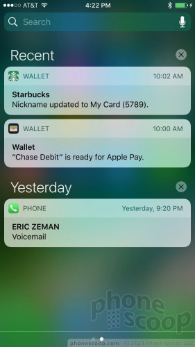
The lock screen is now a very busy place. Technically speaking, there are three functions available from the lock screen: notifications, the Today screen, and camera. Notifications appear on the main lock screen and are far more informative than before. You can see photos and videos or respond to messages right in your notifications. The photo/video previews are neat, but you can turn that feature off for privacy.
Tons of widgets are available for the Today screen. Swipe one screen over from the lockscreen to see the weather, your email or calendar, transit times, news headlines, and much more. You can customize the widgets and arrange them however you wish. Again, there are privacy controls to choose what's available without unlocking. You can also hide the Today screen entirely. I find the widgets offer limited usefulness, especially from the lock screen. If you see a news story you want to read, for example, you have to unlock the phone before you can read it. This kind of negates the idea of quick-consumable content. I do, however, like being able to see my next calendar appointment at a glance.
You can easily access the camera from the lockscreen. I use this all the time and find it very convenient.
I do not care for the changes Apple made to the Control Center. First, the Control Center panel is taller than before, which makes it harder to use on the iPhone 6 Plus (the top can be quite a reach for your thumb). Also, the Control Center is now split into two screens: the first contains radio toggles, screen brightness, and some app shortcuts, while the second is relegated to music controls. The music controls now include album art, but the panel is unnecessarily huge and awkward looking. There was no need to split the panel in two, and it now takes an extra step to control your music.
Taken as a whole, these revamped controls miss mark in my opinion. The user interface is more cluttered and less simple. Granted, you can do more from the lockscreen, but the widgets are of limited usefulness. Android's lockscreen and notification tools can be just as rich, but are easier to manage and use.
iMessage and Typing
My tween daughter is obsessed with iMessage now, and so are all of her friends. Apple's new messaging application supports more emoji, scribbling, animated and disappearing text, GIF/image search, sticker packs, and even apps. It's a home run for those who find words too limiting.
Three new icons appear next to the text box within message threads: camera, heart, and apps. Want to send a photo or video? Press the camera. This tool is easy to figure out and provides access to your photo library or the camera/video camera.
Want to scribble a drawing or send animated air kisses? Press the heart. This tool takes some time to figure out. There are several animations and drawing options available from a small column on the right side of the screen. A camera button is on the left. You can draw whatever you want, or take a photo/video and then draw on the results, or shoot video and draw at the same time. It offers lots of room for creativity, but I didn't find it entirely intuitive.
iMessage apps are probably the best part of iMessage. Press the little app icon and a dialog box opens with all the apps onboard that offer iMessage tools. For example, The Weather Channel has an iMessage tool that lets you send the forecast — complete with Weather Channel branding and colors — to anyone in your iMessage inbox. There's also now an entire store dedicated to iMessage apps. It is accessible from the app dialog box. There are gobs of apps that have iMessage functions, and there is no end of sticker packs (literally digital stickers you can slap on messages). Some are free, some cost money. My favorite is JibJab, which lets you insert your face into all sorts of silly animations for sharing with friends and family. This stuff is all lots of fun.
The new iMessage is competing with Facebook, WhatsApp, Snapchat, and others. In that respect, iMessage in iOS 10 is a competitive offering that may convince some people to stick with Apple's app rather than use third-party options. (We'll see if that changes once Google's AI-assisted Allo app arrives.)
It's worth pointing out that you can send these new and enhanced messages via MMS rather than the actual iMessage service. Android devices, for example, receive app content, scribbles, GIFs, and more in MMS form. For the most part, formatting is intact. We did notice that the scribble-on-video tool only delivers the video to Android devices, and not the accompanying scribble. This could be good or bad.
The keyboard has been bolstered, too. To start, there are hundreds more emoji baked into iOS 10. The emoji are baked into the word suggestions, too. For example, if you type the word "taco" the keyboard will automatically show the taco emoji so you can choose that instead of the boring old word.
The text animations are fun. Using a little arrow that appears on the right edge of the text box, you can select to send messages in huge text or small text, “slam” them to get someone's attention, and even send disappearing text that recipients need to press to read.

Further, the keyboard allows you to designate a second main language so you can type in two languages (English and Spanish, or German and Italian, etc.) without switching keyboards. This is very helpful for those who are multilingual.
Last, the keyboard pops up more contextual predictions. For example, if you're typing a message that says "I'm available at…" the phone will reveal open slots in your calendar. Or if you type "John's number is…" the keyboard will automatically pull up a list of all the Johns in your contacts. Neat.
The Apple keyboard still doesn't include swipe typing, but improved support for third-party keyboards means you can download and use your own without losing access to the fun iMessage animations.
Siri
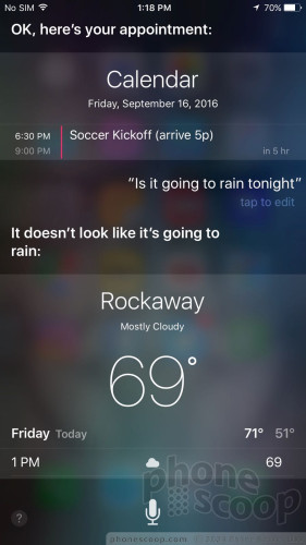
Since its launch, Siri has been limited to interacting with a certain cross section of apps. That changes with iOS 10. Apple released tools to developers so they can add Siri functionality to their own apps. This is huge.

To start, Apple has improved Siri's IQ. The company relies on machine-learning technology to help Siri adapt to each person's individual style of speaking. This means people can speak more naturally and expect Siri to understand what they are saying. I still think Google Now is better at understanding natural language requests, but there's no doubt that Siri is much, much improved over iOS 9. Siri is just a half-step behind Google at this point.
Siri's ability to work with other apps is clutch. Something to keep in mind here is that it is up to third-party app developers to add Siri to their own apps; Siri won't automatically work with every app on the phone. Apple points to partners such as Lyft, Uber, Venmo, LinkedIn, WhatsApp, and Pinterest that are adopting Siri functionality right away. For example, you can say "I'd like a ride to JFK via Lyft" and Siri will understand the request, launch Lyft, and send a ride request.
There are still roadblocks. When I asked Siri to play some Metallica, Siri was able to open Apple Music and start playing the most recent Metallica song. What I asked Siri to play some Metallica using Spotify, Siri was able to open Spotify, but not start the music. It will be on Spotify to add Siri to the app so my request works as intended. It will take some time for apps to accommodate Siri, but the promise is real. I do wish it were easier to assess which apps do support Siri at the moment before I waste lots of time asking my phone to do things it can't yet do.
Maps
Apple Maps stumbled out of the gate when it launched several years ago, but Apple has made steady improvements to the app over time. In iOS 10, Maps adds a handful of functions that may help make traveling around town a bit easier.

Maps now works directly with third-party apps to support reservations and other types of bookings. For example, I searched for a local restaurant in Maps. A button in Maps suggested I make a reservation through OpenTable. I didn't have OpenTable installed, so I had to download the app in order to complete the reservation. Once installed, Maps worked with OpenTable to let me make a booking. I could also book a ride with Uber. As with Siri, it will be up to third-party developers to add their functionality to Maps.
Maps now includes search along your route. It was easy for me to find a gas station on the route between my house and Manhattan. Further, going to the gas station didn't interrupt my real-time navigation. The search tool is easy to use and prioritizes search for categories such as banks, coffee shops, restaurants, hotels, and so on.
Last, Maps is more personal. It is able to learn your daily routine and suggest places and routes depending on your calendar and where you often go. The app will automatically tell you the best way to get to your next meeting.
These tools all worked well enough and they make fine additions to Apple Maps. Google Maps is perhaps more powerful and polished, and some of these new Apple Maps functions mirror what's already available in Google Now. But Apple Maps isn't as far behind as it used to be.
Music
Apple's Music app is incredibly clunky. I think the iOS 9 version was the worst variant, but Apple's attempt to clean things up in iOS 10 didn't go quite far enough.

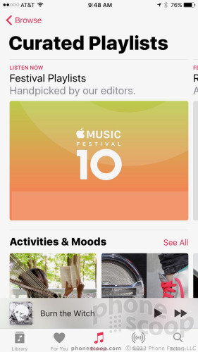
For a company that prides itself on design, Apple Music is darned ugly. Black and red text on a white background may seem modern, but I don't care for the fonts and organization. The "library" tab, for example, is a jumble of menus and album art. You can customize it to a degree, but rearranging the menus doesn't make it any prettier. One change I do like is that it's finally easier to find and access music that's actually downloaded to your device. This is critical for offline playback. Any music you have stored locally is available in a new "downloaded music" screen.
I find the "for you" recommendations to be a little bit better in iOS 10. I subscribe to the Apple Music family plan because my girls like listening to music too. The problem with this was that their tastes don't gel with mine and vice versa. I didn't appreciate Apple Music suggesting my daughters listen to Slayer while it suggests I listen to Taylor Swift. Apple Music now seems to know that we're different people and offers more tailored and appropriate suggestions.
It's somewhat easy to browse for new music in the New Releases section, but I find it hard to reconcile that Apple Music and the iTunes Store — which sells music — are two different things. For example, I'll browse in iTunes and go to add music to my library only to discover that I have to pay for it. Meanwhile, the same music is free to add to my library in Apple Music. This is just dumb and frustrating. On the plus side, Apple Music now includes song lyrics.
Even though I don't particularly care for Apple Music, it's loads better than Google Play Music, which is a total dumpster fire of usability. Apple used to own the mobile music experience with authority. What happened?
News
Apple News in iOS 10 is far more refined and useful than it was in iOS 9. Thankfully, the app is now much faster. The initial setup is still a bit more involved than I want it to be (selecting interests, topics, sources, etc.) but the payoff is bigger. Apple News now shows me much more relevant stories from sources and publications I like. You can always tweak the settings after the fact to find more topics and stories.

The app can support paid subscriptions, so you can add your favorite magazines, newspapers, and websites to the app if you wish. The app also supports customizable notifications for breaking news and other stories you may want to know about right away. Browsing for news is simple, and keyword search makes finding specific stories a snap.
Last, the app is attractive. Stories are formatted attractively on the screen, with imagery and videos embedded for easy viewing.
With Apple News aboard, there's little need to bother with third-party readers, such as Flipboard.
Photos
Apple Photos takes a huge step forward in iOS 10 in order to better combat the powerful Google Photos app. The big change in Apple Photos for iOS 10 is a dash of artificial intelligence to help search for and organize photos and albums.

The tentpole feature is called Memories. Memories automatically searches through photos and videos and assembles images based on events, faces, locations, and more. It then puts the photos into slideshows that you can watch on your iPhone or push to an Apple TV. The slideshows are enhanced with music, titles, and even transitions. It goes without saying that you can edit all this so the memories are just as you want them to be.
Does it work? Well…
One of the oddest limitations is that Memories can only assemble three Memories per day. Remember, it's doing a lot of scanning and processing in the background. If your photo library is large, this takes time. My library has some 50,000 images and 2,000 videos going back more than 15 years.
Apple Photos sure picks some odd ones. The first time I fired up Apple Photos, it presented to me a collage of the "best photos" from a particular day in July. That collection included some neat shots of my kids playing in the pool, but it also included pictures I took of a pair of headphones for work. I'd hardly say that a picture of headphones is worth remembering in a stylized slideshow.
Photos is better at organizing photos by people. It uses facial recognition to lump together photos of particular people. This is even more accurate if you've taken the time to tag peoples' faces in Photos. You can then easily search for all the photos with those people.
Search also works with places and even things. For example, I searched for "Las Vegas" and Photos showed me all the pictures I've shot in Las Vegas going back to 2010. That's pretty cool. Alternately, you could search for "casino" and Photos picked out all the casinos in shots I took on the strip over the years. You can search for stuff like mountains, flowers, beaches, dogs, etc.
The best part is Siri integration. If you have a newer iPhone, you can say "Hey Siri, find my pictures with cats in them" and Siri will open Photos and do exactly that.
Last, Photos gains some of the fun tools found in iMessage. This means you can add stickers to photos as well as draw on them and otherwise mark them up. It's then a snap to share photos through iCloud Photo Sharing, AirDrop, or social networks such as Facebook.
All these tools are a big help for Photos. The app is more feature-rich than ever. It's not quite up to par with Google Photos, but now it's at least in the same league.
Odds and Ends
Apple developed a new app to accompany its HomeKit internet-of-things functionality called Apple Home. The app works with HomeKit-compatible things, like connected lights and thermostats, and gives you a dead-simple dashboard for managing them. You can program select actions that happen when you are "home" or "away," and can take control of individual appliances and systems at a whim. HomeKit-connected gear can't multiply quickly enough. You will need to seek out stuff with the HomeKit logo. For example, some zWave and ZigBee based stuff simply doesn't work with HomeKit.
Apple updated Continuity with some new functions. As long as you use iCloud to link your iPhone, iPad, and Mac, you can copy text on one device and paste it on another. This is a lifesaver when you need to move small bits of content from device to another. Handoff works more consistently, too. With Handoff, you can begin a message on your iPhone and then finish it on your Mac. Handoff works with Mail, Safari, Pages, Numbers, Keynote, Maps, Messages, Reminders, Calendar, Contacts, Notes, Podcasts, Clock, and News.
Apple says it improved Security within iOS. The platform specifically asks for permission before accessing location information or personal data (think contacts, calendars, etc.) Moreover, iPhone owners have total control over what apps are allowed to access HealthKit and HomeKit data. Android offers more options when it comes to protecting personal data. For example, Android's security tools can encrypt the entire device and ensure that no one can decrypt it without the owner's password or PIN. Both platforms are getting better about security, but it still takes some know-how to manage.
Speaking of Health, Apple devised a new app to help manage fitness data and other HealthKit-related information. Even if you don't have an Apple Watch or other fitness device, Apple Health tracks steps, activity, and more throughout the day. The dashboards are easy to use and more feature-rich than Google Fit on Android devices.
Apple Pay is coming to the web. You'll start to see it in mobile websites via Safari on your phone. For example, I was able to use Apple Pay on Apple.com to order an iPhone 7. (Apple Pay is coming to the desktop web, too.)
Apple has a very neat security function in play. As long as your iPhone and Mac are synced via iCloud, you can use Touch ID on your iPhone to authorize Apple Pay payments on your computer. Cool! (You can't use Touch ID to unlock your Mac.)
Wrap-Up
There's no question that iOS 10 is a strong release from Apple. It brings more smarts to the platform along with powerful features that have real use in our everyday lives. I do think Apple needs to make the operating system a bit more cohesive and, dare I say, find a path back to its simpler interface design roots.
The improved apps are, above everything else, fun and delightful. I enjoyed using the refreshed iMessage, and Photos' search tools make it more effective. Apple News looks and performs so much better, and Maps has some neat additions, too. I still think Apple Music is a little lost, and I could do without the revised Control Center.
If you have a compatible device, I highly recommend you upgrade to iOS 10 as soon as you can.

Comments
.
What Apple means: "iOS 10 takes up more of your precious space and adds stuff that everyday people won't use."
iOS 10


 Samsung Refines its Foldable Phones
 iPhone 14 Plus Offers a Big Screen For Less
 iPhone 15 Series Goes All-In on USB-C and Dynamic Island
 Major Update to Google Messages Brings iPhone-Compatible Emoji Reactions
 iMovie Makes it Easier to Create Polished Videos


