Review: iOS 11
Sep 19, 2017, 12:00 PM by Eric M. Zeman
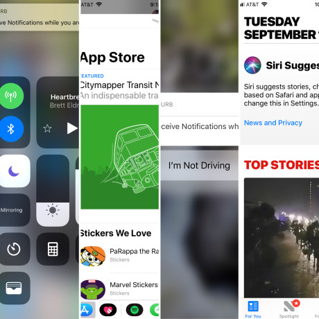
Apple's annual iPhone operating system upgrade is here. Beginning September 19, iPhone, iPad, and iPod Touch owners can download and install iOS 11, the latest mobile platform from Apple. This year sees Apple chiefly refining its core apps, though some new features, such as indoor maps, a new music social network, and augmented reality, are also included. Here's our review of iOS 11.
Prepare Ye
It's critical to backup your device before upgrading. It doesn't take that long. Your stuff is worth it.
iOS 11 runs on most Apple mobile devices released since about 2014. That means the iPhone 5s and SE, the iPhone 6, and newer. On the iPad front, you're looking at the iPad Mini 2, 3, and 4, the iPad Air and Air 2, and any iPad Pro.
Even if your device is on this list, you're not guaranteed the best experience on older models. I tested iOS 11 on an iPhone 5s, and it barely worked at all. The screen is unresponsive, apps are slow to open, and things crash all over the place. If you're happy with the performance of your older device, don't upgrade to iOS 11.
Last but not least, iOS 11 may break some of your apps. Apple has been transitioning to 64-bit computing for several years now. iOS 10 can handle both 32-bit and 64-bit apps, but iOS 11 makes a clean break with the older 32-bit stuff. That means if you have old apps or games that you love, you may find they won't work once you've updated to iOS 11.
You can check before you upgrade to see which of your apps are incompatible via the settings menu (Settings > General > About > Applications). Developers have had plenty of warning and time; any apps that are still 32-bit have essentially been abandoned by their developer.
Lock Screen
The new lock screen and notification shade are probably going to be the first things you notice with iOS 11. Moving forward, swipe down from the top of the display to see your recent and missed notifications in a single spot. Previously, the notification shade darkened the screen a bit and bunched your notifications up near the top of the display. Now, the shade looks exactly like the actual lock screen, complete with the clock. Rather that float on top of your grayed-out home screen, the notifications shade covers the entire screen from top to bottom, so you can see all the missed calls and notifications.
Because this new shade exactly resembles the lock screen, it's somewhat confusing and unintuitive. To start, you can swipe left or right from the notification screen to see your widgets or the camera app — just as you would on the lock screen. The biggest problem, however, is that the words "press home to open" appear at the bottom of the notification shade, which gives you the impression that you have to use Touch ID to go back to your home screen. You can press the home button to dismiss the notifications shade, or just swipe the whole thing back up. We've been swiping up to dismiss the shade for years, why suddenly push the home button as an alternative?
Dealing with notifications is now a jumbled experience. You can slide a text message to the right to open it, or to the left to view it or clear it. Opening the message takes you to the message in its native app. Viewing it opens a smaller window to see the entire content of the message with the option to reply. Clearing it simply dismisses the notification.
I'm not a fan of the new notification shade at all. The whole thing is more complicated and more messy than before. The shade loses more than in gains. Android is still the notification champ.
Control Center
The new control center is another huge departure for Apple. In previous builds of iOS, the control center — accessed by swiping up from the bottom of the screen — revealed some base controls that were easy to understand and use. iOS 10 inexplicably moved the music controls onto a second screen, and that got on people's nerves. With iOS 11, Apple has brought the music buttons back to the main control center, but tangled everything up in the process.
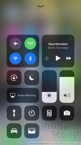
Rather than offer a simple set of controls, you now see blocks of buttons that fill two-thirds of the screen. The top-left block has toggles for the radios, while the top-right block holds the music controls. A collection of smaller buttons and bars forms a clusterf$ck of junk in the lower portion of the screen. These include the rotation lock, night mode, screen mirroring, flashlight, stop watch, calculator, camera, and sliders for brightness and volume.
Some of these buttons respond to a 3D Touch. You're on your own to figure out which ones. For example, a long press makes the brightness bar fill the whole screen to give you finer control over the exact level of brightness, while long-pressing the camera calls up a card with options such as take a selfie, record a video, or record slow-motion.
The one real killer feature here is that you have control over where all the pieces in the control center puzzle land. You can add or delete individual controls and arrange them how you wish. Thank goodness, because I found Apple's default layout to be a disaster.
I liked the control center more when it held just a few toggles and sliders. The control center as realized in iOS 11 is larger, requires more thumb action to manage, and adds far too many options. This is another step back in usability as far as I am concerned.
Do Not Disturb
Apple has made it easier for you to prevent distractions when you're driving.
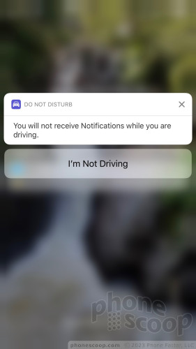
The Do Not Disturb mode has a new feature that blocks calls and texts when the phone senses you're in a moving vehicle. There are three settings: automatic, when connected to car Bluetooth, and manual. With the first, your iPhone will know when it is moving quickly enough that you're likely behind the wheel of a car and it will automatically turn on Do Not Disturb. The latter two are somewhat self explanatory. If you connect your iPhone to the car's Bluetooth radio (with or without CarPlay), the phone will jump into Do Not Disturb mode.
What does this mode do? It blocks calls, texts, and other notifications from reaching your handset. You can control it much like the regular Do Not Disturb mode. You have the option to allow your favorites to break through Do Not Disturb, as well as set an automated response to incoming calls/texts when in Do Not Disturb mode.
It actually works. When I put the iPhone in automatic mode, it definitely kicked on Do Not Disturb almost as soon as my car started moving. Your phone display lights up to let you know Do Not Disturb mode is on and anyone who calls will get your automated "I'm driving!" response. I did notice that the feature automatically engaged when I was on public transit, such as buses and trains. In these instances I had to disable the feature in order to respond to messages.
I like that Apple added this tool to iOS 11. I found it simple enough to control, though I wish Apple would go all the way here and create a CarPlay mode you can use right on your iPhone, the way Google created Android Auto for Android.
Apple Maps
Apple's navigation software gains two big tools: indoor maps for public spaces and lane guidance.
The indoor maps will eventually be helpful. Apple is starting with airports and shopping malls. For example, Amsterdam, London Heathrow, Las Vegas, Los Angeles, Miami, Philadelphia, and San Jose, are on deck to get indoor maps first. A little tag that says "look inside" appears next to the areas that offer indoor maps. Using them, you can navigate between points when inside the airport. This can be a killer travel companion. I was able to take a peek at Heathrow. It seemed to work pretty well. Apple hasn't said what malls it might light up with interior maps.
As for lane guidance, it worked pretty well. Google Maps, Waze, and competing nav services have offered lane guidance for years, so this is a long overdue feature. When navigating via Apple Maps, the software will tell you which lane to be in as you approach complicated interchanges. It works as advertised.
The app now also displays the current speed limit.
Apple Maps still isn't as good as Google Maps, but it does get better every year and it's certainly a fine app for iPhone owners to use as a default nav tool.
Messages / Send Money
Apple has two huge updates to its Message app this year: the streamlined app store experience, and cash transfers.
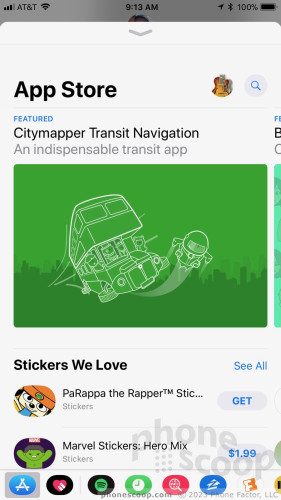
The Message App Store experience is definitely improved. When you first initiate or respond to a message, you'll see the little blue icon for the App Store. Tap it to load the App Store and tap it again to make the App Store go away. Your favorite Message apps are pinned in a dock that lines the bottom of the screen. You can swipe through the dock to quickly access a dozen or more favorites.
What do these let you do? Mostly, insert content from third-party apps directly into messages. For example, I was able to use the Spotify app to search for and send a link to the latest single from the Foo Fighters to my friend. The same goes for mundane stuff such as the weather, or more important stuff like directions. The App Store for Apple's Message app is chock full of fun and useful stuff. I like that the process of accessing the App Store has been streamlined, and I definitely like that you can tell it to go away.
The money-transfer tool will be a big deal … when it launches. Apple says the feature will be ready later this fall. You'll be able to transfer funds from an Apple Pay account to friends and family, all within Apple's Message app. This feature competes with Venmo and similar offerings from PayPal and Facebook. This will be clutch for reimbursing friends (and vice-versa) for those times when someone forgot to bring cash.
Apple was smart to bake the tool directly into its Messages app, but we weren't able to evaluate just how well it works. Google needs to work out something similar.
Siri
The big update for Siri this year is in the smarts department. Apple says it is employing more machine learning in order to make Siri smarter and better able to help you. On top of that, Siri has new voices.
Siri has been a part of our lexicon for six years now and is more often the butt of jokes than anything else. Siri took a big step forward in iOS 10 last year with third-party app integration and moves even further along thanks to the under-the-hood tweaking in iOS 11.
Apple says Siri is able to learn from user behavior and anticipate what you want and make suggestions before you think to ask the question. I'm not sure Siri is *that* smart, though I did begin to see Siri offer me tips on breaking news stories that I might otherwise have missed. In fact, a lot of Siri's improvements are found in Apple's own apps, where Siri digs in and learn the topics that interest you most. It's obvious if you make use of the Apple News widget on the home screen, which will fill up often with fresh content.
Siri is also better at looking through your past to determine your future. Specifically, Siri will remember the things you've looked at recently, be they movie times, concert tickets, or restaurant reservations, and do things such as autocomplete your text as you type. Siri will proactively suggest that you send movie times to friends, or give them an ETA if Siri senses you are en route. Siri has similar hooks buried in Safari, where it will now suggest searches based on your reading list or add flights to your calendar, and so on.
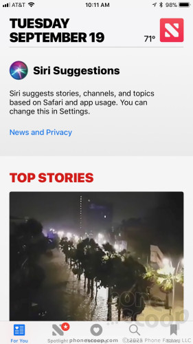
After using iOS 11 in near final form for about two weeks, I began to see these improvements appear throughout my experience. Remember, Siri needs to spend some time learning before it really kicks into gear. It gets better with time.
These are all things Google Assistant has been able to do well for years. Siri is still catching up.
What I like more than the more personal touch are Siri's new voices. Apple picked a handful of new voices (male and female, with several accents) and they are all more expressive and natural sounding. The halting, corny sound of Siri of old is gone and in its place is a somewhat warmer, friendlier tone that speaks faster and more… human.
Siri is better at speaking languages, too. Apple says Siri can translate U.S. English into Mandarin, French, German, Italian, and Spanish. I tried English to Spanish several times with a native Spanish speaker and he said "Siri does well enough to be useful." Translating languages in real time is old hat for Google.
Music
Apple hasn't given up on the idea of a music-based social network, at least not yet. Ping may be dead and buried, but the latest version of Apple Music is as social as ever.
With iOS 11, people can create a personal profile that contains details such as their favorite playlists, recent listens, and musical preferences. You'll have to add a photo, your name and username, as well as elect how public you want your profile to be, such as which playlists are visible to all. People can then subscribe to one another's profiles to see what everyone is listening to and then offer feedback. It's sort of how Spotify baked in support for Facebook several years ago.
Of course, this would all be terrible if notifications weren't involved somehow. That means you can get alerts every time a friend starts following you or listening to one of your playlists. You can also sign up for alerts for new releases, music mixes, or shows that might be nearby. Spotify offers features like this, too. (Google Play Music lags badly in this area.)
As with many things, you get out of this what you put into it. If you're all about sharing your musical experiences, then this can be a fun way to open up and discover new stuff. If you're a private person who doesn't want to participate, well, that's fine too, but don't get upset when no one compliments you on spinning "One Is the Loneliest Number."
Camera / Photos
The camera and photos apps each earn a few new tools, but they're difficult to suss out.
The camera app itself has more features than ever. You can still shoot regular photos, portraits, squares, videos, slow-mos, timelapses, and panoramas. The flash, HDR, timer, and Live Photos tools work the same as they ever have.
iOS 11 adds a new filter tool. Tap the filter icon in the corner and you'll see about a dozen options that range from warm to cool, and from saturated to black and white. The slider tool could be easier to use. I prefer camera apps that overlay the filters in a grid so you can see them all at once. This is the only really new functionality in the camera application. The real fun stuff is found in the Photos app.
Live Photos capture maybe 1 second of video ahead of when you press the shutter button. The result is an image with a small amount of movement. The problem with Live Photos is that they aren't totally shareable. Sure, you can push them to other Apple devices, and even share them in Facebook, but Live Photos are almost impossible to send to Android devices. Google has filled in this gap with its own app called Motion Stills. iOS 11 doesn't appear to solve the sharing problem (yet), but it does let you apply new tweaks to your moving pictures.
Live Photos can now take one of four different forms: the original Live Photo, loop, bounce, and long exposure. The loop tool sets the Live Photo to continuously repeat, while the bounce tool sets the Live Photo to run forwards and then backwards, bouncing back and forth. The long exposure tool takes the Live Photo's time value to give you a blurred image that paints the movement in broad brushstrokes. These are really neat, but you still can't share them with anyone other than iOS users. I like how easy it is to apply these treatments to your photo after the fact, though it does take a second or two to properly render in the Photos app.
There's one trick to accessing these features: you have to remember to shoot Live Photos in the first place. If you have Live Photos turned off (which I often do), you won't be able to apply any of these post-production tweaks. In other words, plan ahead or just leave Live Photos turned on.
The last new feature is called Memory Movies, which are dynamic videos optimized to play in both portrait and landscape orientation. The feature builds on the automatically generated "Memories" photo albums that Apple introduced last year. Now, the photo albums are converted into video format and paired with music. You can dial in different music effects, playback speed, and more. While it automatically generates the memories, you can take control and tweak them how you want. The videos are easy to share via the share sheet.
Google Photos is better for searching and organizing your pictures, particularly considering Google lets you store an unlimited number of photos for free. Apple's iCloud photo search tool is improved, but Apple needs to dramatically reduce the cost of iCloud storage in order to compete with Google.
Screenshots
Apple has finally made screenshots fun(ner). Before iOS 11, the screenshot function merely captured a screen image and sent it off to the photo library. Now, taking screenshots creates a thumbnail that you can tap to mark up.
The new screenshot editor lets you do lots of fun and useful things. For example, you can circle items, write text, crop the photo, and mark it up with a variety of pen types. The tool includes colors, shapes, arrows, magnifiers, and other ways to dive into the screenshot and let people know what you really think. Some of these functions used to be buried in the Photos app, and then buried again in a hidden tool called "markup." It's nice that Apple surfaced them in a usable way.
I also like how simple it is to share your marked up screenshots once you're done making them miniature masterpieces. The share card button is always available and screenshots can be emailed, iMessaged, texted, and sent just about any other way you can think.
LG and Samsung have offered these tools on their Android smartphones for years.
App Store
The App Store now includes a series of informative cards that slide around and fall away as you browse. Apps are featured by day. Upon launch, you'll see the Today tab, which tells you about the app of the day and the game of the day — each gets its own card. Tap the card and you'll see an entire article's worth of information about the app, including notes from the developer and a nice editorial from Apple. This gives you far more information about each app than was previously available.
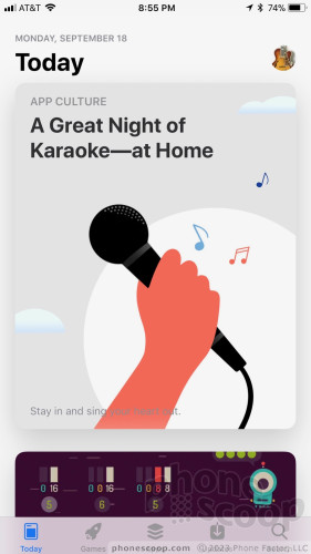
Below the main featured app or game, Apple has posted relevant and related titles, as well as tutorials and so on. If you keep scrolling downward, you'll see the app/game of the day from the previous day. You can scroll back through an entire week's worth of featured apps and games.
I can't say if the new design has helped me find or discover any wild and exciting new apps. Honestly, I usually go to the App Store with a specific app in mind and search for it.
Files
I never thought I'd see the day. Apple has added one small folder to iOS 11 and it changes everything. From the iPhone's birth, individual files have been locked away, marooned within the app that created them, inaccessible through any sort of file hierarchy. That's all changed now.
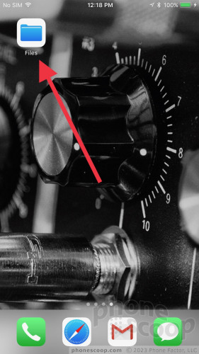
The new Files folder taps into your iCloud account. In it, you'll see a few initial folders to help get you started, such as desktop, documents, music memos, Numbers, Pages, Preview, and TextEdit. These can all be changed or dumped. You can sort the folders by name, date, size, or tags, and of course the tags come in a dozen different colors. You may view the folder via icon, via list, or via most-recently-accessed. These are all the sorting tricks I expect to see from a modern computer.
The Files folder focuses on your productivity apps, not your media apps. I think this is fine. It's much easier to find photos, videos, and songs within their respective apps (particularly if you're using search). All changes are synced back to iCloud and made available to your other Apple devices.
This behavior is akin to Google Drive and Docs / Sheets / Slides. I much prefer how Google Drive works, though this is a decent upgrade from Apple.
Sum
iOS 11 delivers some long-overdue features to Apple's iPhone, while also bringing in some unexpected elements of fun. Power users may love the Files folder, while creative types will have more fun applying bounce effects to their photos. Being able to send friends money via iMessage is simply practical and well within the power of tech companies to offer. I'm not sold on iOS 11's new social music behaviors, but I can't wait for Siri to get to know me better.
The biggest problems I see are all related to usability. The changes to the notification shade and control center, in particular, bug me a lot. There's no way Apple gets to claim that its operating system is still simple and user-friendly. I spend half my weekends troubleshooting iPhones for friends who can't figure it out.
In the end, I think the new powers that are buried in iOS 11 are good enough to make putting up with the initial headaches worth it.
Comments
Phonescoop, your bias toward Google is quite clear with the iOS 11 review!
The world does not revolve around android/google. You compared every feature and nuance of Apple's stellar iOS11 to google.
The new control panel is outstanding and easy to use. Not so says phone scoop. Even the default positions were sketchy according to you guys when I found it amazing and easy to use.
Not a word about how confusing android is to use. Just a nasty comment that ios11 is not easy and apparently your entire community needs to come to you to setup their iPhones, Joke!
You forget that iPod and iTunes saved the entire music industry and the latest version of iOS 11 iTunes is outstanding and ...
(continues)


 Samsung Refines its Foldable Phones
 iPhone 14 Plus Offers a Big Screen For Less
 iPhone 15 Series Goes All-In on USB-C and Dynamic Island
 Samsung S24 Series Adds More AI, Updates the Hardware
 iPhone 16 Brings More Features to All Price Points, Including New Camera Control


