Summer Preview
Jun 26, 2008, 1:37 AM by Eric Zeman & Rich Brome
updated Jun 26, 2008, 10:27 PM
Several companies gathered in NYC this week to show off their newest phones. Our hands-on report with the latest and greatest from HTC, Sony Ericsson, Nokia, and BlackBerry, complete with video tours.
Part 1
SE C905
The Sony Ericsson C905 is the first camera phone for the global market to offer resolution greater than 5 megapixels. There have been a few crazy zillion-megapixel phones for Korea, but the C905 is for everyone with its quad-band GSM and tri-band HSDPA (including 850/1900, ideal for AT&T's 3G network.) Sony Ericsson didn't just go a little over 5 megapixels, either. They truly leapfrogged the competition by stuffing a full 8-megapixel sensor into the C905.
The C905 is impressively small for what it is. It is a tad larger than many slider phones. However, past phones that pushed the limit on camera resolution often felt truly oversize (such as the K800;) the C905 does not have that too-bulky feeling. To fit such optics into a phone this pocket-friendly is impressive.
Handling the C905, I came away impressed. The buttons feel good and the fit and finish are high-quality. It's mostly plastic, but matte finish gives it a nice feel (and resists ugly smudges to boot.) The moving parts - the main slide and the lens cover - fit together like a Swiss watch. I can't recall ever seeing a slider phone with so little gap or play between its halves as the C905. What we handled was a prototype, of course, but these are things that usually only get better in final versions. Small chrome accents on the sides add a touch of class, without obviously aping the iPhone's chrome trim like so many other phones this year.
The lens cover on the C905 is one of its best features. After getting it right on the W800, Sony Ericsson proceeded to screw up the lens cover on subsequent flagship camera phones... until now. The K800 had a lens cover that protruded from the back quite a bit, making it tougher to slip in and out of your pocket and easy to slide by accident. The K850 had a useless internal cover that didn't actually protect the glass window from scratches or smudges at all.
For the C905, Sony Ericsson has developed a unique two-part sliding metal lens cover that forms a smooth, flush back surface when closed, yet opens easily to reveal the lens and activate the camera. Both metal panels lock in place when the cover is fully closed. The mechanism feels a little delicate when sliding it, but when fully open or closed, it feels rock-solid. This clever design is both stylish and highly functional. Although the C905 still has a "camera bulge", the slick lens cover design is quite effective in making the bulge less noticeable and bothersome.
The C905 contains the latest iteration of Sony Ericsson's great camera interface. The easy-to-use options pop up over the active viewfinder, and offer simple four-way navigation, putting the most common options just a few clicks away. Nearly every feature you could hope to find in a standalone digital camera is present, including scene modes, red-eye reduction, panorama mode, image stabilizer, and face detection.
As for the camera's hardware specs, the 8 megapixel sensor is accompanied by an auto-focus lens and a xenon flash (the serious kind.) A rotation sensor and GPS for geo-tagging are also included. An optical zoom is the only feature you would find on a standalone digital camera that you won't find here, but the laws of physics dictate that an optical zoom would add quite a bit to the size.
Another neat feature of the C905 is support for DLNA. This nifty technology standard lets you stream photo and video content to your TV using the C905's built-in WiFi. You'll need a DLNA-compatible TV or set-top box of some kind to receive this content. Sony Ericsson reps were predictably quick to point out that the Sony PlayStation 3 includes this functionality.
The C905 for Europe and Asia will not support US 3G networks, but the C905a for North America will. Both versions are currently planned to ship in Q4 2008.
Here's a quick video tour of the C905:
SE Z780
The Z780 is a clamshell-style 3G phone designed to sell for a mass-market (cheap) price point, while still providing decent specs and features.
The key features include a QVGA display, HSDPA 3G data, 2 megapixel camera, A-GPS, stereo Bluetooth, and memory card slot. Some things that keep the price down: the camera is not auto-focus, and the external display is monochrome. Still, the feature set is decent and the thin profile is a nice bonus.
The monochrome display is worth a few words. The text is huge and highly visible. Like many monochrome displays, it's much easier to read in most conditions than a cheap color display (the type typically used on outer displays.) It's one-line, so long text has a scrolling banner effect (which is very smooth.) The time and most contact names (for caller-ID) will fit just fine without scrolling, though.
The Z780 has been spotted in FCC documents sporting an AT&T logo. A nearly identical phone - the TM506 - has also been spotted, sporting a T-Mobile logo. The TM506 appears to differ from the Z780 only in supporting the 1700 band that T-Mobile uses for 3G, instead of the 850/1900 that AT&T uses.
Bottom line: it looks like both T-Mobile and AT&T plan to carry a version of this phone. Sony Ericsson says they currently plan to ship the Z780 in the US by the end of Q3.
Here is a short video preview of the Z780:
Nokia E71
Finally! Nokia finally got around to announcing the E71 and the E66, both of which have been floating around the Internet for the better part of six months. Both devices are updates to other models, the E71 being the progeny of the E61/62, and the E66 being the offspring of the E65. While these new E series devices bear a certain amount of resemblance to their forebears, they take Nokia's business line in a new direction.
The E71 is simply gorgeous. It is probably the most attractive QWERTY device out there. It is sleek, slender, light weight, and sets a new bar with its fine fit and finish. Materials are quality metals, and plastics made to resemble metal. The overall size is nearly that of the iPhone (perhaps 1mm shorter and narrower), but the E71 bests the E61/62 by a long shot when it comes to how thin it is. It is practically anemic. It feels comfortable in your hand, and isn't so wide or cumbersome that you don't like it. It will slip in and out of jeans pockets with ease.
Despite its small footprint, it packs in some serious usability. It has a full QWERTY keyboard. This keyboard is fairly narrow, but still manages to work well. The keys were simple plastic keys, but they had nice travel and feedback. Though we made some mistakes in our first test of the keyboard, we imagine with regular use, one will get used to how small it is. Speaking of small, the navigation cluster is perhaps the E71s only sticking point. Nokia really reduced the size of all the keys surrounding the D-pad (there are eight of them). I found them to be a little bit difficult to hit accurately with my thumb, given their proximity to one another. The D-pad itself looks as though it was lifted directly from the E51, which bears a striking family resemblance to the E71. It is square, with a large button in the center. It works well enough for navigating around the phone's screen.
Ah, the screen. Nokia stuffed the largest screen possible into the E71. It isn't as big as the screen on the E61/62, but it is large enough to suit most purposes. The resolution is high enough that icons, pictures and other items on the screen looked clear and sharp. The screen is also bright.
The E71 comes loaded with a 3.2 megapixel auto-focus camera with flash. This camera is flat-out one of the fastest auto-focusing cameras we've ever seen. Pressing the shutter release button focuses and snaps the picture nearly instantaneously (see the video). According to Nokia, the E71 is being powered by a much faster processor than on other phones. The media software has been improved a little bit, but it isn't as robust (or as fun to use) as its N series cousins.
It has 3G, WiFi, stereo Bluetooth, support for microSD cards and much, much more. You name it, the E71 probably has it.
Overall, we're very excited about this phone. It may have taken Nokia a few steps to get here, but the E71 is what QWERTY phones should be all about.
Here is a video preview:
Nokia E66
The E66 has all the same features and functions that the E71 has, it just comes packaged in different skin. The changes compared to the E65 are fairly subtle. The overall footprint and basic appearance are the same. This slider phone is long and narrow. You can easily wrap your hand around it, though it will be sticking out at both ends. The materials are nice and classy, and definitely say "business" more than "fashion".
The E66 has a large screen, with a nicely-sized set of function buttons below it. Though the D-pad was identical to the E71's, the function keys surrounding the D-pad were much larger, and this goes a long way to improving usability. They were easy to find and push, with lots of good travel and feedback.
The slider mechanism felt very solid and strong. We're not sure if this was a pre-production unit or not, but it felt final to us. The quality of the slider was top-notch. With the slider popped up, you can access the keypad. These buttons are nicely sized and have excellent travel and feedback.
The camera didn't react quite as fast as that of the E71, but it was still fast enough. It fired the flash when appropriate, and used the typical S60 tools for editing and manipulating photos after they are done.
In summary, the E66 is a powerful business-class device that shuns the QWERTY look in favor of the slider form factor. If you need the powerful capabilities of a smartphone, but not necessarily the looks, the E66 should be in the mix of devices that you consider.
Here is a video preview:
BlackBerry Bold
The new Bold from BlackBerry is a BlackBerry done right. If you think of all the changes that BlackBerries have undergone over the past few years, they've mostly been evolutionary. All the current designs stem from the success of the Pearl, which was the first BlackBerry to use the trackball for navigation. But that design is nearly two years old. The Bold takes BlackBerry in a new direction.
Gone are the straight-laced plastics and squarish designs, and in comes the chrome and black leather, baby! (Seriously, the back of the Bold is covered in black leather.) The front of the device has been given a thorough make-over. It has smooth lines and chrome accents that flow around the phone. It is simply a good looking phone. But it is a large one. It is about the same size as the current 8800 series smartphones from RIM, though the rounded edges make up for that a bit. It is also a bit thicker than we'd like it to be. But these minor detractions don't take away from the phone's luster. When you see it, you can't help but want to reach out and touch it. You can't quote close your hand all the way around it, but the way it sits in your hand is by no means uncomfortable. Despite its size, it will fit in your jeans pocket without too much trouble.

The Bold carries over the trackball for navigation, but the function keys and keyboard have been redesigned a bit. There are no nubby keys on this BlackBerry. The keyboard is a nice smooth arch from one end to the other, and feels very comfortable to use. It is wide enough that your thumbs don't feel cramped using it, but not so wide as to make you feel as though each key requires your thumb to travel miles to reach it. The buttons have sloped surfaces and are made of glossy plastic. We found it to be very easy to type with. The trackball has been embedded a bit further into the phone than on previous models. RIM staffers reminded us that the software for the device is still not final, so we weren't surprised to see that the trackball didn't work perfectly.
Aside from these obvious hardware improvements are some more serious changes. The BlackBerry OS has been updated. The updates include all-new media applications, improved icons and themes, as well as other under-the-hood enhancements that weren't immediately apparent to our eyes. The home screen and main menu have seen the most drastic changes, with an all new look. The basic function and way that the menus work appears to be similar to that of current BlackBerries, but it just looks so much better on the Bold.
The music application borrows heavily from its predecessor, but the media player itself has a refreshed UI with nice icons and graphics. Sorting through your playlists and such is a breeze. The camera software has been upgraded modestly, with better zoom functionality. The gallery app is also much nicer.
The browser and mapping application are both quite good. The trackball is put to very good use, with most zoom and scroll action functioning intuitively without your thumb ever leaving the trackball. In the maps, clicking the trackball toggles between panning and zoom modes.
A cursor in the browser lets you scroll around and click on any area to zoom in. The rendering comes close to a desktop version, except the text size is cranked up quite a bit to make everything easier to read. That's fine for many sites, but can cause the layout to get funky on other sites. A smart zooming causes text columns to fill the screen perfectly with one click. The fast speed provided by 3G data is apparent and much appreciated in both applications.
Unfortunately the devices that RIM had on hand did not have full inboxes, so we weren't able to get a sense of what the email and messaging experience of the Bold is all about. This is a shame, because it is obviously the device's primary attraction. What we were able to see showed a very slight update to the appearance of the inbox. It is more appealing to the eye, less utilitarian.
Once you dig down several layers from the revised menus and icons, you begin to see those old black and white BlackBerry menus appear, so this means RIM didn't take the underlying code too far from its roots. Still, the basic experience you get with the Bold is much closer to that of a feature phone, than with a business device with some features slapped in for good measure. The multimedia functions feel like less of an afterthought. That's a good thing.
Here is a short video preview of the Bold:
Part 2
HTC Touch Pro
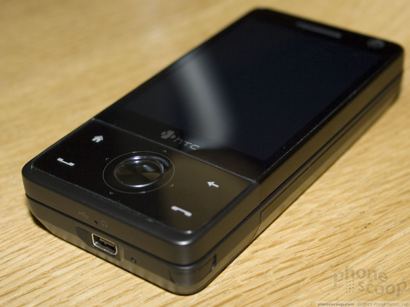
We met with HTC in NYC this week, and had some hands-on time with the recently-announced Touch Pro.
As most people assumed from the initial press photos, it's basically the Touch Diamond with a slide-out keyboard, and thicker. The thickness of the Pro is disappointing, (especially when you set it next to the thin Diamond,) but we were pleased to see that it's essentially the same size as the Diamond in the other dimensions.
We were encouraged by the high-quality feel of the device, and the new Diamond-like styling is a huge improvement in the looks department over the models it will replace. It even boasts a few tweaks to the deign that some people will consider improvements, such as a matte-finish back and slightly rounded corners.
more
We also had additional hands-on time with the Motorola ZINE ZN5. We added our new photos and video to our existing hands-on preview of the Motorola ZN5.
Comments
I want this smartphone bad!!!
I just hope it doesn't cost too, too much when it becomes available tn purchase unlocked, I saw the Touch Pro at simoncells.com, there just isn't a price yet. It sure is a beautiful device, if only it had a 3.5mm headphone jack it'd be perfect!!!
I can't wait to see what LG has...
T-Mobile Bold?
The rumors are that a "Javelin" variant is slated for T-Mobile. If the rumors are true, it's similar to the Bold, but also quite different in some ways. I'm not sure whether it would...
(continues)


 Review: Nokia E71
 BlackBerry Makes a Bold Debut with the 9000
 Samsung Refines its Foldable Phones
 iPhone 14 Plus Offers a Big Screen For Less
 iPhone 15 Series Goes All-In on USB-C and Dynamic Island
 BlackBerry Bold 9000
 HTC Fuze / Touch Pro (GSM)
 Nokia E71 / E71x

