Review: Blu Vivo X
Lock Screen
The phone has a pretty bare bones lock screen experience. The Vivo X does not offer any sort of active display. Notifications will illuminate the notification LED if you want them to, but that's it. A quick press of the screen lock button calls up the lock screen. The time and date are placed in a thin dock that is crammed against the bottom of the screen. The dock also houses a shortcut to the camera. You cannot alter the dock. Like most Android phones, notifications pile up in the center of the screen.
I found the fingerprint reader relatively easy to train. It was faster and more reliable than the reader on the Blu S1, but not quite as quick as today's best phones. In addition to securing the phone, you can rely on your fingerprint to unlock a private folder for those sensitive files.
Home Screens
Blu ships the Vivo X with Android 7.1 Nougat, which, seven months after the debut of Android 8 Oreo, is annoying. The experience is mostly stock Android, so at least there's that.
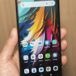
Thankfully, the home screen panels behave like the majority of Android devices. Feel free to customize your home screens with wallpapers, app shortcuts, and widgets. You can adjust the font and icon sizes, which lets you fit more on the screen if you wish.
The phone includes the Google Now screen, which means the left-most home panel is the Google app customized with your content.
The app drawer delivers a standard Android experience, but the settings menu and Quick Settings shade do not. The settings menu carries Blu designs and arrangements.
Rather than drop down from the top of the screen, the "Control Center" is accessed by swiping up from the bottom of the display. This is a UI skin idea we saw from Blu way back in 2016. It functions a lot like the old Control Center did on iPhones running iOS 10. It is here that you adjust screen brightness and toggle on/off various functions. At the same time, notifications are still accessed by swiping down form the top of the screen. This arrangement makes for a lot of swiping.
Blu opted for a MediaTek Helio P25 processor with eight cores clocked at 2.6 GHz. It's paired with 4 GB of RAM and 64 of storage. I found the phone ran well. It never felt laggy or slow. Apps were quick to open and screen transitions were smooth. The P25 provides more than enough oomph for the Vivo X.
Camera
There's a lot going on with this camera app. The quickest, most reliable way to open the camera is to double-press the screen lock button. It opens in about 1 second.
The main viewfinder is crammed with features. A strip of basic toggles/controls lines the far left side of the screen, while the core shooting modes are listed next to the shutter buttons on the right side. Much like the iPhone and Galaxy camera apps, the main shooting modes are accessed by swiping the entire viewfinder. The modes include photo, video, night, backlight, face beauty, panorama, and professional.
The professional (manual) mode allows you to adjust focus, shutter speed (up to 12 seconds), white balance, ISO, and exposure. These tools are easy to manage thanks to rotating dials that appear on the screen. I like that you can open all the dials at once.
Then there are the ancillary shooting modes, which include time-lapse, slow motion, text recognition, GIF, PicNote, smart scan (QR codes), mood photo, card scanner, translation, and group selfie.
The text recognition mode lets you shoot pics of most any text and turn it into an editable document. That's helpful and it works well. The card scanner is for business cards and easily adds them directly to your contacts. The translation function supports a huge number of language combinations. It's a hair slow, but can handle paragraphs at a time. The PicNote tool captures a PDF rather than a photo and then allows you to annotate it with text, graphics, and such.
The group selfie tool is sort of like a panorama. It requires you to take several pictures rather than just a single wide-angle shot. SInce the user-facing camera has a wide-angle lens, this is a redundant and useless feature. The mood photo tool captures pix that are filtered similar to Instagram and then framed in Polaroid-style borders with room for captions.
A standard set of filters is available if you want. A bokeh function is also on board for taking shots with blurred backgrounds. I like that you can adjust the level of background blur before you take the picture.
It's a chaotic camera app, but it is chock full of advanced features.
Photos/Video
Have I mentioned that the Vivo X has four cameras? Yeah. Two on the back and two on the front.
The main rear cameras are composed of a 13-megapixel / 5-megapixel combo at f/2.0. The secondary sensor here is used to capture depth-of-field and contrast information in order to help with the bokeh effects.
I was mostly pleased with the pictures I took with the phone. Indoor shots turned out pretty good considering the range of light (see mall shots). I did notice more grain than I cared for in some indoor shots. Outdoor shots were more apt to be brightly exposed and colorful. Focus was excellent and the majority of pix I captured were sharp and clean.
The bokeh shots were really inconsistent. You can see in the pix of E.T below that half the figure is in focus and half isn't. The bokeh shooting tool includes a dial to control how much background blur there is and I recommend using as little as possible. This at least ensures your subject will be in focus. The other shooting modes offer fine results, but it takes practice to get the best pictures.
The selfie cameras offer more flexibility than most. Here, you have a 20-megapixel / 8-megapixel combo at f/2.0. The main sensor captures standard view shots, while the second sensor captures 120-degree wide-angle shots. The selfie cameras include a screen-based flash for low-light shooting, and many of the standard camera shooting styles are available in selfie mode (face beauty, backlight, etc.).
Selfie shots are generally sharp and well exposed, but saturated with grain no matter how much light is available. The bokeh effect is even more inconsistent when shooting selfies. I do like the super wide-angle shots. Wide-angle selfies are a real thing and need to be available on more phones. (Again, this is in addition to the group selfie tool.) The beautification tools are respectable and don't overdo the makeup effect.
The phone is limited to capturing video up to full HD in resolution (no 4K). The footage I captured looked very good.
I do think most people will be happy using the Vivo X as their main camera, it just takes a bit of practice to get the best results.


 Blu Vivo X Boasts 4 Cameras, 6-Inch 18:9 Display
 Samsung Refreshes Galaxy S Series with S Pen, New Cameras
 Samsung Refines its Foldable Phones
 iPhone 14 Plus Offers a Big Screen For Less
 Samsung S24 Series Adds More AI, Updates the Hardware


