Modern Phones Call for New Case Designs
Oct 23, 2019, 3:00 PM by Rich Brome @richbrome

It may not seem like phones have changed much since the first iPhone came out. But there are a few key trends in recent years that change the relationship between our phones and our hands. Phone cases exist precisely at that crucial interface point, and I argue that they haven't kept up with two key trends: wider phones and gesture-based interfaces. These developments clash badly with current case designs. But there's a better way....
Phone Size: How Wide is Too Wide?
Everyone wants the largest screen in the smallest phone, and that's something phone makers have been making great progress on in recent years, with progressively smaller bezels (the inactive areas around the display.)
Phone designers have also responded to the demand for larger screens by simply making phones larger as well. The question is: how large is too large? That's exactly what the industry has been trying to figure out in recent years.
With today's large, all-screen phone designs, we've nearly reached the limit of how much screen we can put in the palm of your hand comfortably. On the issue of what's comfortable to hold, one specific measurement stands out. Phone makers can only make a phone so wide before it's simply too difficult for the average human to hold in their hand.
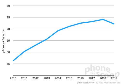
Average width of US phones over past 10 years

We've reached that limit. As you can see in the chart above, the average width of phones in our spec database went down this year compared to last. It's the first time that's happened, and it's a sign that the industry went too far in 2018. After years of experimenting with ever-larger phones, we now know how wide a phone should be.
Width is a game of millimeters. The standard-size flagship phones of 2019 all clock in at around 70mm wide. That seems to feel pretty good to most people. The larger "Max", "XL", and "Plus" versions average closer to 75mm. That seems to work well for people with larger hands, (or those who are willing to make a comfort trade-off in order to get a larger screen.)
Add just a few millimeters in width, and the feeling changes completely. And yet that's exactly what adding a case does to your phone. Factor in the extra thickness that a case adds to your phone, and it's even worse. We know how wide our phones should be to fit in our hands, and yet we routinely make them wider.
The Solution
But you have to make a width sacrifice for protection, right? Not so fast. There is an alternative, and Asus is here to show us how it's done:
The "Aero" case that Asus includes with its new ROG Phone II solves this problem neatly by leaving the sides exposed right where your hand grips the phone. The ROG Phone II clocks in at a whopping 78mm wide; any wider would definitely be too wide. But it's a solution that makes sense for most any modern phone.
The Aero case still provides excellent drop protection by wrapping around all four corners and providing little bump-outs on the front to ensure the screen doesn't take the hit if you drop it face-down on a hard, flat surface. I drop-tested the Aero case several times on the sidewalks of NYC, and it protected the phone perfectly.
The Android 10 Gesture Problem
Android 10 introduces a major new system-wide gesture: swiping in from either side edge to go "back". It requires that you start with your fingertip at the very edge of the screen. It takes getting used to this gesture, but once you do, it's pretty great. I was very skeptical at first, but it's now one of my favorite features of Android.

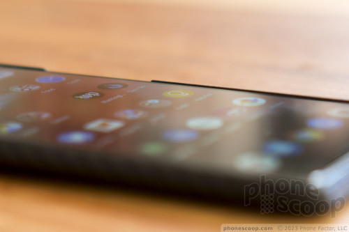
The problem is that most traditional cases get in the way of this gesture. Even with the very thinnest cases, most have a small ridge sticking up next to the sides of the display. This not only makes the new back gesture uncomfortable on your fingertip, but actually makes it much more difficult to perform reliably. This has quickly become apparent (and annoying) with most of the cases and Android 10 phones I've tried in the weeks since Android 10 came out.
Again, the Aero case neatly solves this problem by leaving the sides unencumbered.
Most phones now come with front glass that's gently rounded at the edges, precisely to make swipe gestures more comfortable on your fingertip. It doesn't make sense that we then ruin that experience with a case that adds uncomfortable ridges to the edges of the display.
Between our new-found maximum phone width, and the Android 10 back gesture, I think the time has come for more phone cases that leave the sides exposed in the middle.
Comments
No messages


 Samsung Refreshes Galaxy S Series with S Pen, New Cameras
 Samsung Refines its Foldable Phones
 iPhone 14 Plus Offers a Big Screen For Less
 Hands On with the 2023 moto g 5G & moto g stylus
 iPhone 15 Series Goes All-In on USB-C and Dynamic Island


