Review: HTC Touch Diamond
Phone Scoop has covered Windows Mobile 6 already, but we haven't given a lot of attention to HTC's TouchFLO 3D user interface. When it comes to interacting with the Diamond, I highly recommend that you avoid the WinMo aspects of the UI and do everything possible within TouchFLO.
The reason for this is simple. Windows Mobile Professional still operates with the expectation that you're going to use a stylus. That means the buttons, tabs, boxes and other things you need to interact with on the screen are too darned small for your finger to effectively use it. HTC knows this, and devised the TouchFLO overlay to make using Windows Mobile less painful.
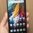
The basic home screen within TouchFLO 3D shows you a nice big clock, your missed calls, voicemails, messages and so on. Running along the bottom of the screen is adock with icons in it. You can poke at any of the visible icons to open up that application, or you can swipe your finger across the carousel to shuffle through the applications. The animations and graphics are nicely done.
Most of these icons actually open or lead to applications, though several show lists of other applications or tasks. The settings tab, for instance, shows a number of selections for customizing the phone grouped into things that make sense, such as "sound," "wallpaper", and so on.
As you shuffle through the carousel, the two function buttons change to action items that are relevant to each application. I particularly liked that the Browser tab allows you to launch the browser itself, but also lists your bookmarks, so you can choose to go straight to a particular Web site if you wish.
Little touches like that make TouchFLO 3D much more enjoyable than Windows Mobile. Heck, it is much more enjoyable than many other phone UIs right now.
The problem with all of this is, it is absolutely jarring when you are forced to interact with Windows Mobile itself.


 HTC Announces Touch Diamond
 Samsung Refines its Foldable Phones
 iPhone 14 Plus Offers a Big Screen For Less
 JBL Puts a Touchscreen on its Earbuds Case
 Google Brings Nearby Share to Windows
 HTC Touch Diamond (CDMA)


