Review: BlackBerry Pearl Flip
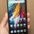
The Pearl Flip comes with the latest version of the BlackBerry OS, which has thankfully been refreshed. It uses all new icons and colors to signify everything and the new theme is called Precision. Out of the box, the basic appearance of the home screen includes your T-Mobile MyFaves in the center of the screen, with a row of five icons running along the bottom. Scrolling the trackball left or right cycles through your MyFaves. If you want to get to the five icons below, you have to scroll down first, and then left or right. These five icons are shortcuts to Messaging, Contacts, Calendar, the Browser and your faves.
Hitting the BlackBerry key - as on all BlackBerries - is where the magic takes place. This button brings up the full menu on the Flip. Here you'll find a grid of 20 icons representing all of the phone's functions. The icons are mostly intuitive and you can figure them out easily enough.
Drilling down beyond this set of icons, though, and things start to look more familiar. The underlying architecture of the BlackBerry OS is the same, which mean menus, menus, and more menus. If you want to do anything, hit the BlackBerry key, and a long list of action items appears. Most often, RIM's software automatically highlights the selection you're probably most interested in. For example, if you tap the BB key when browsing the web, the Web menu appears, and the "Go To Web Page" action item is automatically selected.
The one thing I noticed with the Flip was a bit of a lag. You'd press the trackball to access an application or menu, and there would be a small delay before that app or menu opened or loaded.
In all, though, the BlackBerry menu system is easier than ever to figure out.


 CTIA Fall 2008
 TCL's New Foldable Concept Swings Both Ways
 iPhone 14 Plus Offers a Big Screen For Less
 Hands On with Teams-Certified Bluetooth Earbuds
 Asus Goes Big with Zenfone 11 Ultra
 BlackBerry Pearl Flip 8220


