Review: BlackBerry Storm
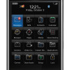
From a distance, there is little to set the Storm apart from the increasingly crowded field of touch-based devices. It's black and has gray and silver accents. RIM did not stretch any design boundaries here. It is sophisticated and elegant, but not unique.
Though the width is nearly identical to that of devices such as the iPhone, the added girth around the waist makes it feel way bigger in your hand. It fills your palm completely. Because the Storm is shaped a bit like a trapezoid (when viewed from the side); the front surface is actually larger than the back surface. You can feel this when you try to wrap your hands all the way around the Storm. It feels big. Darned big. It is solid, but not overly weighty. You're going to notice it in your pocket.
There are five buttons on the front of the Storm. The first is the screen itself. Yes, it's one big-ass button. The screen has just about the same travel and feedback over its entire surface, though the corners have a bit more flex to them. There is a very satisfying click when you press the screen...most of the time.
Below the screen are four more buttons: the send key, BlackBerry key, Back key and End key. All four have good travel and feedback. Sliding your thumb from the screen down to these four buttons makes them easy to find. It is a bit difficult to differentiate between the keys as you slide your thumb across the four buttons from side to side, though.
Along the top edge of the phone are two keys. On the left is the lock/unlock key and on the right is the mute/silence key. These keys are pretty well hidden, and you may not notice them at first. They are built into the plastics of the Storm, so there is no way to tell that your thumb is on them. Thankfully, they are all the way up against the Storm's outer edge, so find the edge with your thumb, and you've found the button.
On the left side of the phone is the voice-command key. I'll be darned if I wasn't pressing it every five seconds and accidentally starting the voice-command application. This really ticked me off. It's just too easy to press. It has three little bumps on it that make it very findable. Just below it is the microUSB port for charging and data transfer.
The right side holds the 3.5mm headset jack at the very top. Just below it is the volume toggle / camera zoom key. The key is very easy to find, but travel and feedback are a bit mushy. Last up is the two-stage camera key. This button sticks up a bit more, and has two distinct clicks as you press to focus the camera and take a picture.
The back surface of the Storm is brushed metal, which I have to say I really like. In order to remove it, you have to press two clasps on either side of it simultaneously. Only then will it come off. Under it is the battery, microSD slot (hot swapping is possible) and the Verizon Wireless SIM card.


 RIM's First Touch Device, the BlackBerry Storm, Emerges
 What is C Band 5G?
 iOS 16 Revamps the Lock Screen
 JBL Puts a Touchscreen on its Earbuds Case
 Google Overhauls Android's Parental Controls
 BlackBerry Storm 9530


