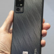
Review: AT&T Quickfire
The Quickfire's menu system has been well adapted for touch-based input. With the phone in the closed position, there are the now-familiar four icons running across the bottom of the screen. These take you to the main menu, the dial-pad / phone, your music, or your contacts. Each button is perfectly sized for pressing with your finger. The button between the send/end keys along the bottom of the phone always brings up a short box of applications, including the main menu, calling features, messaging, browser and music player, no matter what screen you're on.
The 12-icon grid in the main menu is what you expect to see on an AT&T feature phone. This first page is easily used, but subsequent pages further into the menu are a bit trickier.
Once you navigate deeper than the main menu, it switches from finger-friendly buttons to finger-fooling lists. The lists are smaller and more difficult to press. In addition, due to the unresponsiveness of the screen, you'll find that panning around these listed menus is a bit frustrating. Rather than really flick up and down as on other touch devioces, there is a scroll bar on the right side of the screen which is used to drag the menu up or down. It only scrolls one whole screen at a time. It's not smooth scrolling, in fact it's not even line-by-line. The extreme jumping from screen to screen makes it hard to tell where you are.
At the top of each menu screen is a software "back" button to take you to the previous screen.
When you open the screen and hold the phone sideways, the Quickfire changes its behavior. Rather than show you a sideways view of the home screen, it brings up a mini-menu with five options. These options are geared towards messaging functions of the Quickfire, as that's what the software assumes you want to do with the phone open. They are Messaging, Email, IM, Address Book and another button to open the full menu. This makes sense.
Unlike many other phones we've tested, the Quickfire re-orients itself immediately. There is no delay in switching between landscape and portrait mode.
In all, the menu system is simple and to the point, which is exactly how we like it.


 AT&T Fires Off Four Messaging Devices
 Hands On with the TCL Stylus 5G
 iPhone 15 Series Goes All-In on USB-C and Dynamic Island
 iMovie Makes it Easier to Create Polished Videos
 iOS 16 Revamps the Lock Screen
 PCD QuickFire


