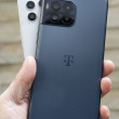
Review: Samsung Impression
The Impression uses Samsung's TouchWiz user interface. The best part about TouchWiz is the home screen. The home screen is a fully customizable desktop area where you can drag and drop widgets and shortcuts to pretty much any application you want. When you first get the phone, you'll see a little tab on the left side of the screen close to the top of the phone. Touch this tab and a dock pops up from the left side, similar to the dock in Mac OS X. The dock is easily opened and closed with this little tab. Here, you can snag the widgets and drop them onto the desktop, or you can take them from the desktop and drop them back into the dock. You can also open applications directly from the dock.
There are 20 widgets in the dock, though only about 6 fit on the screen at any one time. You can scroll the dock up and down to see the other widgets in there. Using the menus, you can control which widgets are visible and which aren't. The default is to make them all visible.
The home screen also holds three permanent icons at the bottom: Dial, Contacts, and Menu, It doesn't take a rocket scientist to figure out what each of them does. The main menu holds 12 icons for AT&T's services in a basic grid. All the subsequent menus that you find as you dig deeper into the phone are lists. You can't change the way any of these menus look. What you see is what you get.


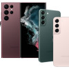 Samsung Refreshes Galaxy S Series with S Pen, New Cameras
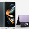 Samsung Refines its Foldable Phones
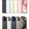 iPhone 15 Series Goes All-In on USB-C and Dynamic Island
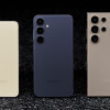 Samsung S24 Series Adds More AI, Updates the Hardware
 Samsung Galaxy A53 Coming to US in Two Weeks
 Samsung Impression SGH-A877

