Review: HTC Touch Pro2
Sep 14, 2009, 3:35 PM by Eric M. Zeman
HTC has customized its Touch Pro 2 smartphone for Sprint, T-Mobile and Verizon Wireless. Each specific version has small advantages over the others, but all versions offer a bevy of features aimed at the business user.
Form
Is It Your Type?

For business types that want — nay, need — it all, the Touch Pro 2 from HTC should be on your shopping list. Huge screen? Check. Great keyboard? Check. Powerful business apps and tools? Check. Svelte and sexy design? Er, not so much.
Body
There's no beating around the bush. The Touch Pro 2 (TP2) from HTC is absolutely ginormous. It's literally the size of two iPhones stacked on top of one another — big. Big. BIG. What's worse, it weighs a ton (OK, really only 6.61 oz, but still...). This is not a fashionable phone that's going to slip easily into tight pockets. No. This is the type of phone you expect to see sitting on a table next to a businessman at the airport, not out at the club on a Saturday night. The TP2 conforms to the business-y mold. That means it is professional looking, clean cut, and dressed up for work.
It feels like a brick in your hand. The weight and size are obvious when you hold it. When closed, it is difficult to wrap your hand all the way around it.
The front of the phone has just four buttons, and they are crammed way down at the very bottom edge. They are the send/end keys, home key and back key. I understand that HTC had to stick them there so the zoom tool (more on that later) could fit below the screen, but these buttons feel squished just the same. On top of that, they are a bit mushy, with minimal travel and feedback. I expect better from HTC.
On the left side of the phone you'll find the volume toggle closer to the top. It is easy enough to find and has good travel and feedback. Below it is a hatch covering the microSD slot. If you have no fingernails, you won't be able to get this hatch open. It takes a bit of work. The miniUSB port is on the bottom, as is access to the stylus, which is tucked away in the corner. (The Sprint version has a 3.5mm headset jack on the bottom, the T-Mobile version does not.) On the right side of the phone you'll see only a small hole for resetting the device. On the back is the camera. Below the camera is a stroke of genius — a mute key. HTC knows that users of this device are likely to use it for conference calls. The mute button will mute the TP2's microphone when the speakerphone is on so you can avoid any gaffes when conducting business. Very nice.
The slider mechanism that moves the screen to reveal the full QWERTY keyboard feels as though it could withstand the force of a tank. It's tough and solid, but that doesn't mean it is difficult to open. Similar to the Tilt from several years ago, the TP2's screen tilts up to about a 45 degree angle. This makes viewing the screen easier when using the keyboard. The hinge that tilts the screen up also feels solid and strong. The TP2 feels well balanced when open. I didn't experience any fatigue in my hands when holding or typing on the device for extended periods.
The TP2's keyboard is generously large. It has five full rows, with lots of nice little touches. For example, there are keyboard shortcuts to create text messages, to access email, to launch the browser and to launch the phone's communications manager. I've always appreciated that HTC puts a little indicator light on its keyboard to let you know when you've hit the CAP or ALT key. The keys themselves have a soft-touch paint feel to them. Each key stands out from the surface of the keyboard itself just enough so that you can tell them apart as you move your fingers across the keyboard. They all have the right amount of travel and feedback. My only real complaint about the keyboard is that I wish the space key were larger.
In all, everything about the TP2 implies that it is to be used for productivity purposes. Type this. File that. Email them.
The Three S's
Screen
The TP2's screen is absolutely gorgeous. It measures 3.6 inches and packs in 480 x 800 pixels — and boy can you tell. Everything looks fantastic on the display. Pictures, web sites and emails are crystal clear and even the smallest fonts are easy to read. Visibility in the sun was a bit more difficult than I would have liked but it wasn't worse off than most phones in that respect. It was also prone to becoming smudged, but that's simply the new reality of touch phones.
Signal
In our tests, we were able to compare the T-Mobile HTC Touch Pro 2 side-by-side with the one being distributed by Sprint.
T-Mobile: The T-Mobile variant didn't do so well in gathering signal. Compared to other T-Mobile phones, it definitely registered fewer bars. I didn't miss any calls, though there were a few times when voicemails didn't show up for a while. Connecting to T-Mobile's 3G data network never presented any challenges. It always managed to connect, though there were a few times when it stalled a bit before connecting. It's good to see another smartphone on T-Mobile's network pick up 3G. Nonoe of T-Mo's BlackBerries have 3G yet, for example.
Sprint: The Sprint variant of the TP2 performed better on the signal strength tests. It was consistently finding Sprint's 3G network. I didn't miss any calls or messages. Connecting to the Internet was a breeze. Voicemails arrived immediately. Sprint's version can roam internationally on quad-band GSM/EDGE and 2100 WCDMA networks, as well.
Sound
Ringers for the TP2 were reasonably loud, but not ear-drum-shattering. You're probably not going to miss a call if the phone is somewhere on the same floor as you are (such as in an apartment), but if it is downstairs and you are upstairs, I wouldn't be surprised if you don't hear it. The earpiece was better. I was able to hear callers just fine even in somewhat noisy spaces, such as a mall or a coffee shop. Quality of phone calls was good. I heard few pops, hissing or other weird noises on either phone (Sprint and T-Mobile). The speakerphone was impressive. It was very loud and clear. I often use speakerphone for business calls, and the Touch Pro 2 did a great job.
Battery
With such a huge screen and so many radios connecting to so many different wireless services, I was not at all surprised that the TP2 only managed to get through about 1.5 days on a single charge. If you need to go out of town, take the charger. Or a spare battery.
Basics
Menus
The TP2 runs HTC's TouchFLO user interface on top of Windows Mobile 6.1. When it comes to interacting with the TP2, I highly recommend that you avoid the WinMo aspects of the UI and do everything possible within TouchFLO.
The reason for this is simple. Windows Mobile Professional 6.1 still operates with the expectation that you're going to use a stylus. That means the buttons, tabs, boxes and other things you need to interact with on the screen are too darned small for your finger to effectively use it. HTC knows this, and devised the TouchFLO overlay to make using Windows Mobile less painful.
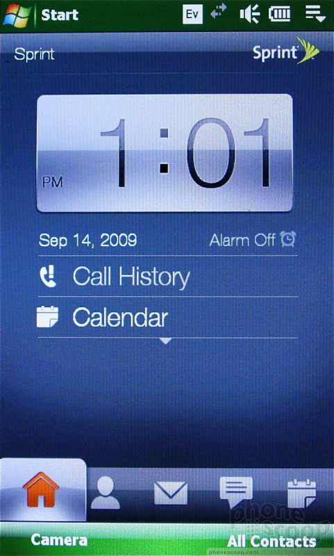
The basic home screen within TouchFLO 3D shows you a nice big clock, your missed calls, voicemails, messages and so on. Running along the bottom of the screen is a dock with icons. You can poke at any of the visible icons to open up that application, or you can swipe your finger across the dock like a slider control to shuffle through the applications. The animations and graphics are nicely done.
Most of these icons actually open or lead to applications, though several show lists of other applications or tasks. The settings tab, for instance, shows a number of selections for customizing the phone grouped into things that make sense, such as "sound," "wallpaper", and so on.
As you shuffle through the carousel, the two function buttons change to action items that are relevant to each application. I particularly liked that the Browser tab allows you to launch the browser itself, but also lists your bookmarks, so you can choose to go straight to a particular Web site if you wish. Little touches like that make TouchFLO 3D much more enjoyable than Windows Mobile. The user interface is designed well enough that even a complete newbie to WinMo phones is going to be able to access and interact with all the systems that they need to with no problems.
The problem with all of this is, it is absolutely jarring when you are forced to interact with Windows Mobile itself. WinMo 6.1 feels as dated as it looks. Windows Mobile 6.5 can't arrive quickly enough.
One last comment. If you were hoping that HTC was able to cure the TP2 of any lag, prepare for disappointment. I noticed plenty of lag when using the TP2. The Touch Pro2 has a 528MHz processor. This is just too slow. A lot of competing models are sporting 612MHz or higher processors. The TP2's 528MHz just doesn't seem to have the power necessary to make TouchFLO 3D, er, well, flow.
Calls/Contacts
Calls
With the TP2 set to the "Home" screen, one of the two function buttons is labeled "Phone" and takes you to the software dialer. Since there is a listing of your missed calls as part of the home screen, you can also choose to press that to see your recent calls. Alternately, you can always press the send key to bring up the dialer, no matter what other screen you may be on.
The default view in the dialer shows you the dialpad and a handful of the most recent calls. You can make the dialpad itself disappear, though, in order to see a more complete view of recent calls. The menu button brings up an extensive list of actions you can take.
Once you dial a call, the screen opens up a calling box that is similar to what other touch-based devices are doing. You have six main buttons to choose from on this screen: Call log, Calendar, Notes, Mute, Speakerphone and Contacts. You can access all of that information during a call. You can also find many of the same functions by pressing the menu button. The dialer also shows you detailed information about the contact you're calling, including photo ID.
One touch I really liked is a simple button at the bottom of the screen for conferencing a call together with multiple other lines. Hit the button, and your contact list will appear, each with a check box next to the number. Click on those that you wish to dial, and then send the call.
Contacts
The contacts application is powerful. Since the TP2 runs Windows Mobile, you can sync it with your computer to store all of your contacts on it if you wish. You can also choose to sync with Microsoft's new MyPhone service, which stores your information on Microsoft's servers. Anything you might wish to do with your contacts, you can in Windows Mobile.
The T-Mobile TP2 of course has T-Mobile's MyFaves calling plan, and you can set the home screen so that your MyFaves are always visible.
Or, you can use HTC's "People" application, which is much more pleasant. The People app (Sprint version only) shows you your favorite contacts as a series of photos. You can shuffle through them, and the 3D user interface will animate the pictures as you move through them to the contact you're looking for. Very nice.
Messaging
TouchFLO 3D gives you a couple of avenues to take towards your messages. Text and MMS messages are funneled into the messaging application. When you scroll over to the Messaging app, the latest message will be displayed on the screen, along with a list of unread messages. You can swipe up or down through the messages to view them. There's also a button at the top of the screen that lets you launch a new SMS message. The actual screen used to compose messages has not been fancied up by HTC, and is a stark WinMo app. Thankfully, threaded messaging is included.
The TP2 supports instant messaging, and clients for AIM, Google Talk, MySpace IM and Windows Live Messenger are all pre-loaded. They worked fairly well.
The email application is robust. The TP2 can sync with Microsoft Exchange servers for business emails, and can also handle pretty much any POP3 or IMAP email account you care to throw at it. The TouchFLO 3D inbox is very nice to look at. You have animated letters that appear in envelopes, and you can read the headline and first few lines of text in each of these letters. If you tap the message, it will open up in the Windows Mobile email program.
You can set up a number of email accounts, and each account will be listed separately along the right side of the email inbox so you can change between accounts faster.
There are no pre-installed social networking applications such as Facebook or Twitter, but those are easy enough to find on the web. Still, it would be nice to have them already on board.
Extras
Music
Music is just another selection in the TouchFLO UI. The default view shows you a set of album covers from your library, which you can shuffle through. There is also a large button at the top that takes you to the Sprint Music Store (Sprint version only). I bought a few tracks from the store. They downloaded just fine and sounded good.
The TP2 can sync with Windows Media Player, or be used as a mass storage device. This lets you drag and drop music files from your computer and transfer them directly to the phone's internal memory. Transferring music this way was reasonably fast.
With the music icon selected, the left soft key is what you need to press to get into your library. HTC has dressed up Windows Media Player a little bit, but the basic menu architecture is the same. You have to choose from artists, albums, songs, playlists, etc. Pick what you want and press play. You'll shoot back out to the main screen, and you'll see the album cover art and some basic on-screen controls to pause the music and skip forward/backward tracks.
Alternately, you can open Windows Media Player itself from the TP2's menus and use the regular player. The regular player offers a bit more choices for customizing control, but it doesn't have an equalizer to adjust the sound.
Music playback sounded good through headphones, though it wasn't stellar. Using the headset adapter stinks — if you're a T-Mobile customer. Sprint customers get a 3.5mm headset jack, which works with most regular stereo headphones. That gives the Sprint version an edge in my opinion.
Camera
The camera and gallery application are integrated into the TouchFLO UI nicely. Scrolling over to the camera icon, TouchFLO automatically brings up the gallery. You can see the most recent image you've taken as a postcard floating on the screen. Using your finger, you can swipe through the gallery. Pressing the center of any picture will bring it up on the entire screen. You can move through your library by swiping your finger, or by starting a slide show.
There are two icons in the top right part of the gallery, one for the camera, one for the video camera. The camera takes a few seconds to load. You rotate the phone sideways to take pictures.
In order to take a picture, you press an on-screen software button. There is no camera button on the side of the phone. The camera uses autofocus, and I found it to be a little on the slow side. The camera often took 2 or 3 seconds to focus a picture. If you do nothing, the camera will focus automatically on whatever is in the middle of the screen. Alternately, you can pick the object you'd like the camera to focus on by touching it on the display first. Once the image is taken, you are presented with four choices: go back to the camera, view your gallery, trash the picture or send it.
With the settings, you can make adjustments to the resolution, color balance, white balance, timer, adding a shutter sound, how the camera measures light and so on. I especially liked that you can quickly dial the ISO (sensitivity) to different settings quickly by repeatedly pressing the on-screen key. It just cycles from Auto to 100, 200, 400 and 800 and back again.
The video camera's controls are pretty much identical to the still camera's controls.
Photos/Video
Photos
The TP2 has a 3.2 megapixel camera, and it performed much better than other cameras from HTC of late. In fact, I was pleasantly shocked at the clarity of some of the images I captured. Focus was sharp and crisp, colors looked real-to-life, and even white balance was pretty much all that you could ask for. Kudos to HTC for making improvements to its cameras. The images are definitely worthy of sharing via Facebook, Picasa, Flickr, etc.
Video
Video performance was also improved compared to past HTC models. Video looked cleaner and showed less grain. It also reacted better to drastic changes in light, and movement of the subject (no ghosting). The TP2 may be more about business than play, but it can sure get its multimedia on when it needs to.

3GPP / MPEG-4 format (viewable with QuickTime)
Browse/Customize
Browser
The TP2 uses a customized version of the Opera browser. It is a great browser, and works very well when paired with both T-Mobile and Sprint's 3G networks. The Internet tab of TouchFLO lets you open the browser or jump straight to bookmarks.
The basic screen has five tools running across the bottom: a back key, a favorites key, a window key, the home key and the settings key. They are large and easy to press.
You can open multiple tabs at a time while browsing, which is a handy feature, and adding bookmarks is a snap. The zoom control at the bottom of the display lets you zoom in and out quickly. It is a set feature, swipe from left to right to zoom in, and right to left to zoom out. This is often necessary, too, because many of the buttons and links you wish to choose are too small if you don't zoom in. Most web pages — even the full versions complete with images — load fast enough that you won't get impatient waiting for them. The screen is large enough to make the mobile Internet rewarding.
The TP2 also has Internet Explorer if you would rather use that browser.
Customize
The TP2 is fairly customizable. You can pick your own wallpapers, ringtones and such. Since it is a Windows Mobile device, you can add your own third-party applications that will expand its capabilities.
One of the icons in the TouchFLO menu is labeled "Programs". This screen functions similarly to Sprint's "Favorites" menu as seen on its feature phones. You can completely customize and add shortcuts to the applications and features of the phone that you want. This helps you avoid diving down into the Windows Mobile menus to find applications.
Apps
Microsoft's Marketplace for Windows Mobile is primed to open in just a few short weeks in early October. Until then, users will need to be content with downloading compatible Windows Mobiles applications directly from the companies that make them, such as Google.
Apps can be arranged at will using TouchFLO, and set in places that are easy to access and launch them from.
Extras
Business Card Reader
One of the most useful apps pre-installed on the TP2 (Sprint version only) is WorldCard. This application allows you to take pictures of business cards, and then automatically converts them into contacts. I shot 5 separate cards, each with a variety of colors and fonts. To its credit, the application ignores color and takes a B&W image. This lets it parse the data to find the information and fill in the contact fields with the appropriate data. As with all card readers, it definitely goofed up from time to time. Still, it's FAR faster to enter in contact information this way and clean it up later if necessary.
Bluetooth
The Bluetooth worked great. The TP2 paired easily with standard and stereo headsets. Calls sounded good and so did music. The TP2 also paired with PCs, and could transfer files to/from them without issues.
Clock
The default setting of the TP2 places a large clock at the top of the home screen. If the home screen was the last screen you looked at, pressing the lock (power) key will light up the screen and you can check the time no problem. If you left another application open or running, the TP2 will not show you the clock when you unlock it, but rather the last application you were using. This could be frustrating if all you want to do is check the time. To be honest, this has been a problem with HTC phones for a while now. I am surprised it hasn't been fixed, though I understand the value of quickly getting back to the last application used.
GPS
Both variants of the TP2 have GPS on board with access to navigation apps. I found the GPS radio to be extremely accurate when outdoors. It was able to pinpoint me to within several feet. Driving directions via TeleNav (T-Mobile) or Sprint Navigation (Sprint) were simple to obtain and offered good routing.
Weather
I've said it before, and I'll say it again: I love the weather app in the TouchFLO UI. HTC obviously thinks knowing what the weather is is important, because one of the icons in the carousel is for the weather. I opened it up today to look at the weather forecast for New York City. It was partly cloudy, and the not only does the weather application tell you that it partly cloudy, but it is animated, and shows you moving clouds and the sun trying to peek out. Very neat. Adding and removing cities is easy, and you can also choose to see a 5-day view of the weather.
Wi-Fi
The Touch Pro2 has Wi-Fi on board. The T-Mobile version will seamlessly find a T-Mobile hotspot and connect for data and voice calls. I found that internet and data usage was smoother and faster over Wi-Fi than either T-Mobile or Sprint's 3G networks, but that's not all that surprising.
YouTube
The TP2 also contains a YouTube client that is built into the browser section of the phone. It lets you go to a mobile-friendly version of YouTube and find videos to watch. The videos streamed quickly and without too much stuttering or pauses.
Wrap Up
The TP2 is a strong smartphone from HTC. It offers a lot of the features that business users demand, such as a solid browser, good email, fast 3G / Wi-Fi browsing, GPS and so on. It also has a few good media features that help smooth out some of its workaholic edges. But there are trade-offs.
It may have a great display, ample QWERTY keyboard and every radio known to mankind, but it's also huge! You can't expect a small phone to have big features, however, and that's the trade-off users will make with the Touch Pro2. You want the big screen? You want the big keyboard? you're gonna get a big phone. Size plays a role with many people. Be sure to get your hands on this phone in a store before you commit to owning it for two years. Size and weight can get old fast.
The TouchFLO user interface from HTC still works well and is intuitive to use. The problem is that the phone lags a bit when using it. This is something we've hoped HTC would clear up by now. It hasn't.
Given how competitive the market is these days, the Touch Pro2's hefty $350 price tag is enough to scare away many potential users, but for those using the device for work, that's a pretty good deal given all the productivity enhancing features contained within.
Comments
Why a physical keyboard?
T-Mobile ROM on HTC Touch Pro 2
Other reatailers of software
They are www.mobihand.com, www.handango.com, and www.smartphone.net and they have thousands of applications available for purchase.
It is disappointing that Microsoft has chosen to go down the path of forcing developers to pay them to provide a retail source of the developer's applications. It will be interesting to see what additional benefits Microsoft's Marketplace for Windows Mobile will offer developers to justify the fee for posting software on the site.
Since there is no fee at the above sites, why would one choose to post on MS's site?
Just my two cents...
Rob.
All of my PDA Phones have been from HTC. They just seem to have the...
(continues)
Lag???
How does the still camera handle movement?
The first gen' iPhone does a much better job than my Touch Pro when it comes to getting something in focus when taking pictures of moving objects. I'm not sure if it's just a shutter speed thing (I haven't tried burst or sports mode on my TP) or if it has to do with the camera's focus.
Thanks.
Did you miss the hard keys and D-pad?
Without them, how did manage?
for this phone the windows 6.5 would be ideal




 Samsung Upgrades its Wearables
 iPhone 14 Plus Offers a Big Screen For Less
 Qualcomm Taps Iridium for Satellite Connectivity
 iPhone 15 Series Goes All-In on USB-C and Dynamic Island
 iPhone 16 Brings More Features to All Price Points, Including New Camera Control
 HTC Touch Pro2 (GSM) / Tilt 2
 HTC Touch Pro2 (CDMA)

