Nokia N900 Hands-On
Our time with the N900 was brief, but we did get to see (and photograph) some keys parts of the user interface (UI). We have a few brief thoughts to share based on our quick spin around the thing.
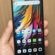
The home screen is a lot like Android, with re-arrangeable widgets on side-by-side screens that you can switch between with a swipe to the left or right. Widgets sit next to app icons and web page shortcuts.
When you edit a home screen, little buttons appear on the widgets to remove or adjusting options. The widget options window slides up from the bottom of the screen, with the desktop blurred in the background; it's a slick-looking effect.
The UI in general takes some getting used to. There are non-obvious tricks you need to know to get around, like poking at the edge of the screen (where there's nothing) is supposed to take you "back". In general, you can usually get where you want by poking at the icon in the top-left corner. I was never really sure what action it was supposed to perform nor where it would take me, but it seemed to cycle through main screens - like home, main menu, and the app switcher - such that I eventually got where I wanted to go.
The main menu is a fixed grid of "top" app icons, with the last item being a "more" icon. "More" takes you to a more-common scrolling grid of all the remaining apps. This reminds us of the way Windows Mobile used to work.
The app switcher is straightforward enough. This is a true multi-tasking phone.
The browser looks decent enough. The very high-res display on the N900 really shines here.
The text messaging experience is quite nice. New messages appear as a notification at the top of the screen, with message text and all. In the app switcher - which usually shows simple thumbnail views of app screens - the messaging app has a special look that summarizes new messages. Going into the messaging app itself, you get a very nice threaded view with contact photos, exact times, and large emotion button when composing a reply.


 Video Tour: Nokia N900
 Hands On with the T-Mobile REVVL 6 Pro 5G
 iPhone 15 Series Goes All-In on USB-C and Dynamic Island
 Samsung S24 Series Adds More AI, Updates the Hardware
 Nokia Phones Coming to New US Carriers in 2022
 Nokia N900

