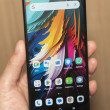
First Look: Motorola Droid
Oct 28, 2009, 12:41 PM by Eric M. Zeman
Phone Scoop goes hands-on with the new Motorola Droid, the first Android device for Verizon Wireless. Does it live up to the hype that Verizon has been scaring up the last few weeks?
Today Motorola launched the Droid, its second Android handset and the first for Verizon Wireless. Verizon has been pitching the device as an iPhone killer with its attack ads. What's more important is how the Droid stacks up against the existing crop of Android devices...and the rest of Verizon Wireless' lineup.
The hardware is the best I've seen from Motorola in some time. The combination of materials, design and execution are exactly what Motorola needs to be doing right now to get back into the game.
The fit and finish is top notch. Nothing about the Droid feels cheap. The joints all lock together snugly. It's impressively thin. Motorola claims it is the thinnest QWERTY slider on the market, and I am inclined to believe it. It is a weighty phone, though. Motorola's engineers said that they really packed everything in, so it is dense. Still, it feels good in the hand, probably in no small part due to the metal surfaces.
The screen is simply huge and it easily topples much of the competition. It stretches 3.7 inches and the 854 x 480 pixel resolution really impresses. Web sites look fantastic, images and video spring to life from the display, and it's very bright. I could gush all day. It really is incredible.
On the bottom of the screen are four capacitive buttons. These buttons provide haptic feedback and require slightly more pressure to activate than the touch display itself. Buttons on either side of the phone are minimal, limited to just a volume toggle and camera key.
The slider mechanism is not spring-assisted, and that makes the device feel even sturdier. The slider is very solid, with zero looseness or give.
The keyboard isn't as impressive as the rest of the hardware. It's flat, the keys have no contour or shape, and there's just enough travel and feedback to be acceptable. I prefer offset keyboards (they look more like a computer keyboard), but Motorola opted for a straight up-and-down keyboard due to space constraints introduced by the inclusion of the D-Pad.
In all, the hardware is definitely solid.
On the user interface side of things, it is essentially the same user interface that comes with any regular, non-custom Android handset. Verizon and Motorola have changed up the appearance of the home screen, but only with different wallpapers.
You have just three home screens — compared to the CLIQ's five or Hero's seven — which limits how many apps, widgets and shortcuts can be loaded onto the screen.
The user interface is fairly snappy, but not as fast as we were hoping. Many of the Droid's features are dependent on Android 2.0 Eclair. Having a unified inbox, support for multiple email accounts, SMS search, Facebook contacts integration and the new Google Maps product really help set the Droid apart — for now.
Verizon and Motorola both touted the "upgradability" of the platform, so you know that there are plenty of good things on the way.
Phone Scoop will provide a more in-depth review in the coming days.
Comments
False comparisons...
I've gone through hundreds of lists of features that Droid claims it can do and the iPhone cannot, I've tested a Droid now for 3 days, and guess what... I have see NOTHING the Droid does that the iPhone cannot do (and/or do better)!
I'm definitely NOT saying the Droid is a...
(continues)
Syncing Music
I fo...
(continues)
5MP camera images
http://www.engadget.com/2009/10/30/motorola-droid-re ... »
are there good themes for android
Anyone hear of what the available memory
Phone Comparison?
I hope they come out with a model without the slide out keyboard
My Verizon every-2 comes in March so I'll be ready about the time all the reviews are in.
The CrackBerry Storm 2 looks interesting also.
(continues)
window apps
This is what you call a review?????
Are you on Verizons pay-roll????
Come on, give me a real review!


 Review: Motorola Droid
 What is C Band 5G?
 Hands On with the Motorola edge (2022)
 TCL's Newest Concept Phone has a Matte Screen
 Hands On with the Motorola edge+ (2023)
 Motorola Droid

