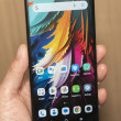
Review: LG Lotus Elite
The Lotus Elite uses Sprint's One Click user interface. The base home screen has a carousel running along the bottom of the screen. Using the D-pad you move sideways through this carousel to access different menu items. As you pass over each item, a list of options appears above it that you can choose from. For example, if you scroll over the messaging icon, you'll get a list of different things to choose from, such as going to your inbox, initiating a new message, etc.
The carousel itself is fully customizable. You can add or delete icons at will, and move them around to an order that suits your needs. As with all One Click phones we've tested, we noticed a bit of a lag when scrolling from icon to icon. The Lotus Elite shows some improvement, but there is still a delay, even if it is shorter than before.
The carousel items are meant to serve as shortcuts to sections of the phone. The Browser icon, for example, lets you choose to open the browser, see your recent history or go to your bookmarks. This lets you jump straight to the web page you really want to go to rather than launching the browser first and then scrolling to your bookmarks or history.
One carousel item is Google. When you scroll to it, it opens a Google search bar, and below that are links to Google Maps, Gmail, and several other Google services. This is a nice touch to have built in mobile search capabilities.
As is common to Sprint phones, there is a carousel item for your favorites. This lets you populate a bunch of shortcuts to action items or applications.
There is also a full regular menu that houses all of the phone's applications and services. This larger menu appears in a standard list or grid view.
One Click eliminates a lot of the digging around in menus that is necessary in Sprint's entry-level feature phone user interface. One Click does actually make finding the phone's features faster, even if not in "one click."


 Samsung Refines its Foldable Phones
 Hands On with the Motorola edge (2022)
 Hands On with Xplora Kids Smartwatches
 iMovie Makes it Easier to Create Polished Videos
 JBL Puts a Touchscreen on its Earbuds Case
 LG Lotus Elite / Mystique


