Review: Motorola Devour
While the Motorola Droid served as a flagship phone, with its high-res screen, excellent battery life and superior hardware specs all around, the Motorola Devour is all about social networking. The Motoblur interface offers deeper integration with your favorite social sites, especially Facebook, Twitter and MySpace. If you want a constant stream of information from all your friends and followers, the Motorola Devour is the better choice on Verizon Wireless.
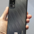
The Devour is held back a bit by some strange design choices. The phone feels chunky and cumbersome. The screen seems too small against all the plastic and metal that surrounds it. Touch sensitive buttons under the display gave me plenty of trouble, and the optical joystick was so bad that I stopped using it after a few tries, even when I hiked the sensitivity up to its maximum. The keyboard isn't bad; it's even better than the keyboard on the Droid, but it isn't great, either, and the phone would be easier to use with more shortcut keys and buttons under the slide.
Verizon Wireless also hasn't added any useful software to this phone, and every attempt seems worse than the alternative free option. The V Cast Music Store is horrible, a sluggish and buggy mess of a music store that had me longing for the Amazon MP3 store on other Android phones. VZ Navigator worked fine, except when it didn't work at all, but the extra location-based features aren't enough to justify the extra monthly expense, especially when Google's own navigation option comes free on this phone. Motorola has added their own extras in a PC sync tool and wireless media sharing, but none of these services were compatible with my computer so I had to skip them for now. That kind of defeats the purpose of Google's platform-agnostic Android intentions.
The best competition for the Motorola Devour is probably the Palm Pre Plus. Both phones have deep contact integration with your favorite social networks and innovative search options that let you dig into the Web, the mapping software or the phone itself. While Palm's WebOS might be easier to use out of the gate, Google's Android platform allows for deeper customization options and has a more robust App Market. I won't foment this argument any further, because both of these phones are a fine choice for the right user.


 Samsung Refines its Foldable Phones
 Samsung Upgrades its Wearables
 iPhone 14 Plus Offers a Big Screen For Less
 iMovie Makes it Easier to Create Polished Videos
 Google Revamps Android Auto Interface
 Motorola Devour


