Review: Samsung Sunburst
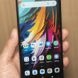
When it comes to touch response, the Samsung Sunburst has two big strikes against it. First, the touchscreen was not very responsive. The resistive technology required a firm push to register taps, and it often missed my input. This made everything more difficult. Dialing was harder than it should have been, as was typing on the keyboard. The phone also frequently registered a tap when I was actually starting a swiping motion. For an inexpensive phone, this isn't such a surprise, but it's still disappointing. I've seen better touchscreens, especilly the screen on the Pantech Pursuit that I just reviewed, also on AT&T. For cheap tablet phones, though, this is par for the course.
The second strike against the Sunburst is Samsung's TouchWIZ interface. TouchWIZ requires more screen real estate than the phone offers. Swiping between the three paneled home screen worked well, some of the best response I got on this phone. But there's plenty of tapping and dragging that didn't work as well. The tiny widget drawer was difficult to tap accurately on this screen. When widgets overlapped, it was tough to home in on the one I wanted to press.


 Samsung Refreshes Galaxy S Series with S Pen, New Cameras
 Samsung Refines its Foldable Phones
 iPhone 14 Plus Offers a Big Screen For Less
 Google Revamps Android Auto Interface
 iOS 16 Revamps the Lock Screen
 Samsung Sunburst A697


