Review: Samsung Vibrant
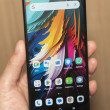
The Vibrant is a big slab of a phone. It's not as egregiously ginormous as the Droid X or EVO 4G, but it is big, just the same. It feels fairly light in the hand, but still solid and well made. Most surfaces are either plastic or glass, and it comes off a bit slippery in the hand. Not only that, but it looks almost identical to the iPhone 3G/3GS, which sadly takes away from its personality. The AT&T Captivate has a bit more of a unique appeal to the hardware.
The front is dominated by the large touch screen. There are four capacitive buttons placed at the bottom edge to access the standard Android Menu, Home, Back, Search actions. These capacitive buttons were not quite as responsive as I would have liked. They do, however, offer the option to include haptic feedback (micro vibrations) when touched. For those who need a little bit more guidance, the haptic feedback can be helpful.
The volume toggle is on the left side of the phone and I can't say I care for it all that much. It's small-ish, and has minimal travel and feedback. The power/lock key is located on the right side of the phone. It is way too small and difficult to find. Samsung likes to place the power/lock key in this spot on many of its phones. Given the size and shape of the Vibrant, it simply isn't all that comfortable to use.
The 3.5mm headset jack is located on the top of the phone, as is the microUSB port. The microUSB port is perhaps my favorite physical feature of the Vibrant. It is covered by a little door. The door slides sideways to reveal the port. It's much better to use than those sometimes-tricky hatches.
The microSD card slot is located under the battery cover, but thankfully not under the battery itself. The entire back surface of the Vibrant peels off easily to access both the battery and microSD card.
Slab-style phones are hard to make unique. The Captivate does a better job than the Vibrant. The Vibrant follows too many of the iPhone's cues, and comes across as too conservative and vanilla in my book.


 Hands-On with Samsung's Galaxy S Phones for the US
 Samsung Refreshes Galaxy S Series with S Pen, New Cameras
 Samsung Refines its Foldable Phones
 Samsung Upgrades its Wearables
 Samsung S24 Series Adds More AI, Updates the Hardware
 Samsung Vibrant (Galaxy S)


